Workshop Template Feedback Thread

Remove this Banner Ad

Working on a few illustrator templates.
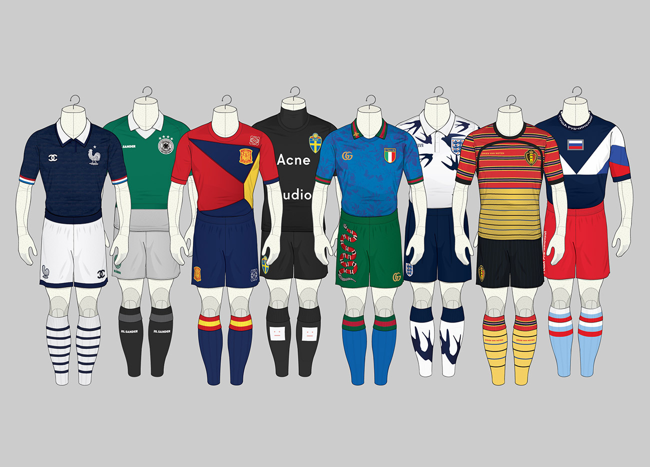
This one is a mannequin concept inspired by a blog I found year's ago but can't seem to find again.
May add some more texture.

View attachment 588547
View attachment 588544
So good, your templates seem to all have a look to them almost like they are drawings done in copic markers. Can't wait to see you enter some of the big competitions on here.
 
So good, your templates seem to all have a look to them almost like they are drawings done in copic markers. Can't wait to see you enter some of the big competitions on here.

Funny you say that... the last few years all my designs have been in copic markers on random scraps of paper as I didn't want to go anywhere near a computer after work.
 
I found the name of the designer who inspired me to do a mannequin template.
Though I can't find his original blog, I have been able to find some other sites.
His name is Angelo Trofa and mainly does soccer kits.

His Instagram: https://www.instagram.com/angt34/?hl=en

I have also found some online flip magazine's that he's created... some good stuff for kit designers in there... do check it out if you have the chance.
https://e.issuu.com/anonymous-embed.html?u=angt34&d=issue4_football_strip_concepts_issu

Sample of his style below.

LYST_FOOTBALL_1300.jpg
 

Log in to remove this ad.

I found the name of the designer who inspired me to do a mannequin template.
Though I can't find his original blog, I have been able to find some other sites.
His name is Angelo Trofa and mainly does soccer kits.

His Instagram: https://www.instagram.com/angt34/?hl=en

I have also found some online flip magazine's that he's created... some good stuff for kit designers in there... do check it out if you have the chance.
https://e.issuu.com/anonymous-embed.html?u=angt34&d=issue4_football_strip_concepts_issu

Sample of his style below.

LYST_FOOTBALL_1300.jpg
Thought it might have been, managed to get one of his latest mag last year, big fan of his stuff.
 
Has anyone else got Pinta on mac? I don't like the way Photoshop is set up and barely understand how to use it as I've been using paint pretty much my whole life. But I downloaded Pinta as I was told it's sort of a cross between the two, and this is the first template I have come up with, ignore the obviously shithouse logos and spicks and specks all over the place, what do you guys think??

upload_2018-11-27_23-20-58.png

Essentially it is a template underneath and then a coloured in layer over the top.
 
Cheers for the info El_Scorcho, the smart object does make it work a lot better although I do need to mess around with it a bit more. I feel like warping the image drops the quality quite a bit. Anyone else have this problem? port test.JPG
 
Cheers for the info El_Scorcho, the smart object does make it work a lot better although I do need to mess around with it a bit more. I feel like warping the image drops the quality quite a bit. Anyone else have this problem?View attachment 589392

You may have to make a larger template, and then shrink down the size of the image when presenting. Warping naturally just makes things look worse, so generally has to be done at a larger size so when it's brought down the distortion is no longer noticeable.
 
You've done a good job actually. Reminds me of the womens cotton on collar. Looks nice

On SM-G960F using BigFooty.com mobile app
That part of the collar has that depth off the main collar mainly because I don't know how to get rid of it :p But it is certainly a start.
 
That part of the collar has that depth off the main collar mainly because I don't know how to get rid of it :p But it is certainly a start.
Perhaps the spot healing brush on the overlay, although good luck getting that to look good
Join the BFFCL
 

(Log in to remove this ad.)

Perhaps the spot healing brush on the overlay, although good luck getting that to look good
Join the BFFCL
Cheecky from you Fiz.
 
Still prefer the length of the old back, but the rest of it seems like an improvement
Yeah, I sort of agree. Most negative feedback so far is that it’s too short, but now it seems too thin. Maybe it’s because I’m used to the old one so much, so it will take some time to warm to it. I still need to make the logos bigger. Might eventually make it a little wider once I see what it looks like in the end.
 
Decided to make this flat template and keep my realistic one for comps. This is the template with both collars that I've done so far. Thoughts?
View attachment 593043
View attachment 593044
Something about this seems familiar. Is it based on the old BLK templates?
15clashjumper2205.png

They had a longer template that looked more like yours but I can't find any pictures of it.
 
Something about this seems familiar. Is it based on the old BLK templates?
15clashjumper2205.png

They had a longer template that looked more like yours but I can't find any pictures of it.

It's based off the XBlades template which is most likely stolen from BLK haha
 

Remove this Banner Ad

Back
Top