Workshop Template Feedback Thread

Remove this Banner Ad

This thread hasn't been used for a while, but I don't care.
I'm working on a basketball template, how do we like it? Obviously I'm gonna fix up things in the design that need fixing, but strictly on the template, yay/nay?
View attachment 704093
If you’re going for a retro look, I’d add some more of that shading and mess with the outline a bit to make it look like more of a loose fit if that makes sense. Coming along nicely though.
 
can anyone give me a hand on how to make realistic folds in my template, been looking all around youtube and can't find much that helps
 
If you’re going for a retro look, I’d add some more of that shading and mess with the outline a bit to make it look like more of a loose fit if that makes sense. Coming along nicely though.
Gave it a go, but because I warped the overlay layer a little the part which was the collar that I had spot healed had started to reveal and it just came out messy. Plus I couldn't get it to look right. I'll work on this in the long run though.
can anyone give me a hand on how to make realistic folds in my template, been looking all around youtube and can't find much that helps
Get an image of a white t-shirt/singlet/jersey/whatever and set the blending mode from Normal to Multiply. Make a clipping mask of this layer within your base layer and you're good to go.
 

Log in to remove this ad.

Then, someone answered that thread from the font and e-mail brought me here. I thought: Why not try a new template? Some feedback on this would be nice.

In time: It seems that the photorealistic world is not for me. I work much better with vectors.

GZWbRAN.png
 
Then, someone answered that thread from the font and e-mail brought me here. I thought: Why not try a new template? Some feedback on this would be nice.

In time: It seems that the photorealistic world is not for me. I work much better with vectors.

GZWbRAN.png
That's really nice what you've got there. The only thing I can think of is maybe lowering the opacity of the stitching, but if that's the kind of look you're going for then it looks great.
 
Then, someone answered that thread from the font and e-mail brought me here. I thought: Why not try a new template? Some feedback on this would be nice.

In time: It seems that the photorealistic world is not for me. I work much better with vectors.

GZWbRAN.png
Awesome, would say that the shorts are a bit big (focus should really be on the guernsey imo), but there is something about a really well crafted flat template like this that is just special.
 
1586742724185.png

Stepping into a new era of templates...

Just need to figure out if there's an easier way to apply the jumper creases other than having to draw out all the shading as a shape from the base image.

EDIT: Did just that ^

1586759704958.png

A cookie to the person who can find the image this is based from (shouldn't be too hard I'd imagine) ;)
 
Last edited:
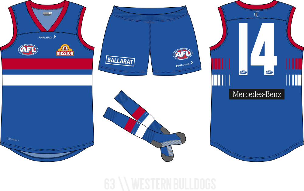
Righto, my first crack at a full kit on Illustrator
Thoughts?
View attachment 857759
Great! It's such a good feeling being able to work with shapes so easily when making templates now :)
Shorts I feel like are a tad wide, or at least feel disproportionate to the size of the torso - struggled with this myself on some of my early ventures into templates.
Cuffs to me also seem a bit too thin in comparison to thickness of collar, though this can be completely down to personal preference so do what thou wilt.
 
Last edited:

(Log in to remove this ad.)

1586871042153.png

Had to use slightly different image of special player that captured his shorts and align my tracing of that and his legs with the upper half of template I'd created.
A template that is very personalised to the specific design, I like the idea of tweaking a single template uniquely for each separate design and this fits the bill. Takes a bit more technique and skill to create designs on this kind of template from scratch rather than using simple shape tools.

Will hopefully be giving this one and other variants in upcoming comps.
 
Righto, my first crack at a full kit on Illustrator
Thoughts?
View attachment 857759
Subjectively
- I'd make the main stroke around the cuffs, the body, etc just plain black. Same with the stitching, but just lower the opacity.
- The shape of the jumper is a bit weird. I'd probably make it a bit longer and take the cuffs out a bit, give yourself more room in the chest.

Objectively
- The stitching on the cuffs needs to be closer to the cuffs. Like what you've done with the collar back.
- The shape of the cuff stitching on the back doesn't match the shape of the cuffs.

On the right track!
 
Hey gang, just got my pc back and decided to give a crack at using Illustrator to build a new template.

Here's what i have so far
1587212012235.png

Any thoughts or tips anyone can throw my way to improve it?
 
Last edited:
Looks good man, are you going for a laid down flat look or like it's being worn? Hard to tell.

Gibbsy Red Crow this thread can probably be merged with the Template Feedback thread
Not entirely sure, i don't like the outright flat ones so a semi-worn looking one might be the way to go.

To be honest i found a lot of the template links and stuff with either dead links/images or just a bit dated. Now that we're all home it mightn't be a bad idea to build more!
 
Not entirely sure, i don't like the outright flat ones so a semi-worn looking one might be the way to go.

To be honest i found a lot of the template links and stuff with either dead links/images or just a bit dated. Now that we're all home it mightn't be a bad idea to build more!
Yeah the stickied template thread kinda sucks, it could use an update. Pretty sure no one uses anything in it lol.


This is the one I was talking about.
 
Nice clean start. What sort of style are you going for overall? Are you doing sort of shading or are you leaving it flat?
 
Thinking a bit of shading. I haven't really used illustrator since like 2008 so i'm having to relearn a lot!

Always good to upskill and learn new things anyway. I've used a photorealistic style template for ages on this board but it'd gotten a bit stale, so i'm going for more of a flat vector style template at the moment and i'm learning heaps.
 
Always good to upskill and learn new things anyway. I've used a photorealistic style template for ages on this board but it'd gotten a bit stale, so i'm going for more of a flat vector style template at the moment and i'm learning heaps.
I actually was just chatting to my partner, I realised I had some old drawings I did that are .AI files from 2004, which is when I briefly did a graphic design course before getting into an IT traineeship. That means I haven't used illustrator since 2004! Holy crap lol
 
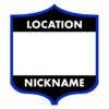
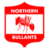
Took a crack at making a VFA/VFL shield logo Photoshop template, based off an old Waverley Panthers logo Mero posted here ages ago.

It was a bit of a challenge (pen tool's never been one of my strong suits), but I think it turned out pretty great, if a little rough around the edges.

Base.png

bullants.png
 

Remove this Banner Ad

Back
Top