I don't go crazy over the colours and uniforms but wish we had the black and white going obviously.Going back some time to the discussion on silver as one of Port's 4 AFL colours, I have been whingeing about the club's use of gun metal grey as a substitute for silver in merchandising, branding, etc.
People say to me "well, you know that a lump of silver looks grey, wah wah wah....". This pic from the Veronica's half time entertainment shows the reflective, shimmery silver I reckon we need to use (the colour - NOT the design of the outfits!!!).
People talk about "silverware" when they are referring to kitchen cutlery, or sporting trophies, etc. That is what I am talking about.
Our primary colours are Black and white. Secondary colour is teal/blue. Tertiary colour is silver. As a colour to use for piping, highlighting, etc it would look specky under lights (not so much in daytime).

I think we should do something similar to the NFL Raiders as their kits always looks cool, powerful and dangerous. Mainly black with silver.
Also, just straight black with a touch of silver like the All Blacks would be awesome. Powerful, cool stuff and aligned to a great team like the All Blacks.
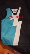
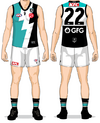
Also, I like the lightning bolt on the kit. It has the runic power of sig.


