Discussion TV Broadcast Graphics - Designs & Discussion

Remove this Banner Ad

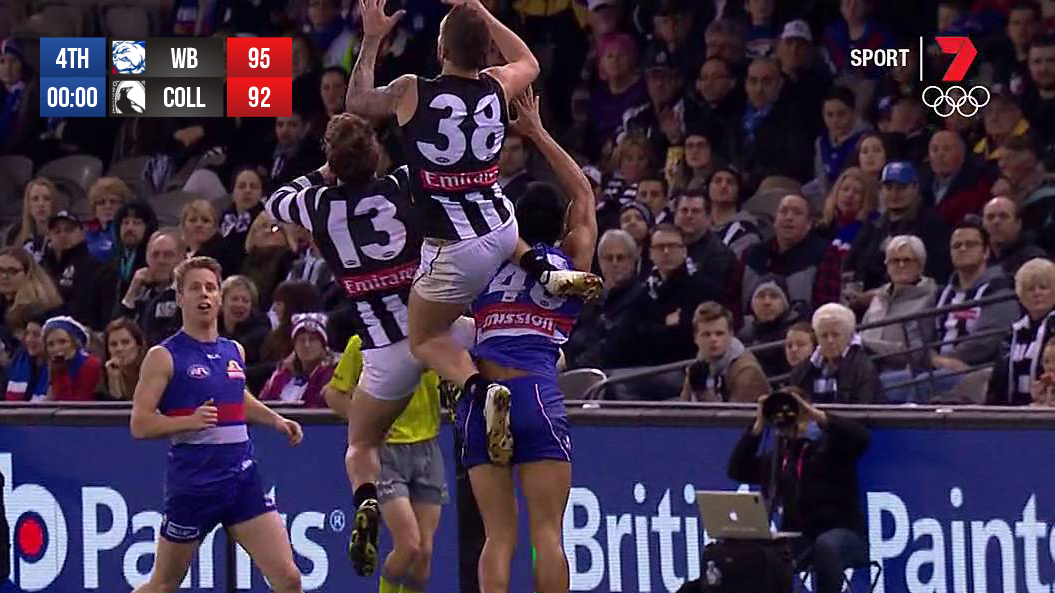
Its tackiness is only reinforced when the camera pans left to display the commentators names during a ball up in the 50M arc.


And solidified by the goalkicking percentage graphics.

What happened to graphics that didn't have all the dribs and drabs?
 
Last edited:
I love Olympics graphics. Just so clean and clear. All the information you could want so easily presented, and all uniform across all of the sports. Its been interesting to see how they've developed since 2000 (the first year I was old enough to really take any notice of them). Since 2000, they've mostly had a blue base, but interesting to see this year they've shifted to a greener hue. Suits really well with the imagery of Rio.

I've put together some images of the swimming graphics since 2000 to show the development. Haven't been able to find a shot of the start list for this year yet, but I'll update when I do.

2000 Sydney Swimming.png


2004 Athens Swimming.png


2008 Beijing Swimming.png


2012 London Swimming.png


2016 Rio Swimming.png
 

Log in to remove this ad.

I'd like to see 7 abbreviate the names like they should be. The full names are so unnecessary and it makes the score bug far longer than it should be. I wish they'd move it to the top of the screen too.

aa9190.png
 
I'd like to see 7 abbreviate the names like they should be. The full names are so unnecessary and it makes the score bug far longer than it should be. I wish they'd move it to the top of the screen too.

aa9190.png
Looks good. Mind telling me what the font is?
 
I'd like to see 7 abbreviate the names like they should be. The full names are so unnecessary and it makes the score bug far longer than it should be. I wish they'd move it to the top of the screen too.

aa9190.png

I'd like it if they just did mascots.
Would prefer location, but the Bulldogs messed that up.

Right now it's weird that you can get games of North Melbourne VS Geelong Cats, or Western Bulldogs Vs St Kilda
 
I'd like it if they just did mascots.
Would prefer location, but the Bulldogs messed that up.

Right now it's weird that you can get games of North Melbourne VS Geelong Cats, or Western Bulldogs Vs St Kilda

Nah nicknames should be just that. Hate that NRL graphics on Nine are say "Storm v Panthers". Not as professional IMO.

Blame the lack of consistency on clubs that deliberately choose to be known by their full name. I reckon Brisbane Lions is fair enough (to honour both sides of the merger) and the Bulldogs can't be just written as "Western", but others like Geelong and Adelaide in particular annoy me (I may have mentioned this once or twice before...).
 
The graphics from the past couple of years have formed as part of the identity of the Premier League. You see those old graphics and you know instantly that it's Premier League Football.

This is just blah.

Its interesting though that people in the UK don't actually get the world feed Premier League graphics. Sky Sports and BT Sport use their own graphics for PL games.

But I do agree with you, and considering the last couple of FIFA games have also had the official graphics for PL games, they've become strongly identifiable.
 

(Log in to remove this ad.)

New Premier League graphics. Simple and clean, but the colours are jarring! That bright green is just terrible. The Optus Sport logo which follows the same colour scheme is also poor.

View attachment 276409 View attachment 276410

Yeah it is clean and simple, but the colours just don't work, I don't get why they would go for such outlandish colours for a league with so much history and class in it's previous presentations. Also the Lion head above the score is not needed as the watermark is in the bottom right (is just overkill). Though I do like the transition graphic with the logo, extremely simple, but looks great and very effective.

However though I don't particularly like the Optus Sport logo (too simple and just trying to copy the PL), I do like the blue and purple combination.

They're clearly going for a more modern approach, but you're right - they really lack any class. The Premier League doesn't need any modern, youth-oriented ginmicks.
 
They're clearly going for a more modern approach, but you're right - they really lack any class. The Premier League doesn't need any modern, youth-oriented ginmicks.
Because it IS one.
 
Yeah it is clean and simple, but the colours just don't work, I don't get why they would go for such outlandish colours for a league with so much history and class in it's previous presentations. Also the Lion head above the score is not needed as the watermark is in the bottom right (is just overkill). Though I do like the transition graphic with the logo, extremely simple, but looks great and very effective.

However though I don't particularly like the Optus Sport logo (too simple and just trying to copy the PL), I do like the blue and purple combination.

The colour combination they have used in seen to be on trend this year in Europe, give it eighteen months and it will be the trend here you can guarantee it. The shade of green in particular has come from the pantone survey which is the in colour at the moment. What is interesting is the original release of the new branding showed the logo in different colour combinations suggesting it will be refreshed every so often.

18337_liverpool-fc-third-jersey-2016-17---kids_01_s.png
1440-third-834-3186622_613x460.jpg
 

Remove this Banner Ad

Back
Top