Certified Legendary Thread Winged Guernsey Petition/Letter - #ReturnTheWings: WINGS RETURNED, PERIL RETURNED - JOB DONE!

Remove this Banner Ad

Status
Not open for further replies.
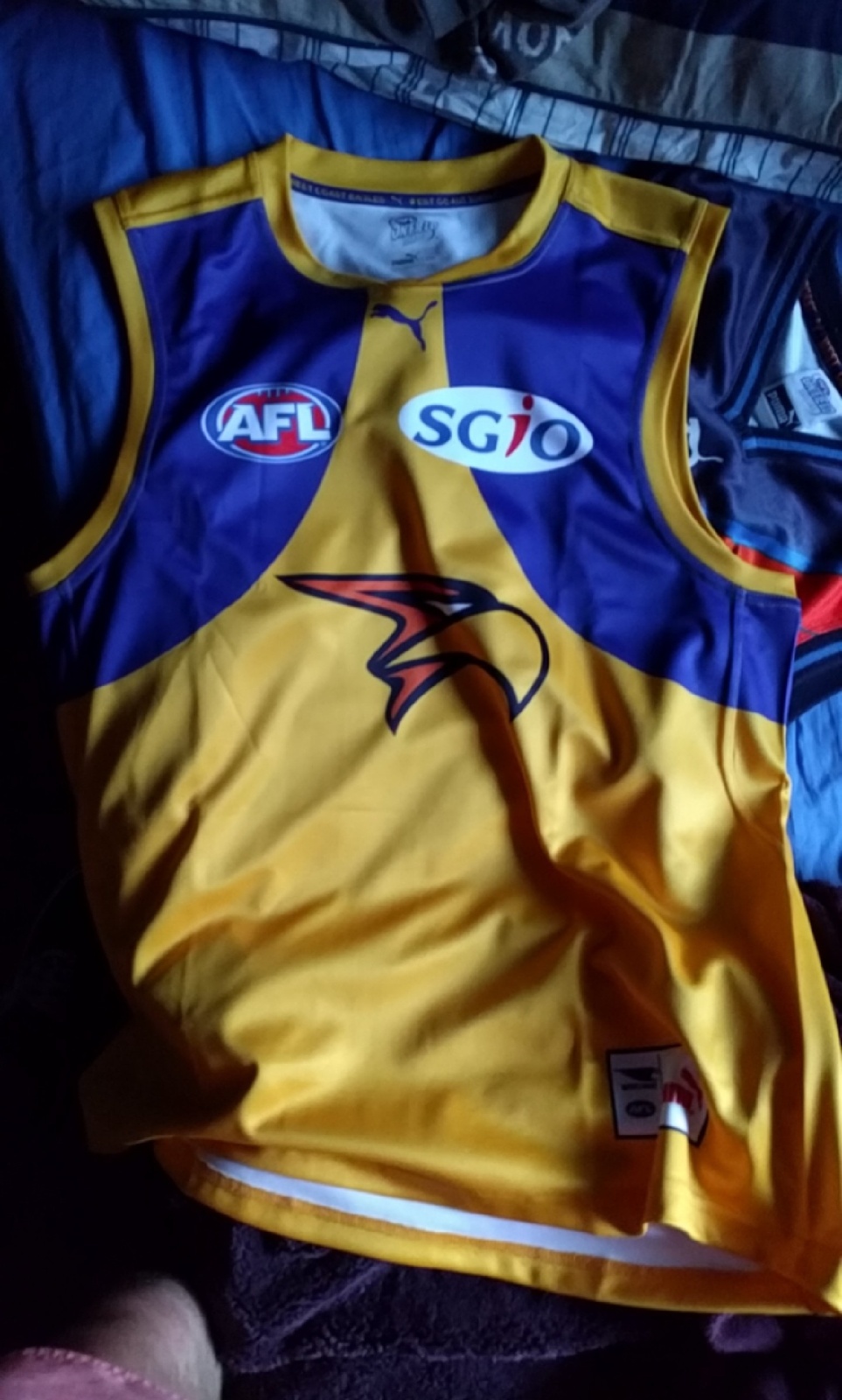
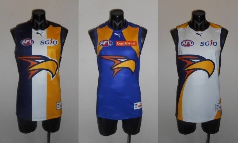
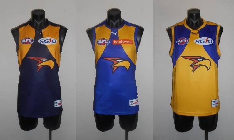
Smaller oval. That's what we all wanted right?

I didn't really mind to be honest but now it looks uneven on the sides. The right side of the oval is more pointy than the left. To me it looks really obvious. Even more so then the navy outline around the Eagles head lol I guess my OCD is kicking in


Sent from my iPhone using Tapatalk
 

Log in to remove this ad.

2psq39k.jpg
 
It's amazing to think that in a little over 12 months we've gone from this...

2_zpstg7ccs69.jpg


to this...

1_zps6sjvgqal.jpg
I just really really really wish the wings followed up over the shoulder and around the back.

Looks extra obvious on the peril
 

(Log in to remove this ad.)

The 2015 royal, looked good full royal (on GF day), but by god that Eagle head is ginormous. I forgot how bad the jumper had gotten.
The absolute ideal IMO is that they come up with a new, more symmetrical, and importantly single-coloured logo, in either a monogram style (slightly pretentious given we are only 30 years old, but let's face it - monogram logos are the best) or a shield style, and have it in the middle of the guernsey where the eagle head is now.

The way the current one is lopsided sucks and really detracts from the awesome symmetry of the wings design.

The Dandenong Stingrays design highlights how much better the wings jumper design looks when the logo is monochrome and somewhat symmetrical.
 
Status
Not open for further replies.

Remove this Banner Ad

Back
Top