Navigation
Install the app
How to install the app on iOS
Follow along with the video below to see how to install our site as a web app on your home screen.
Note: This feature may not be available in some browsers.
More options
-
 BigFooty Tipping Notice Img
Weekly Prize - Join Any Time - Tip Round 10
The Golden Ticket - MCG and Marvel Medallion Club tickets and Corporate Box tickets at the Gabba, MCG and Marvel.
Round 9 Winner: philreich
You are using an out of date browser. It may not display this or other websites correctly.
You should upgrade or use an alternative browser.
You should upgrade or use an alternative browser.
Carlton in the Media (articles, podcasts etc)
- Thread starter Aphrodite
- Start date
- Tagged users None
- Status
- Not open for further replies.
Big words from Trigg Beach.
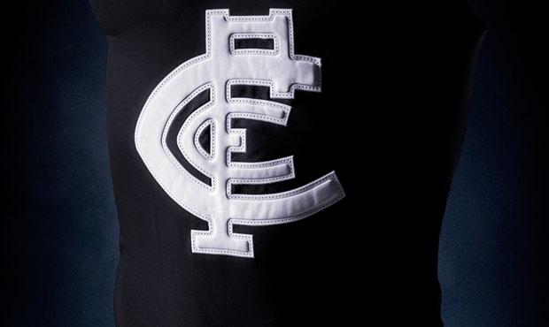
Would hate to see our heritage jumper become permanent.
Why's that and whichever way, you best get used to it. It's coming.
Why's that
It's an ugly design. Looks too cartoony.
and whichever way, you best get used to it. It's coming.
I guess.
It's an ugly design. Looks too cartoony.
You are kidding .... right ??
This is the best jumper not only in the club's history but the league's as well.
It is a symbol of success & strength !!
It's an ugly design. Looks too cartoony.
You're likely to be in the minority there.


This or that.......................No contest for mine.
You are kidding .... right ??
This is the best jumper not only in the club's history but the league's as well.
It is a symbol of success & strength !!
The fact that the club won a bunch of flags while wearing the design has nothing to do with the fact that it looks rubbish and should be left in the past where it belongs.
- Sep 5, 2013
- 6,555
- 11,108
- AFL Club
- Carlton
- Other Teams
- Western Bulldogs
And if you order one online it comes in its own brown paper bag.You are kidding .... right ??
This is the best jumper not only in the club's history but the league's as well.
It is a symbol of success & strength !!
- Thread starter
- Moderator
- #7,834
Big words from Trigg Beach.
Would hate to see our heritage jumper become permanent.
Best. Jumper. Ever!

- Sep 5, 2013
- 6,555
- 11,108
- AFL Club
- Carlton
- Other Teams
- Western Bulldogs
Surprised you didn't show our yellow strip. I would prefer to see the boys in an acid wash denim number with sequinned numbers than that one again.You're likely to be in the minority there.


This or that.......................No contest for mine.
You're likely to be in the minority there.
I don't doubt it. A lot of Carlton supporters seem to be stuck in the 70's and 80's. Even the ones that weren't around then.


This or that.......................No contest for mine.
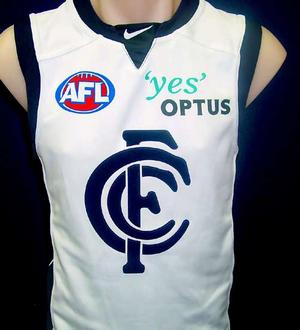
I'm no design major but the newer one looks much cleaner and aesthetically pleasing.
Surprised you didn't show our yellow strip. I would prefer to see the boys in an acid wash DOUBLE denim number with sequinned numbers than that one again.
Edited.
Best. Jumper. Ever!

What really stands out in that photo is the amount of corners and edges the logo has which I think is why it looks so bad.
What I do like though is that the jumper in the photo looks much darker than usual.
I don't doubt it. A lot of Carlton supporters seem to be stuck in the 70's and 80's. Even the ones that weren't around then.
I'm no design major but the newer one looks much cleaner and aesthetically pleasing.
I would have used the terms flaccid or insipid but cleaner sort of works.
Nothing to do with 70's or 80's or wanting to head back to a bygone era. When it's right it's right.
I'm neither here nor there on the issue. As someone mentioned on the jumpers board, I'd like to see how our current logo would look without the gaps (as one solid block).
Hank93
Brownlow Medallist
Blues consider adopting heritage jumper permanently
The story is about our jumper going forward but this is more interesting.
Nothing new but Trigg is on record here and we're going to want to see 55K next year for him to be true to his word.
Won't be easy though........sleeves best be rolled up Steve.
It certainly one thing that didn't seem to be apparent at the AFC (Accepting fan feedback). Looks like he's off to a good start though

- Sep 26, 2012
- 17,214
- 14,403
- AFL Club
- Carlton
From the reports from AFC fans about Trigg, it seemed he couldn't get any worse and therefore the only way is upIt certainly one thing that didn't seem to be apparent at the AFC (Accepting fan feedback). Looks like he's off to a good start though
I think it's also quite handy that he has a point to prove. Added motivation. So you never know, in a few years time, we might look back and be grateful for Tippett gate.
It certainly one thing that didn't seem to be apparent at the AFC (Accepting fan feedback). Looks like he's off to a good start though
He's got no choice. Adelaide have to fend off members and Carlton can't buy them.
We laughed when Brendan Gale declared that the RFC will have 70K members by 2015...............he was right.
Trigg has to do something similar and pull all stops out................starting now.
You're likely to be in the minority there.


This or that.......................No contest for mine.
One jumper was worn by the most successful club/team in the AFL that won more premierships than any other and never won a wooden spoon.
The other Jumper was worn by a team that achieved mediocre results at best, never won a premiership, won plenty of spoons or got close to doing so, cheated the salary cap and became a laughing stock. Just a poor attempt to modernise, which was the style at the time.
It's a no brainer, bring back the traditional one.
Last edited:
- Sep 5, 2013
- 6,555
- 11,108
- AFL Club
- Carlton
- Other Teams
- Western Bulldogs
Well to be fair, those who wore the second jumper did so bearing a burden bought about by the actions of some of those behind the first.
Perhaps the second should be cut a little slack.
Perhaps the second should be cut a little slack.
One jumper was worn by the most successful club/team in the AFL that won more premierships than any other and never won a wooden spoon.
The other Jumper was worn by a team that achieved mediocre results at best, won plenty of spoons or got close to doing so, cheated the salary cap and became a laughing stock.
It's a no brainer, bring back the traditional one.
I wonder how you'll feel when we lose to GWS in the old jumper.
- Jan 13, 2010
- 1,323
- 998
- AFL Club
- Carlton
- Other Teams
- New England Patriots, Liverpool
If anything, the "newer", rounder logo looks more cartoony.It's an ugly design. Looks too cartoony.
I was born in the 90s, have seen the old 70s and 80s games and like you said the past is in the past, that is history I'll give you that much.
That being said, forget about who many flags we've won in the jumper with the old logo, a good design is a good design and I know the majority of the Carlton supporters would love to stick with it, with a lot of petitions online all for the traditional logo design, I have even heard a whole lot of opposition supporters saying it looks great.
Oh Yaz
Are you following the twitter feed from Yarran's girlfriend ??
thylacine60
Premium Platinum
- Banned
- #7,850
Pillow Talk.
- Status
- Not open for further replies.
Similar threads
- Replies
- 20
- Views
- 1K
- Replies
- 2K
- Views
- 183K
- Replies
- 4
- Views
- 284
- Replies
- 41
- Views
- 2K
- Locked
- Replies
- 772
- Views
- 33K


