


That's the one. I had the photo but couldn't find it. Hahaha
Navigation
Install the app
How to install the app on iOS
Follow along with the video below to see how to install our site as a web app on your home screen.
Note: This feature may not be available in some browsers.
More options
You are using an out of date browser. It may not display this or other websites correctly.
You should upgrade or use an alternative browser.
You should upgrade or use an alternative browser.
News New Jumpers for 2015
- Thread starter Gibbsy
- Start date
- Tagged users None
- Status
- Not open for further replies.
Not really a fan of the Pie's having "star" on the collar, the logo worked just fine.


Looks like they have substantially trimmed down the red box for Emirates.
Compare the space above and below the text with 2014...

Compare the space above and below the text with 2014...
wing it
Club Legend
- Jun 6, 2013
- 2,427
- 3,917
- AFL Club
- West Coast
That fella on the right is deadset swimming in that guernsey. Straight off to get measured up tomorrow, young lad!Not really a fan of the Pie's having "star" on the collar, the logo worked just fine.View attachment 94608
north albury
Debutant
Guys i know this has nothing to do with afl or even footy jumpers but i would just like to pay my respects to Phil Hughes and his family we lost not just a cricketer but also a great bloke RIP hughesy 
MKMatty
Busy Vibin’
I grimace everytime I see that photo. When I see stuff like that I image it happening to me, and just.. eugh >< that wouldn't feel nice.
When I started on here I was 16 and wondered if I was too young for this.And here I am thinking I was one of the young guys on here.
That's f**ked
- Thread starter
- Moderator
- #2,409
Looks like they have substantially trimmed down the red box for Emirates.
Compare the space above and below the text with 2014...
Yeah, I never thought I'd be saying this but I actually prefer the larger Emirates box. It just fills out the front of the guernsey more, the new thin logo looks like someone's copied it on MS Paint
MKMatty
Busy Vibin’
I agree. It looks too thin the way it is now. Makes it look kinda lost on the jumper.Yeah, I never thought I'd be saying this but I actually prefer the larger Emirates box. It just fills out the front of the guernsey more, the new thin logo looks like someone's copied it on MS Paint
Heardy_101
LET'S GO BRANDON
Looks like they have substantially trimmed down the red box for Emirates.
Compare the space above and below the text with 2014...
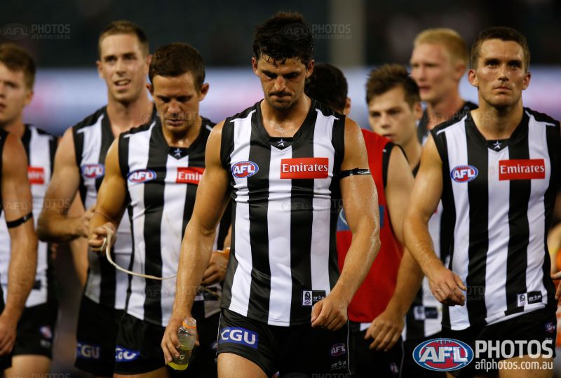
Anyone else really love this photo?
Nothing like Collingwood after a loss.
Whoops, not the Bay. Carry on.
- Jun 6, 2010
- 4,030
- 12,851
- AFL Club
- Fremantle
- Other Teams
- Dillon Panthers

- Thread starter
- Moderator
- #2,413
Not as bad as I thought really
MKMatty
Busy Vibin’
I still think the red Woodside logo takes away from the chevrons. I don't know why though.
Also, whats up with that collar? Looks different.
Also, whats up with that collar? Looks different.
Heardy_101
LET'S GO BRANDON
Collar definately looks different.
Spanna_
The secret ingredient is crime
Well don't we all know it?The stereotype isn't true and I know because I'm in primary school and I hate it.
It looks odd... but it could just be that he's a relatively small bloke.
Greater Gattsby
♛ All Class ♛
- Oct 6, 2011
- 8,865
- 11,421
- AFL Club
- North Melbourne
- Other Teams
- Melbourne Victory | West Ham United
It's really weird having mates that got drafted...
hitthepost
Norm Smith Medallist
BragIt's really weird having mates that got drafted...
The Collingwood black on white looks soooo much better.
lionbear
Geelong Member from 2016
- Feb 25, 2007
- 12,425
- 8,875
- AFL Club
- Geelong
- Other Teams
- 49ers, Indians, Storm
Why couldn't Collingwood have gotten a couple of jumpers that didn't look like a tent on the players for the top 10 shoot, especially when one was a father son selection?
Javelin
All Australian
- Jun 6, 2013
- 849
- 1,116
- AFL Club
- West Coast
You can kick a goal through his front teeth!No change, but just look at that beautiful man

Jones2ByrneJones
Hour of Pessimism
- Jul 27, 2012
- 15,820
- 27,995
- AFL Club
- Port Adelaide
It appears as though they've added an AFLPhotos.com.au watermark to that guernsey. Should get on to updating that, Mero.No change, but just look at that beautiful man
- Jul 9, 2010
- 24,163
- 26,536
- AFL Club
- Fremantle
And especially when the top four was pretty obvious and it was fairly known Go Doey would be speedily delivered to them. I doubt Travis Cloke would've had a decent fit in those things.Why couldn't Collingwood have gotten a couple of jumpers that didn't look like a tent on the players for the top 10 shoot, especially when one was a father son selection?
Also, no issue for me with that Woodside logo. Maybe it's because it's such a dulled red, or it kind of mirrors the AFL logo, or just because red, white, and purple isn't as jarring as Port having black, white, and teal against a bright yellow. The collar is hugely naff though, but I'm guessing a prototype. I was in the Freo team store yesterday and there weren't any 2015 jumpers so potentially an early version of the retail? ISC always give Freo their gear last (our 2013 team photos had all the boys in the 2012 jumpers).
Yeah, I never thought I'd be saying this but I actually prefer the larger Emirates box. It just fills out the front of the guernsey more, the new thin logo looks like someone's copied it on MS Paint
Note the time and date, folks. For the first and only time, someone here just endorsed bigger sponsor logos.
We are through the looking glass.
- Status
- Not open for further replies.
Similar threads
- Replies
- 175
- Views
- 14K
