News 2014 Geelong guernseys and apparel - new 'premiership guernsey' to be worn in Round 23

Remove this Banner Ad

People don't hate clashes when you win things in them. If we were
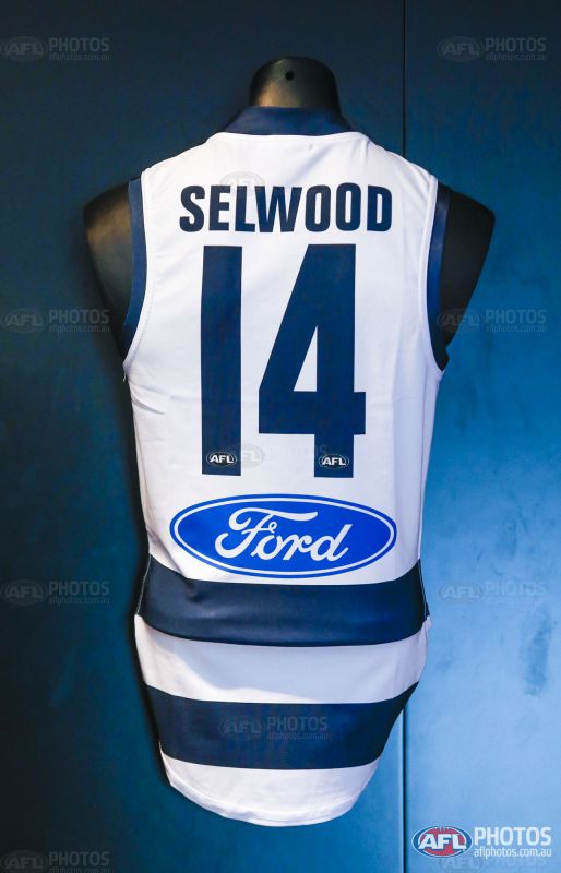
View attachment 46239

The front on the clash jumper is classic, and it is so close to being an all time classic design.
Why on earth have the twin hoops/stripes on the back, and of course the cat head graphic?
Just look at the side seam and how the front "hoop" meets the back. It's like (in fact it is) two completely different designs sandwiched together.
How, why would you do that?
Such a pity, but I'm still grateful for how good the front looks.

It makes me sad that someone was paid to do that design.
 
The front on the clash jumper is classic, and it is so close to being an all time classic design.
Why on earth have the twin hoops/stripes on the back, and of course the cat head graphic?
Just look at the side seam and how the front "hoop" meets the back. It's like (in fact it is) two completely different designs sandwiched together.
How, why would you do that?
Such a pity, but I'm still grateful for how good the front looks.

Good post , I know this is one of SJ's issues. Im not as fussed but its a great photo to demonstrate the point. Im sort of the thought that its a very big step in the right direction.(as far as a dark themed strip go's). Not perfect but if it takes another step to correct the back , so be it.

Just to add , why have the two different versions of cat on it , we can see the front has the 2D Cat as does the shorts
 

Log in to remove this ad.

Good post , I know this is one of SJ's issues. Im not as fussed but its a great photo to demonstrate the point. Im sort of the thought that its a very big step in the right direction.(as far as a dark themed strip go's). Not perfect but if it takes another step to correct the back , so be it.

Just to add , why have the two different versions of cat on it , we can see the front has the 2D Cat as does the shorts
It's just a pissy way to get a Cat face on 'to appeal to the kids'.

Let's face it, none of us grew up supporting a footy team because we saw an animal face on a jumper.

In fact I reckon kids prefer the simple designs that they can draw all over their school books.
 
It's just a pissy way to get a Cat face on 'to appeal to the kids'.

Let's face it, none of us grew up supporting a footy team because we saw an animal face on a jumper.

In fact I reckon kids prefer the simple designs that they can draw all over their school books.

Thats' pretty much the Rule 1 in footy design - if the kids can't draw it, don't use it. Heck, some of us even used to :oops:ahh, crochet :oops:, the Cats emblam in arts and craft class back in '81. Then again, that ghostly, feline design we had back then wasn't that easy.
 
It's just a pissy way to get a Cat face on 'to appeal to the kids'.

Let's face it, none of us grew up supporting a footy team because we saw an animal face on a jumper.

In fact I reckon kids prefer the simple designs that they can draw all over their school books.

Evidenced by Port Adelaide getting a 7-year-old girl to draw a design for a footy jumper. WHICH THE CLUB NOW WEARS.
 
It's just a pissy way to get a Cat face on 'to appeal to the kids'.

Let's face it, none of us grew up supporting a footy team because we saw an animal face on a jumper.

In fact I reckon kids prefer the simple designs that they can draw all over their school books.


Happily, the cat's face seems to bunch up and be obscured pretty well during a game, which makes it look better, but makes the original concept even more stupid.

I have to admit, I was a fan of the Bears and Eagles guernseys when I was a little tacker and they were the new teams. They looked a lot more interesting to me than the other teams. And I couldn't draw the Fitzroy or Carlton guernseys either in those days. I thought the monograms were just a bunch of abstract crap on the front for years until someone explained them to me.
 

(Log in to remove this ad.)

Yes, and i was chasing a #7 player issue to add to my #9 and #11 that i will be getting framed surrounded by the respective premiership card sets.

Glad it went to a good home. Will post tomorrow.
 
322154.jpg
 
Honestly, it's not as bad as I imagined. I think we are lucky because we just have two colours on it. Blue and white and the logo isn't too high. Other clubs have got 3/4/5 colours and all sorts of weirdly shaped logos.
 
Honestly, it's not as bad as I imagined. I think we are lucky because we just have two colours on it. Blue and white and the logo isn't too high. Other clubs have got 3/4/5 colours and all sorts of weirdly shaped logos.
I agree, it doesn't look so bad.
I just don't understand the need to continue changing things. Not only this example, but constant rule changes etc.
It's been good enough for 150+ years, so if it aint broke...
 
I agree, it doesn't look so bad.
I just don't understand the need to continue changing things. Not only this example, but constant rule changes etc.
It's been good enough for 150+ years, so if it aint broke...

Names should have been on jumpers years ago at the top level.
I've never understood it.
 
I think the names look great.

This really should have happened when the jumpers went from knitted to synthetic fabric.
 
Finally, a person standing within a few metres of a player (and who can read) will be able to know the player's name!

But it discriminates against Collingwood supporters.
 
At least Selwood's name spaces nicely along the back; it would be interesting to see how the following names fit though, Christensen, Sheringham, Horlin-Smith (over 2 lines?) & Kolodjashnij (would be interesting to see if people tried to refer to him by name or just #8), those are the longest names on our list
 
At least Selwood's name spaces nicely along the back; it would be interesting to see how the following names fit though, Christensen, Sheringham, Horlin-Smith (over 2 lines?) & Kolodjashnij (would be interesting to see if people tried to refer to him by name or just #8), those are the longest names on our list
upload_2014-4-14_19-51-31.png
 

Remove this Banner Ad

Back
Top