Navigation
Install the app
How to install the app on iOS
Follow along with the video below to see how to install our site as a web app on your home screen.
Note: This feature may not be available in some browsers.
More options


You are using an out of date browser. It may not display this or other websites correctly.
You should upgrade or use an alternative browser.
You should upgrade or use an alternative browser.
Competition CCRC | Season 2- Hub Thread
- Thread starter Spanna_
- Start date
- Tagged users None
- Aug 21, 2007
- 31,677
- 99,047
- AFL Club
- Port Adelaide
- Other Teams
- Aston Villa, San Antonio Spurs
And considering I've only received one entry I'll most likely be pushing the due date back.
2 weeks is a heap of time, just bump this thread a lot and if it gets into the last 4 or 5 days, start tagging people.
Freight Train
Once hit the sign at the Mercantile Mutual Cup
- Moderator
- #28
I stated in the op that I'm fine with you to use a white base behind the logo, that's all good.
I get that, but it's that the muted teal just lacks a real universal adaptation, especially on bright designs. Wouldn't even have been as bad if it was a more vibrant teal. Just something to look at it the future if we do go with league logos that you cannot recolour, is how it looks on all sorts of designs. That's where the NAFL and FIRA ones are good.
")
As for pushing back due date, don't worry cobbah. People typically send entries in with like less than a week to go.
- Aug 21, 2007
- 31,677
- 99,047
- AFL Club
- Port Adelaide
- Other Teams
- Aston Villa, San Antonio Spurs
I preferred the logo from last season just because it was a patch and sat well on any sleeve. I have some stripes on my sleeves and this logo even with a stroke doesn't handle them as well. As Fruittrain said, just something to consider for next season.
I get that, but it's that the muted teal just lacks a real universal adaptation, especially on bright designs. Wouldn't even have been as bad if it was a more vibrant teal. Just something to look at it the future if we do go with league logos that you cannot recolour, is how it looks on all sorts of designs. That's where the NAFL and FIRA ones are good.
NAFL logo is recolourable which makes it a completely different situation.
I do get the issue with the secondary colours (lime and a pale skyish blue), I just used what was selected for last season with the colours. If spanna had asked I would have gladly altered them and if the logo continues into the future (even with further design alterations on top of what has already happened) the colours can be discussed further.
Plus I would think having a logo design that is a bit harder to work with would be better as designers have to think of ways for it to be incorporated into designs thus adding another challenge to their entry. Just having a logo that can be recoloured makes it too easy and is almost a cheat when compared to the real world.
I preferred the logo from last season just because it was a patch and sat well on any sleeve. I have some stripes on my sleeves and this logo even with a stroke doesn't handle them as well. As Fruittrain said, just something to consider for next season.
What would the difference be between the current logo using a white background or being turned into a patch (which everyone is able to do if they wanted) and the old one? It would still exclude the stripes on the sleeves and if utilised properly the current one allows for more stripes to appear and for the one design I have with stripes on the sleeves I find it actually blends better than the old one, but each to their own I guess.
Also I know you like the old logo but it was not an original design. It was some elements I had added to another design. This years though seemingly less liked is 100% original. That is actually why it probably is a little less liked as it still needs some refinement as it isn't basically a recolour with some added elements.
Freight Train
Once hit the sign at the Mercantile Mutual Cup
- Moderator
- #31
NAFL logo is recolourable which makes it a completely different situation.
I do get the issue with the secondary colours (lime and a pale skyish blue), I just used what was selected for last season with the colours. If spanna had asked I would have gladly altered them and if the logo continues into the future (even with further design alterations on top of what has already happened) the colours can be discussed further.
Plus I would think having a logo design that is a bit harder to work with would be better as designers have to think of ways for it to be incorporated into designs thus adding another challenge to their entry. Just having a logo that can be recoloured makes it too easy and is almost a cheat when compared to the real world.
What would the difference be between the current logo using a white background or being turned into a patch (which everyone is able to do if they wanted) and the old one? It would still exclude the stripes on the sleeves and if utilised properly the current one allows for more stripes to appear and for the one design I have with stripes on the sleeves I find it actually blends better than the old one, but each to their own I guess.
Also I know you like the old logo but it was not an original design. It was some elements I had added to another design. This years though seemingly less liked is 100% original. That is actually why it probably is a little less liked as it still needs some refinement as it isn't basically a recolour with some added elements.
Regardless of if NAFL is recolourable, even if you don't recolour it, it looks good. Which goes with most league logos in the real world where they don't need to be recoloured because they use nice, vibrant colours. You've used murky ocean teal which as I said only fits with black, blue or white, or funnily enough with your own designs because you always (or at least a majority of the time) use muted colours. So the whole "added challenge" thing is a total cop out. I have no problems with not being able to recolour, I just wish you went with some vibrant colours rather than the maroon, muted teal - lime being an exception I suppose.
Regardless of if NAFL is recolourable, even if you don't recolour it, it looks good. Which goes with most league logos in the real world where they don't need to be recoloured because they use nice, vibrant colours. You've used murky ocean teal which as I said only fits with black, blue or white, or funnily enough with your own designs because you always (or at least a majority of the time) use muted colours. So the whole "added challenge" thing is a total cop out. I have no problems with not being able to recolour, I just wish you went with some vibrant colours rather than the maroon, muted teal - lime being an exception I suppose.
As I said, this seasons logo colours just transferred over from the old design, if people want them changed (should the logo continue to be used) then I am completely happy to change them.
As for the origin of the colours, from memory they were not my choice or were based on some other previous look as I am fairly certain I would not have chosen them to represent north and south unless something pushed me towards it.
I also really hope that you didn't just make an assumption that I made the designs to benefit myself, as I would never do that.
Are these better colours Freight Train?
*Replaced all the current colours, including a slightly lighter dark blue and more vibrant red, light blue and lime green. I also made a orange version of the Southern Conference logo as a possible variant (keeps all the colours in the logos within a more similar range - dark and light blue and red and orange). All colours are from pantone charts.
*Replaced all the current colours, including a slightly lighter dark blue and more vibrant red, light blue and lime green. I also made a orange version of the Southern Conference logo as a possible variant (keeps all the colours in the logos within a more similar range - dark and light blue and red and orange). All colours are from pantone charts.
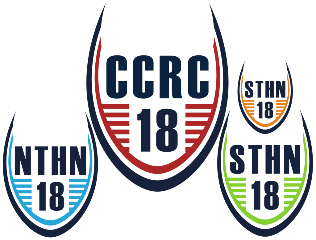
I reckon get rid of the light blue (it's too close to the colours seen in the Can-Am logos). Replace it with green (to "represent" the Aurora Borealis) and use the orange for Southern (represents the desert of the Great Southern LandAre these better colours Freight Train?
*Replaced all the current colours, including a slightly lighter dark blue and more vibrant red, light blue and lime green. I also made a orange version of the Southern Conference logo as a possible variant (keeps all the colours in the logos within a more similar range - dark and light blue and red and orange). All colours are from pantone charts.
)I reckon get rid of the light blue (it's too close to the colours seen in the Can-Am logos). Replace it with green (to "represent" the Aurora Borealis) and use the orange for Southern (represents the desert of the Great Southern Land
That could work, I went for blue to represent northern winters/snow, but the link to the northern lights could also work with the green.
The orange was also selected for the link to the deserts/savannas of the southern hemisphere.
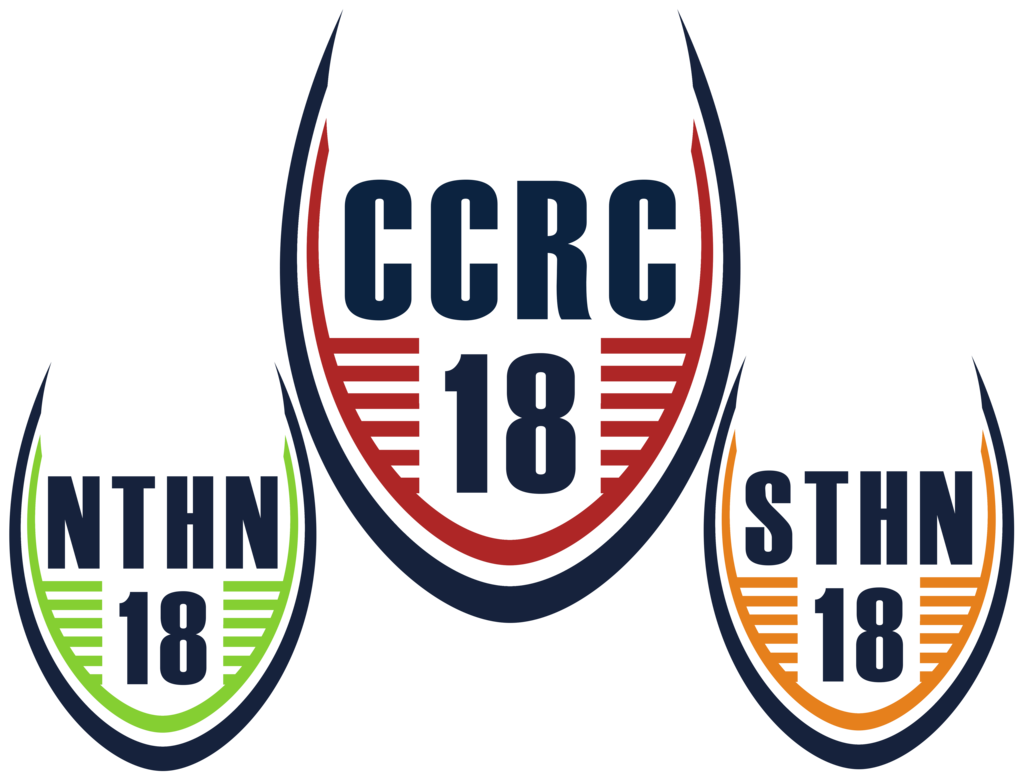
edit: here is the set using Bryce's suggestion;
Last edited:
- Aug 21, 2007
- 31,677
- 99,047
- AFL Club
- Port Adelaide
- Other Teams
- Aston Villa, San Antonio Spurs
How would you sit it on a patch? Just an oval?
Sent from my SM-G935F using Tapatalk
Sent from my SM-G935F using Tapatalk
How would you sit it on a patch? Just an oval?
Sent from my SM-G935F using Tapatalk
If you wanted, it could also be a rounded shield shape, really anything that the designer chose to use that complemented the uniform and allowed the logo to be used effectively on the kit.
Be creative, be unique. The logo allows for some out of the box thinking.
Freight Train
Once hit the sign at the Mercantile Mutual Cup
- Moderator
- #38
Be creative, be unique. The logo allows for some out of the box thinking.
why are you like this.
why are you like this.
Like what?
- Aug 21, 2007
- 31,677
- 99,047
- AFL Club
- Port Adelaide
- Other Teams
- Aston Villa, San Antonio Spurs
Sounds like the ad for a renevator's dream real estate listingIf you wanted, it could also be a rounded shield shape, really anything that the designer chose to use that complemented the uniform and allowed the logo to be used effectively on the kit.
Be creative, be unique. The logo allows for some out of the box thinking.
- Jun 18, 2016
- 51,731
- 99,099
- AFL Club
- West Coast
- Other Teams
- Perth Scorchers
"There's plenty of room if you use it right."Sounds like the ad for a renevator's dream real estate listing
"It's 3m x 2m."
"Just think of the possibilities."

Freight Train
Once hit the sign at the Mercantile Mutual Cup
- Moderator
- #45
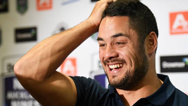
LOS ANGELES SUNS SIGN JARRYD HAYNE
A press conference was called today to announce that the LA Suns, who will be competing in the CCRC for the first time, have signed rugby league, NFL, rugby sevens, AFL, cricket, horse racing, bocce and competitive tag-team ghosting champion Jarryd Hayne on a one year deal.
"It's been a dream of mine to play in the CCRC for the Los Angeles Suns since I heard about the team a week and a half ago from my agent who said they will be paying me about 5% more than what I was earning at the Gold Coast Titans. So, dream come true!"
lmach
Naitanui2Yeo
I'm not even in this comp but I reckon the logo needs a complete revamp.
Fizzler
BBTB
- Dec 26, 2013
- 12,781
- 16,367
- AFL Club
- Port Adelaide
- Other Teams
- OKC, Coburg, Werribee, Storm, QPR
Has anyone got a good template for Paint? I've done an Andonis1997 and had to return my laptop to school meaning no photoshop.
Didnt realise this was due so early sorry mate I won't be able to submit
Similar threads
- Replies
- 19
- Views
- 1K
- Replies
- 27
- Views
- 1K
- Replies
- 37
- Views
- 2K
