- Joined
- Oct 23, 2018
- Posts
- 7,431
- Reaction score
- 6,901
- Location
- Victoria
- AFL Club
- Gold Coast
- Other Teams
- Storm, Western Utd
The NRL Nines are returning in 2020 to be played in Perth. Here is the new logo for the tournament.

Follow along with the video below to see how to install our site as a web app on your home screen.
Note: This feature may not be available in some browsers.

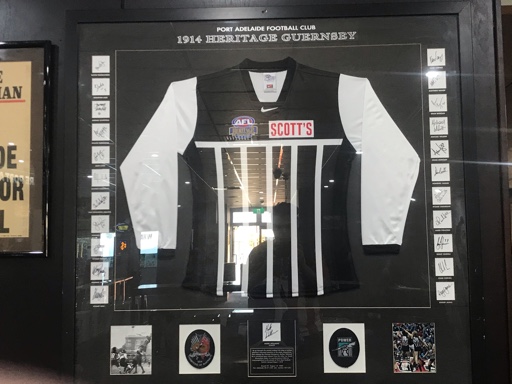
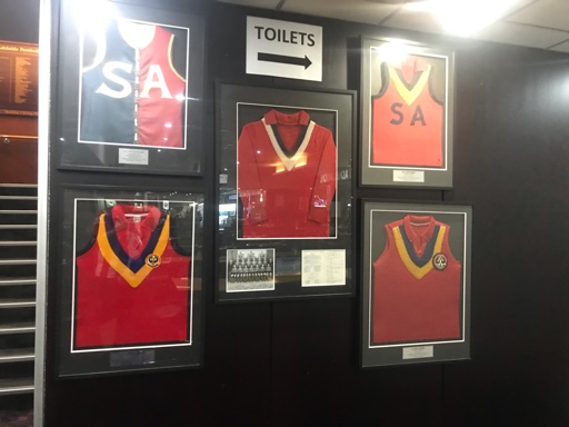
What did you think of the heritage/history on display? I love losing track of time in that space!Made the trip to Adelaide for the FFA Cup final and to kill time while my room gets ready, thought I’d give that logo a sus. Doesn’t look like it’s going anywhere because it’s everywhere. Keychains, shirts, signs, coasters etc
Also saw a Guernsey Pr0n addition
What did you think of the heritage/history on display? I love losing track of time in that space!
Log in to remove this Banner Ad

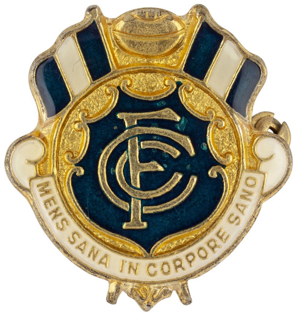
Terrible choice by the club. The retro monogram works on a jumper because of its ruggedness and affinity with a time when jumpers could only be crudely (by today's standards) made (see the old Saints crest as another example of this). It does not work at all when reproduced on media or documents, where applications can and should be more refined.It looks as if Carlton has ditched the logo with the wreath in favour of just the CFC
View attachment 772908
Once it's on the AFL website it's official!


to be on the ‘verge of greatness’, we actually gotta win games.

It's a no-show on the team website and none of the just released Puma gear features the laurel and monogram logo. I am dumfounded that a club like Carlton fail to understand basic design principles and the importance of history. It's akin to Coca Cola ditching their script logo.Hope we keep the old logo, and the AFL site update is just a secondary logo make the site cleaner.
See I don't think so. Most people recognise the CFC and the laurel etc is just extra stuff they probably don't even see. Whereas the script IS the logo. Historically yeah I get it but I don't think most people will notice because it's just the stuff "around the logo" to them.It's a no-show on the team website and none of the just released Puma gear features the laurel and monogram logo. I am dumfounded that a club like Carlton fail to understand basic design principles and the importance of history. It's akin to Coca Cola ditching their script logo.
The wreath logo has been around in some form since at least 1905. I doubt people simply 'don't even see it'.See I don't think so. Most people recognise the CFC and the laurel etc is just extra stuff they probably don't even see. Whereas the script IS the logo. Historically yeah I get it but I don't think most people will notice because it's just the stuff "around the logo" to them.


Plus what do AFLW use?It's probably going to be like North's logo situation.
one for wider promotional purposes:
View attachment 773033
and the original logo for use on official club documents, and things related to the club history:
View attachment 773032
Plus what do AFLW use?

The issue with that is it makes the CFC look lopsided. The stem of the 'F' isn't perfectly centred, whereas the monograms from 1998-2014 is more central and aesthetically pleasing.Carlton just needed to put the monogram thats on the guernsey into the wreath


rip ochre


