Came here to post this, thank god they didn’t end up using that!Although, I just noticed this on the scoreboard for the nz station’s coverage. Quite weird lookingView attachment 1916627
Last edited:
Follow along with the video below to see how to install our site as a web app on your home screen.
Note: This feature may not be available in some browsers.
Came here to post this, thank god they didn’t end up using that!Although, I just noticed this on the scoreboard for the nz station’s coverage. Quite weird lookingView attachment 1916627
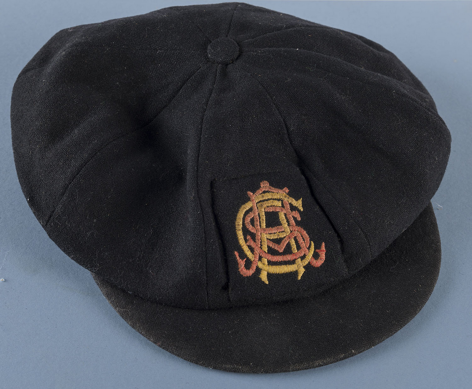
Stumbled across this

View attachment 1942337
SACA In. Redbacks Out. Getting back to their traditional roots. Can’t wait to see next seasons kits and caps.
Such a lovely font choice too. Reminds of those old school tourism posters from the 30s or so.View attachment 1942337
SACA In. Redbacks Out. Getting back to their traditional roots. Can’t wait to see next seasons kits and caps.
It just goes to show things most would consider 'old' or 'out of style' like monograms cant still work in this day and age and if anything can work better with the design capabilities we have now. It's just a magnificent piece of work from the CargoLocomotiveElite monogram work, just gorgeous. Getting 4 overlaid letters so readable and balanced, while capturing the essence of the historical logo so well. Masterpiece.


This is awesome! Comparing yours to the 150 year logo, you did an especially great job at not making it look cluttered while also not making the thickness of each letter different across the board. I’m very curious, how long is the process behind something like this? I imagine there’d be a few spots where it has to get ticked off by different parties, and having to make revisions would take time too, but was this something you were able to perfect relatively quickly or did you have to spend a lot of time tinkering with it?View attachment 1943172
So anyway, pretty crazy how real this is now, feel like it’s been a big secret for a long while now so glad it’s out in the world.
I think the reception has been fairly positive overall, a lot of work went into this, like it’s not just a logo, it’s an entire overhaul of a brand and everything that goes into that, and just really excited for more and more to come out over the coming months as we head towards the new season.
Monogram is a modernisation of what has been used by SACA in the past, and was brought back to celebrate the 150th anniversary a few years back, and of course now redesigned for this.
View attachment 1943185
Also Fizzler, I can’t wait for everyone to see the new kits as well, really proud of the design and can’t wait to see it worn by the teams come next summer.
This is awesome! Comparing yours to the 150 year logo, you did an especially great job at not making it look cluttered while also not making the thickness of each letter different across the board. I’m very curious, how long is the process behind something like this? I imagine there’d be a few spots where it has to get ticked off by different parties, and having to make revisions would take time too, but was this something you were able to perfect relatively quickly or did you have to spend a lot of time tinkering with it?