Jen2310
Premium Platinum
bit of a collab with local streetwear alfred's apartment. a lot of the boys rep alfreds, wouldnt be surprised if there was an actual merch drop at some point
Interesting logo. Just having "suns"
Wonder if it means anything?
Follow along with the video below to see how to install our site as a web app on your home screen.
Note: This feature may not be available in some browsers.

bit of a collab with local streetwear alfred's apartment. a lot of the boys rep alfreds, wouldnt be surprised if there was an actual merch drop at some point
Best one I've seen. Love thisThoughts? View attachment 2021340
I like it but might need to change the team song if we go with this one......Thoughts? View attachment 2021340
Log in to remove this Banner Ad
I like it but might need to change the team song if we go with this one......
We are the SUNS of the Gold Coast sky
We are one in the red, gold and blue
I will say that I've always sung "We are the one in the red-gold hue" because I like the sound of it better.I like it but might need to change the team song if we go with this one......
We are the SUNS of the Gold Coast sky
We are one in the red, gold and blue
I respect your opinion but I don't agree with it...I will say that I've always sung "We are the one in the red-gold hue" because I like the sound of it better.
The blue has always been one of the weaker elements of the Gold Coast branding, it never made a tonne of sense as more than a clash guernsey colour, and it's too similar to the SA state colours. I really don't like the blue stripe on the guernsey's side panels this year, it takes away from the striking red-gold contrast.
That's a little bit better, but I think it should be more like Carlton's, Melbourne or Fitzroy's traditional monogram designs. They should just keep it with a red base like it is now, no gold side bars, and a traditional gold monogram, it would look elite.Interesting logo. Just having "suns"
Wonder if it means anything?
That would be top tier just with a red base, no gold collars and no horizontal stripes. Maybe make the monogram a tad bit smaller like Carlton's.Not my design. Have had this saved for a while off internet, but to me its a beautiful design for a jumpe.
The two tone red and heritage font. Just gorgeous and so Simple.
Would 100% vote for this if GC had the option.
View attachment 1983488
bit of a collab with local streetwear alfred's apartment. a lot of the boys rep alfreds, wouldnt be surprised if there was an actual merch drop at some point
This merch will be available in store on Saturday and online next week
Sent from my iPhone using BigFooty.com
I agree with you on the monogram but I like the gold side panels too much. Think I might be the only one based on this thread.That's a little bit better, but I think it should be more like Carlton's, Melbourne or Fitzroy's traditional monogram designs. They should just keep it with a red base like it is now, no gold side bars, and a traditional gold monogram, it would look elite.

I see Lachie Weller is going through his Jared Leto phaseThe collab pics have dropped

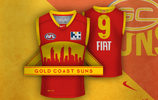
I'm still of the opinion that the mock up that involved the Gold Coast skyline as a silhouette is the best mock guernsey i've seen anyone make for us.Call me crazy, but I want more yellow, somehow. We are the “gold” coast after all.
As others have mentioned, the problem is that our colours are a bit too similar to Crows.

Really?!The logo is goooone. 8 rounds left.
Sent from my iPhone using BigFooty.com
Really?!
