- Joined
- Apr 25, 2025
- Posts
- 829
- Reaction score
- 1,682
- AFL Club
- Collingwood
- Other Teams
- FC Bayern
I hate that collarView attachment 2482352
We might be going a 66’ style black cuffs white collar as the 26’ home jumper?
Follow along with the video below to see how to install our site as a web app on your home screen.
Note: This feature may not be available in some browsers.

PLUS Your club board comp is now up!
 BigFooty Tipping Notice Img
Weekly Prize - Join Any Time - Tip Opening Round
The Golden Ticket - Official AFL on-seller of MCG and Marvel Medallion Club tickets and Corporate Box tickets at the Gabba, MCG and Marvel.
I hate that collarView attachment 2482352
We might be going a 66’ style black cuffs white collar as the 26’ home jumper?
We have arguably the best sponsors in the league barring maybe Collingwood, although red doesn't look too good on their kit. The only noticeable difference is Caltex replacing Swiftx and Mcdonald's upgrading their sponsorship to membership partner as well as staying on the collar. However, our main sponsors of XXXX/Hyundai/Youi/Mcdonald's should stay the same for at least the next 3/4 seasonsi noticed on the polo we now have a caltex sponsor on the sleeves again. but yes couldn’t see anything different on the home jersey other than the updated afl logo. i’m glad no sponsor change as i don’t mind the youi on the front and back, much better than past sponsors such as national storage and camperdown
Geelong had the best and now they've sold out! lolWe have arguably the best sponsors in the league barring maybe Collingwood, although red doesn't look too good on their kit. The only noticeable difference is Caltex replacing Swiftx and Mcdonald's upgrading their sponsorship to membership partner as well as staying on the collar. However, our main sponsors of XXXX/Hyundai/Youi/Mcdonald's should stay the same for at least the next 3/4 seasons
Log in to remove this Banner Ad
Mero might be able to help?Bit off topic but is there a resource or website with all current AFL primary and secondary logos available to download?
What format?Mero might be able to help?
Could well be. I like it for the nostalgia, my favourite players of all time wore it - but in general think we are in need of a new logo. Moving to the new training facility would have been the perfect time to do so.

View attachment 2482801
This for mine is timeless. A refresh in 2007 was needed, but not a complete departure from it.


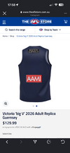
Besides the fact it’s stupid, the logo also looks awful. I know the game is in WA, but why isn’t the Victorian team sponsored by the Victorian government? The Victorian cricket team is sponsored by the machete bins, they’ve got all sorts of stuff going on here to advertise. Put the suburban rail loop on there or something.If you needed any more confirmation that the revived State of Origin is nothing but a money-spinner for whichever state government wants to host it, Victoria will be running out with a great big “Western Australia” logo above their numbers. It would be amusing if it wasn’t so embarrassing.
Can you imagine anyone that previously pulled on the Big V in the good old days being okay with this? Hasn’t hit the media yet but I wouldn’t be surprised if it gets covered by another sponsor before game day. Remember NSW state of origin rugby league team changing their Victoria Bitter sponsor to Vic Bitter so that it didn’t have the “Victoria” name on it?
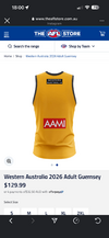
It’s on the WA jumper too, for what it’s worth, but it’s ridiculous.
View attachment 2483097
View attachment 2483098
I don’t know whether many would agree but I’m sure some would, but I reckon the 1960’s (before my time so no nostalgia) was peak Australian rules guernsey’s. Button up looks better as a collar than the V, wool looks infinitely better than synthetic. Nearly every team had a better. Good on the Saints here.View attachment 2482352
We might be going a 66’ style black cuffs white collar as the 26’ home jumper?
yeah noI don’t know whether many would agree but I’m sure some would, but I reckon the 1960’s (before my time so no nostalgia) was peak Australian rules guernsey’s. Button up looks better as a collar than the V, wool looks infinitely better than synthetic. Nearly every team had a better. Good on the Saints here.
The Big V on the front is worse. It's so smallIf you needed any more confirmation that the revived State of Origin is nothing but a money-spinner for whichever state government wants to host it, Victoria will be running out with a great big “Western Australia” logo above their numbers. It would be amusing if it wasn’t so embarrassing.
Can you imagine anyone that previously pulled on the Big V in the good old days being okay with this? Hasn’t hit the media yet but I wouldn’t be surprised if it gets covered by another sponsor before game day. Remember NSW state of origin rugby league team changing their Victoria Bitter sponsor to Vic Bitter so that it didn’t have the “Victoria” name on it?
It’s on the WA jumper too, for what it’s worth, but it’s ridiculous.
View attachment 2483097
View attachment 2483098
If you needed any more confirmation that the revived State of Origin is nothing but a money-spinner for whichever state government wants to host it, Victoria will be running out with a great big “Western Australia” logo above their numbers. It would be amusing if it wasn’t so embarrassing.
Can you imagine anyone that previously pulled on the Big V in the good old days being okay with this? Hasn’t hit the media yet but I wouldn’t be surprised if it gets covered by another sponsor before game day. Remember NSW state of origin rugby league team changing their Victoria Bitter sponsor to Vic Bitter so that it didn’t have the “Victoria” name on it?
It’s on the WA jumper too, for what it’s worth, but it’s ridiculous.
View attachment 2483097
View attachment 2483098

Big dog, I hate to break it to you, but it’s the same Bali jumper template Freo are rocking.Can’t get over how ****in shit the Kookaburra template is, it’s like a Bali jumper.
That would be a massive improvement on their current Hawk.
Us, Hawthorn, Geelong and Fremantle (along with Essendon which is admittedly from the 90's) badly need a new logo.Yup, those 2010 core logos have aged terribly
I like the fact that we have the same front and back of jumper sponsor now meaning we could wear our home jumper in the prelim, but it does annoy me having a black and white logo on our jumper.i noticed on the polo we now have a caltex sponsor on the sleeves again. but yes couldn’t see anything different on the home jersey other than the updated afl logo. i’m glad no sponsor change as i don’t mind the youi on the front and back, much better than past sponsors such as national storage and camperdown
I still don't think the maroon/navy clash is that bad... Just because they're dark colours, doesn't mean we can't tell who's who.How good was last night seeing Carlton finally wear the correct jumper in an away game against us.
I've always thought brisbane should do what carlton did and make the fitzroy lion itself the logoUs, Hawthorn, Geelong and Fremantle (along with Essendon which is admittedly from the 90's) badly need a new logo.
I think most Lions fans feel this way. I'm ok with us having the existing Lionhead as a corporate logo, but the passant Lion is pretty iconic and would be a great logo (even with a maroon stroke on a light background).I've always thought brisbane should do what carlton did and make the fitzroy lion itself the logo

I think this is the only way it can get turned into a standalone logo. It needs to be cleaned up and modernised (despite any protests/agreements).I get why they haven’t/wouldn’t but I’d love to see the passant lion cleaned up around the edges.
Absolutely not. Just have the edges of the passant/fitzroy lion redone and the logo digitised properly. Don’t need to make any other changes.Que the entry of the costa sports lion