Remove this Banner Ad

2010 new away guernsey

  • Thread starter Thread starter Mr Crow!
  • Start date Start date
  • Tagged users Tagged users None

🥰 Love BigFooty? Join now for free.

This was a design that I came up with a couple of years ago when we were all trying to get the new red clash guernsey changed. This one was designed as a clash strip only.

Crows_Clash-strip-designs.png
 
In an old thread about what would happened if ......

My 1984 AFC jumper looked like this, a bastardisation of the old SOO jumper.

2lx8cbn.jpg

I like the way this one is heading. Different, no logo, only problem is we're a "hoops" team and its a "stripes" jumper, if that makes any difference nowadays.
 

Log in to remove this Banner Ad

it's not. the basis of practicality is the predominant white guernsey and shorts. it just doesnt look as embarrassing as the "crow". someone else also referred to the lack of symmetry. may sound petty, but (s)he? had a point. it also ties in well with the tradition of the hoops and our home strip.

Well, without trying to get into an argument here because like I said, I respect your desires to maintain some tradition in AFL, I have to disagree. The originally proposed jersey, while not perfect (symmetry may be an issue for example), is a move in the right direction.


indeed. striaght lines, sashes, Vs, hoops.. almost any symmetrical coloured pattern is timeless (and professional). cartoon character emblems have (short) used by dates (i.e flashes in the pan).

Straight lines... classic, yes... BUT, it depends on how they're done. Straight lines on piping, necklines, sleeves, shoulders can be timeless. Opposing colors down the sides work too. Horizontal hoops are not. Sashes, definitely look dated. Essendon's jumper... pathetic. Richmond's jumper... also pathetic. In fact, I think that the best uniforms are predominently solid color with small touches of alternate colors on the piping, etc. But that's just my own preference.

our home guernsey is embarrassing? oh dear. it's a classic design and i think you're on your own there. i dont care who designs it. maybe moms (and 9yos) make the best guernseys, and not 35yo computer geeks employed by clubs to sit in front of fancy computer software whilst trying to show off their photoshop skills.

My point (or rather my opinion) here is that our uniform should make us look intimidating and cutting edge, not like a bunch of country yokels. Anyway, hope I haven't offended you lincsPJ.
 
One thing that Trigg said but seems to be missed here is that we will only have 2 jumpers next year. Our home jumper which will stay the same (so it should) and the new away jumper that will be replacing our away and clash jumper. So chances are it will look like something that doesn't clash with any other jumper in the league.
 
My point (or rather my opinion) here is that our uniform should make us look intimidating and cutting edge, not like a bunch of country yokels. Anyway, hope I haven't offended you lincsPJ.

ha you're alright. my opinions on a footy guernsey arent something that id get too offended by! i think there's a fine line between intimidating and lame though - i reckon its that terrible looking blue crow which is doing my head in.

we might just have to agree to disagree on this one. but thats what BF is for, everyone has different ideas.
 
I like the way this one is heading. Different, no logo, only problem is we're a "hoops" team and its a "stripes" jumper, if that makes any difference nowadays.

I designed that jumper in a thread on the MB about what would it look like if the Crows started when the VFL wanted us in (a SANFL side) rather than when they got around to it. Kernahan, Motley, Bradley, Platten all 300 gamers etc, John Cahill coaching us to a flag in 1990, inaugural squad member Malcolm Blight taking over, you get the drift.

went through who would could have picked, who we could have got if we got the same entry conditions that the Eagles got in 87 and how a Crows VFL jumper could have looked, a change to hoops and then a 25th Anniversary 'heritage' jumper worn at home games in 2008.

i1en8k.jpg


I posted it in reference to Port borrowing the idea of an old State jumper for their back in black jumper.
 
Hey, just wondering. With the new away top coming in next year, will the 09 one get cleared at a cheaper price in stores.

I wouldn't expect it to but I'm hopeful of picking one up if they did.
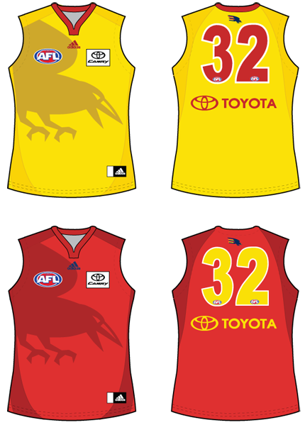
 

Remove this Banner Ad

Slightly off topic but I couldn't find any tops at Crowmania for 60 bucks. They were still flogging off the white and bright orange tops training tops for 120... :(
 
$120 for those training tops is an absolute disgrace.

I bought a yellow training top last year for $40!!

Why are they $80 more this time around? It is ridiculous. I would like one for cricket training/running etc but not at $120!!!
 
$120 for those training tops is an absolute disgrace.

I bought a yellow training top last year for $40!!

Why are they $80 more this time around? It is ridiculous. I would like one for cricket training/running etc but not at $120!!!

Yep it's stupid. I havent been there since I got my match worn guernseys, but I imagine they are all gone by now and only the training ones remain, and aren't really selling. I don't even get how they thought that it would be fair for them to be sold at the same price as the match worn guernseys!
 
i like the idea of a predominantly white away guernsey... i have a theory about wearing white... the teams that do seem to have infringements against them noticed more by the umps... maybe its the subconcious psyche, white = the good guys, so pay 'em more frees
 
I hate the idea of us having white on the jumper at all, let alone as a base for the guernsey. It's simply not a club colour.

Adding a 4th colour - and a colour that is part of about half the guernsey's around the league - only increases clash potential.
 

🥰 Love BigFooty? Join now for free.

I hate the idea of us having white on the jumper at all, let alone as a base for the guernsey. It's simply not a club colour.

Adding a 4th colour - and a colour that is part of about half the guernsey's around the league - only increases clash potential.

Our current logo sits on a white background! :D
 
Something I have noted just reading all this, is we have some people here who are seriously talented in designing a playing top. What would other people's thoughts be about the club putting it to a vote for our away strip? Could think nothing better would fit in with the 19th man concept than for a fan to design the top we wear.
 
I love that idea. I'd get involved in this if the opportunity came up. Although there is no way any of my designs will be using that horrid new club logo!!!
 

Remove this Banner Ad

Remove this Banner Ad

🥰 Love BigFooty? Join now for free.

Back
Top Bottom