Discussion 2011 Jumper Suggestion

Remove this Banner Ad

23Legend

All Australian
Jul 19, 2010
812
2
Adelaide
AFL Club
Adelaide
Other Teams
Wonders, Lakers, Double Blues, SA
I know GANTY already did this but I wanted to do one.
First of all, I'd like to explain the rules I want to see in the AFL.

  • Each team must have a light and a dark jumper with shorts matching each colour
  • White shorts must be worn at ALL away games, including Sydney and Gold Coast
  • Inverted guernseys where teams wear stripes do NOT count as clash jumpers, Collingwood, get a real clash
  • Guernseys may only include the teams colours, excluding situations like when a team has a sash across the back, white numbers can be included then
  • Each team must have a retro guernsey from 70s 80s or 90s where colours and designs from those years guernseys must be included on the current template, with no sidebars etc.
    Each team must wear the same style socks on their home and away jumper, although different ones are allowed for the retro.
  • If these rules are not followed there will be a 2 premiership points taken off and 10% off the percentage
 
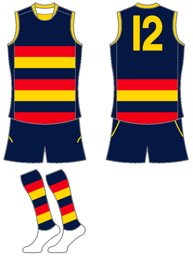
Adelaide Crows

Home
Same as 2010 although the collar is completely yellow
AdelaideCrows2011Home.png


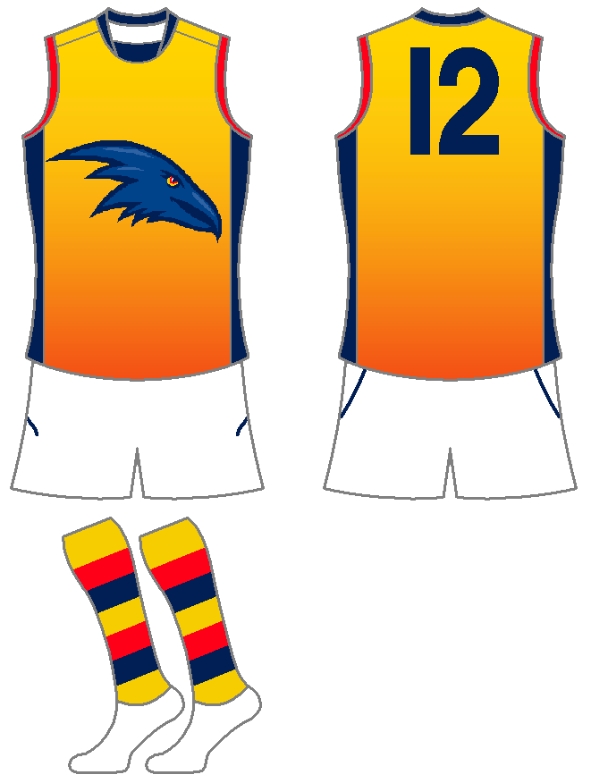
Away
An idea I've had floating around in my head for a while although it originally included our old logo and the gradient was red to yellow
AdelaideCrows2011Away.png


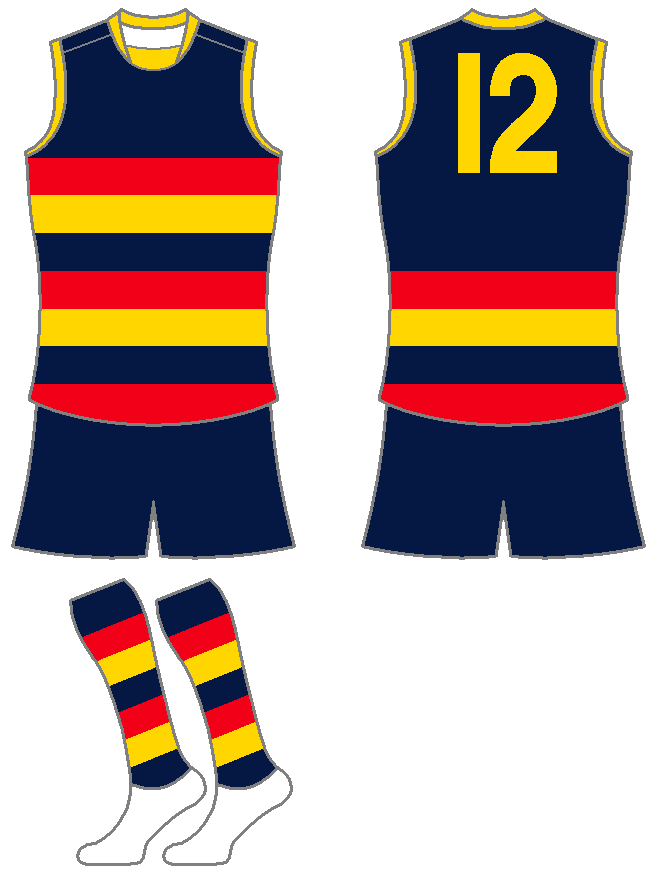
Retro
Based on the 1991-95 jumper
AdelaideCrows2011Retro.png
 
Nice start I guess. Not really a fan of the away though. How do you have so much time on your hands???

Will be watching this thread closely.
 

Log in to remove this ad.

I wish people would stop buying into the idea that Collingwoods clash isn't good. They have an all black and an all white kit for christ sake. The problem comes because of the AFL rule of wearing white shorts away, if they could wear all black verse light home guernseys (North and Geelong) there would not be a problem. The rules are the issue - not Collingwood.

I like the idea of the retro jumper - teams should wear them at random times of the year rather then the heritage round idea. The away guernsey is a decent start, but needs a lot of work - the gradient needs to be more subtle as well as the crows head, needs to blend into the/a design more.
 
I wish people would stop buying into the idea that Collingwoods clash isn't good. They have an all black and an all white kit for christ sake. The problem comes because of the AFL rule of wearing white shorts away, if they could wear all black verse light home guernseys (North and Geelong) there would not be a problem. The rules are the issue - not Collingwood.

this

if it wasnt collingwood, and was north just reversing colours, no one would have a problem
 
FFS what is with every bastard doing an essendon clash jersey with white in it? make it silver or grey or any other shade that is remotely similar to that. There is silver in their goddamn logo. it wouldn't be that hard to make a jumper with a red sash, black outline and a silver background. simple, and as close as traditional as essendon are going to get.
 
FFS what is with every bastard doing an essendon clash jersey with white in it? make it silver or grey or any other shade that is remotely similar to that. There is silver in their goddamn logo. it wouldn't be that hard to make a jumper with a red sash, black outline and a silver background. simple, and as close as traditional as essendon are going to get.

Well why don't you make one and stop complaining
 

(Log in to remove this ad.)

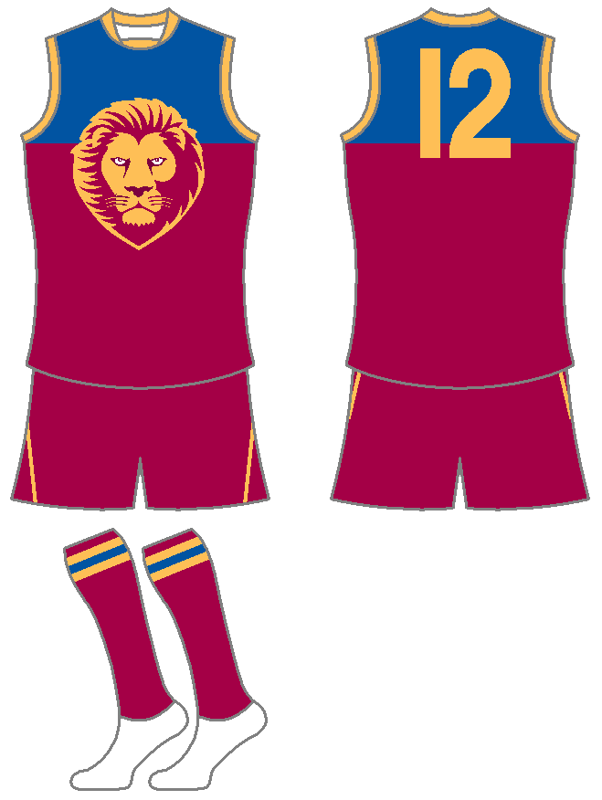
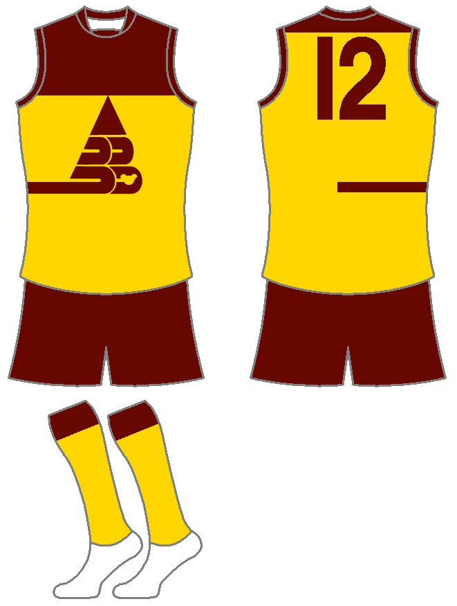
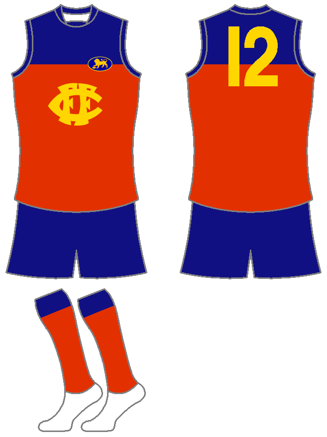
Brisbane Lions

Home
The lion body is gone, not only did the Lions throw away the Roy history when they got rid of their lion they then decided to dance on their grave by tacking it on to what they called the Fitzroy Lion. Also, the lion does have some slight differences to the current logo.
Brisbane2011LionsHome.png


Away
Inverted version of home but with a larger yoke.
Brisbane2011LionsAway.png


Retro 1
Based on the Bears 1987-88 home.
BrisbaneLions2011Retro1.png


Retro 2
Based on the Fitzroy 1975-78 jumper.
BrisbaneLions2011Retro2.png
Looks fine, except not so sure about the inverted lion on the away jumper.
 
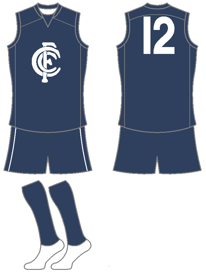
Carlton Blues

Home
Same as 2010
CarltonBlues2011Home.png


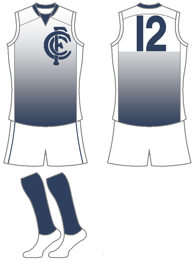
Away
Similair to 2011 but with a gradient design
CarltonBlues2011Away.png


Retro
Based on the 1927-97 jumper
CarltonBlues2011Retro.png
 
Think you might like the pies away
getting started on it soon.
 
I like the concept 23Legend. Especially the 'Retro' style guernsey, reminds me of the NBA throwback guernseys (which are actually being worn now)

I agree with Gibbsy that the home and retro look nice but IMHO the clash jumpers looked rushed and uninspired.

Anyway

My go at Collingwood Clash:

CollingwoodClashConcept.jpg


and Essendon Clash
EssendonClashConcept-1.jpg
just for you brockparty ;)
 
To be honest I'm not a big fan of that Hawk's clash, just doesn't work for me. Wouldn't mind seeing it without the Hawks head though..
 
Away
Inverted version of home but with a larger yoke.
Brisbane2011LionsAway.png

Don't take this the wrong way, but dear god no! The head looks horrible. Try keeping its colours and make an outline around the outside of it to differentiate it from the yoke. Also, it needs to be more yellow/gold.

This is my spin off of a Collingwood Clash and a Hawthorn Clash.
Please be as harsh as you like with your criticism thanks :thumbsu:

Collingwood:

CollingwoodClash.jpg


Hawthorn:

HawthornClash.jpg

Not a fan of the Collingwood one at all, I can see what you're trying to do but it just doesn't work.

I like the pinstripes on the Hawks one, but as Willo said, without the Hawks head.
 

Remove this Banner Ad

Back
Top