Portfolio AFAA: Australian Football Association of America

Remove this Banner Ad

Not an entirely fresh premise in these parts, but I’d like to think I’ve added some distinctive specifications so as to not completely tread over old ground.

The general idea of this is to design a home (dark/coloured) and away (light/predominantly white) guernsey for 18 football teams based in the United States, with the following guidelines I’ve set for myself:
-No sponsor logos, except for clothing manufacturers.
-Consistent number and player name fonts on back of jumpers.
-Each team will have an affiliation with an AFL club. These alignments should be reflected in the concepts in at least one apparent way or another.
-Away jumpers must be more than a simple re-coloured version of the home.

Other things I’m focussing on:
-Controlled experimentation, or in other words, try and make these uniforms as whacked-out as possible (and more so as the portfolio progresses) while still trying to deliver something that looks decent.
-Having a second crack at some of my old designs that I think need it. It’s kind of a two-disc best-of compilation album in that sense—some remastered stuff, some new crap.
-Juxtaposing traditional Australian football jumpers with iconic American pro sport design elements, and maybe the occasional “modern graphic”.

Any feedback is welcome, but just know that I have killed before.

The first image I ought to plonk here is the league logo, which will launch our game afar.

It’s also a good example of what I alluded to earlier. This is similar to a logo I came up for the NAFL competition on here, only this one is better.

AFAALogo_zpsqowjqsn7.png


The first team I will present is the New York Knights. There was a competition on this board a few years ago called USFL, and I had an idea for a NY team but never fully fleshed it out. Introducing the Collingwood connection gave me the inspiration to finish it.

AFAANewYorkKnights_zpsbbtvcx14.png
 
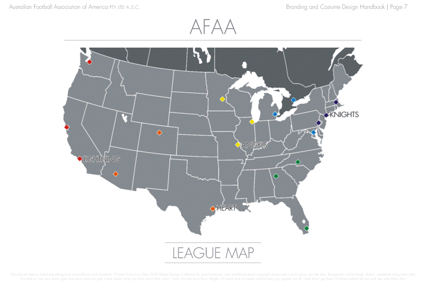
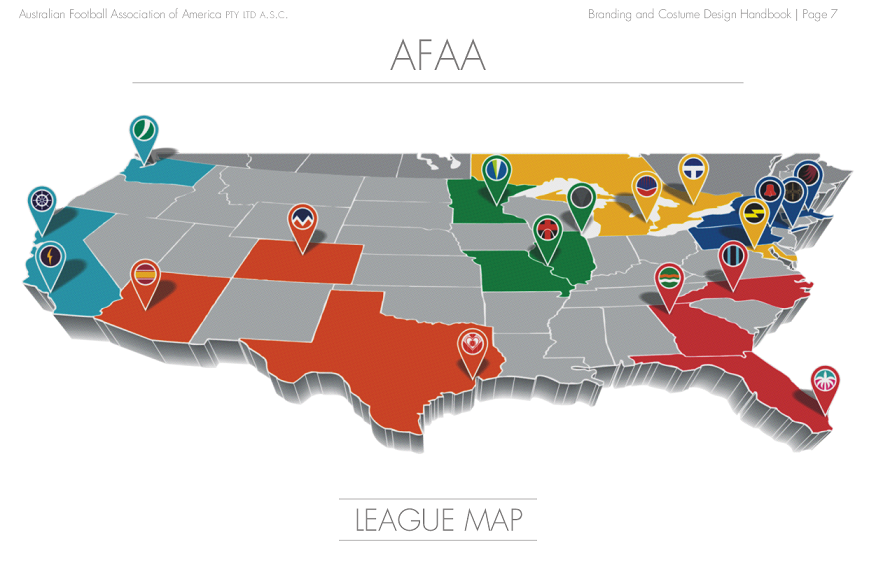
Before I jump into the next uniform, a bit of sizzle first. Here's a map of where the 18 teams will be located (note in the OP I said they're all based in the United States, but one is actually in Canada) as well as the names of teams that have been, or are soon to be, fully revealed.

AFAALeagueMap_zpssvq56z4s.png


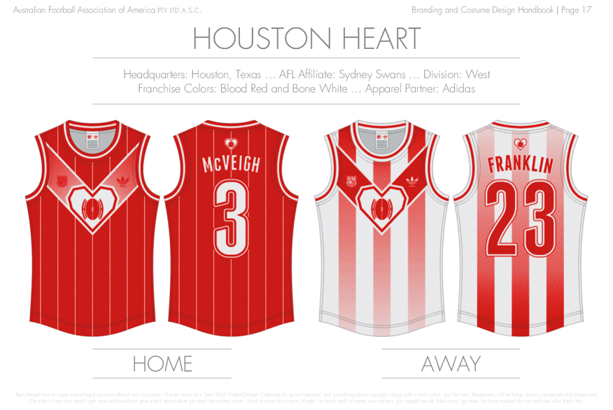
Now, hopefully we have no problems with the next team: Houston! I don't expect I'll use gradients a whole lot throughout this project, but in this case it just tickled my fancy for some reason. And for that matter, vertical stripes won't be a feature of every jumper either.

AFAAHoustonHeart_zpswmgpent9.png
 

Log in to remove this ad.

Not an entirely fresh premise in these parts, but I’d like to think I’ve added some distinctive specifications so as to not completely tread over old ground.

The general idea of this is to design a home (dark/coloured) and away (light/predominantly white) guernsey for 18 football teams based in the United States, with the following guidelines I’ve set for myself:
-No sponsor logos, except for clothing manufacturers.
-Consistent number and player name fonts on back of jumpers.
-Each team will have an affiliation with an AFL club. These alignments should be reflected in the concepts in at least one apparent way or another.
-Away jumpers must be more than a simple re-coloured version of the home.

Other things I’m focussing on:
-Controlled experimentation, or in other words, try and make these uniforms as whacked-out as possible (and more so as the portfolio progresses) while still trying to deliver something that looks decent.
-Having a second crack at some of my old designs that I think need it. It’s kind of a two-disc best-of compilation album in that sense—some remastered stuff, some new crap.
-Juxtaposing traditional Australian football jumpers with iconic American pro sport design elements, and maybe the occasional “modern graphic”.

Any feedback is welcome, but just know that I have killed before.

The first image I ought to plonk here is the league logo, which will launch our game afar.

It’s also a good example of what I alluded to earlier. This is similar to a logo I came up for the NAFL competition on here, only this one is better.
AFAALogo_zpsqowjqsn7.png


The first team I will present is the New York Knights. There was a competition on this board a few years ago called USFL, and I had an idea for a NY team but never fully fleshed it out. Introducing the Collingwood connection gave me the inspiration to finish it.
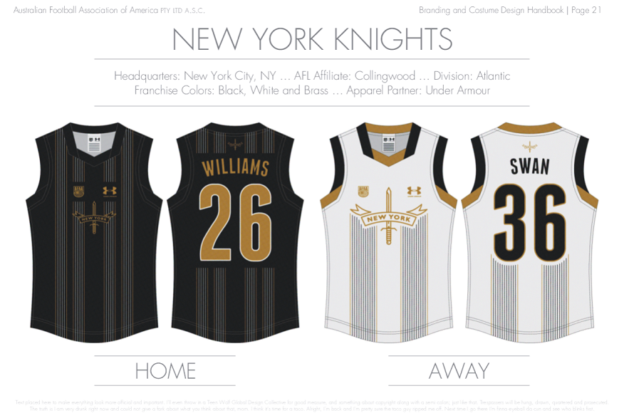
AFAANewYorkKnights_zpsbbtvcx14.png
I would agree with craegus here. The logos in the home are very close together. And I'd maybe change the club logo on the front to white in order to make it stand out a bit more.
 
A great concept, I am liking the current designs except I think the logos on the NY home are a little too close together

I would agree with craegus here. The logos in the home are very close together. And I'd maybe change the club logo on the front to white in order to make it stand out a bit more.

You might be right about that. I certainly had my reasons for those choices, but some fresh eyes can be pretty useful when dealing with the finer things. I'll probably come back to it later and try/re-try a few different solutions.

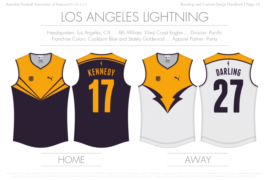
In the meantime, let's push on over to the west coast where the next team awaits. Not much to say about these designs except I lifted them from ideas I originally had for Port Adelaide a few years ago, and they just as easily invoke the Melbourne Storm.

AFAALosAngelesLightning_zpsemua3kxu.png
 
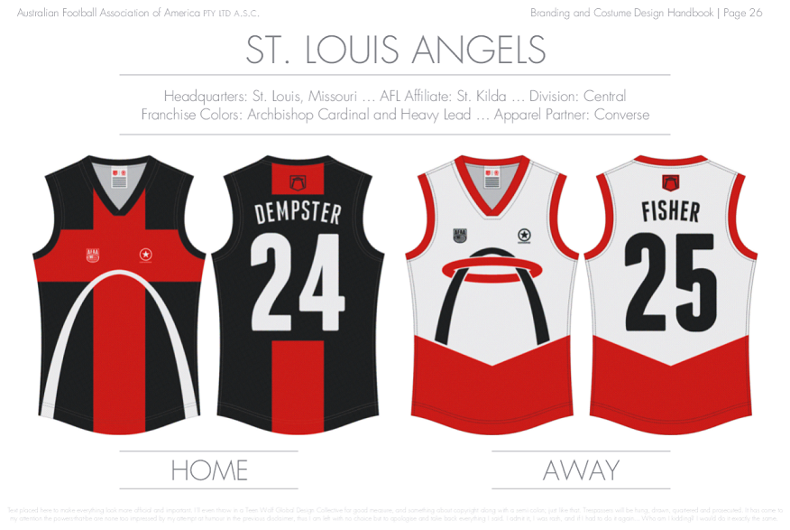
Well, the response on here to date has been heartening, so thanks to everybody for that. Time to continue on with the program, take a look at the St. Louis Angels.

I flip-flopped over a few things a lot on this one, particularly the logo/away jumper which is perhaps a bit too St. Louis Saturns or St. Louis Nets. Tricky one, because pushing the halo further up helped fix that, but then you lose the nifty interaction with the Gateway Arch. So in the end I stuck with the former, and maybe I like it more than I ought to.

AFAAStLouisAngels_zpsdvky9n8y.png
 
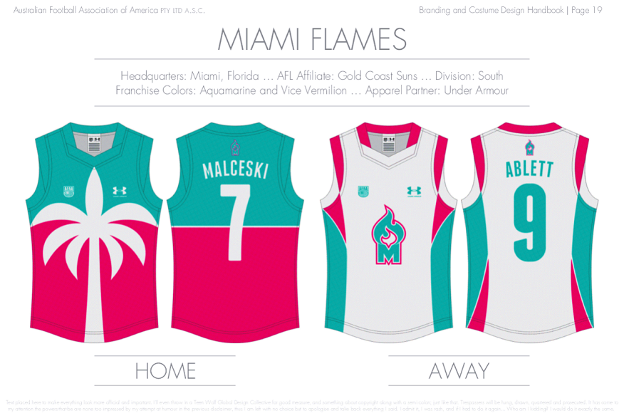
I'd love to see your take on a "Miami Vice" team in the classic turquoise and pink. I reckon youd make it look absolutely speccy mate.

By coincidence, the next team I had lined up to go was Miami, only with a rather different concept. But I had a think about what you said and then decided I would at least try changing it to your suggested colour scheme. And now I'm sticking with it!

I love that you're making changes to the template with each manufacturer, and each change really suits the manufacturer.

Loving the portfolio.

Thanks mate. Probably doing 6 manufacturers in total, and making minor adjustments to the collars/cuffs when I use each template the 2nd and 3rd time.


Alright, time to put the next team on display. Couple bits of info: The palm tree design is similar to something I belatedly entered into the BigFooty Designathon several seasons past (which craegus harshly but fairly dq'd on those grounds). It's sort of meant to be the equivalent to GC's wave jumper, albeit crossed with the old Freo anchor. As for the away, what could be more Gold Coast Suns than sidepanels with a big logo slapped on in the centre.

AFAAMiamiFlames_zpsruubwl9f.png
 
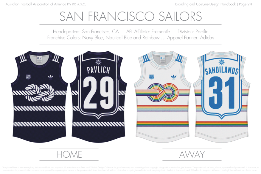
Alright, I think I can get this finished by the end of the year, otherwise it's just sad. Next up, we go back to California to check out the Dockers' Bay Area representation.

AFAASanFranciscoSailors_zpsg611kisu.png


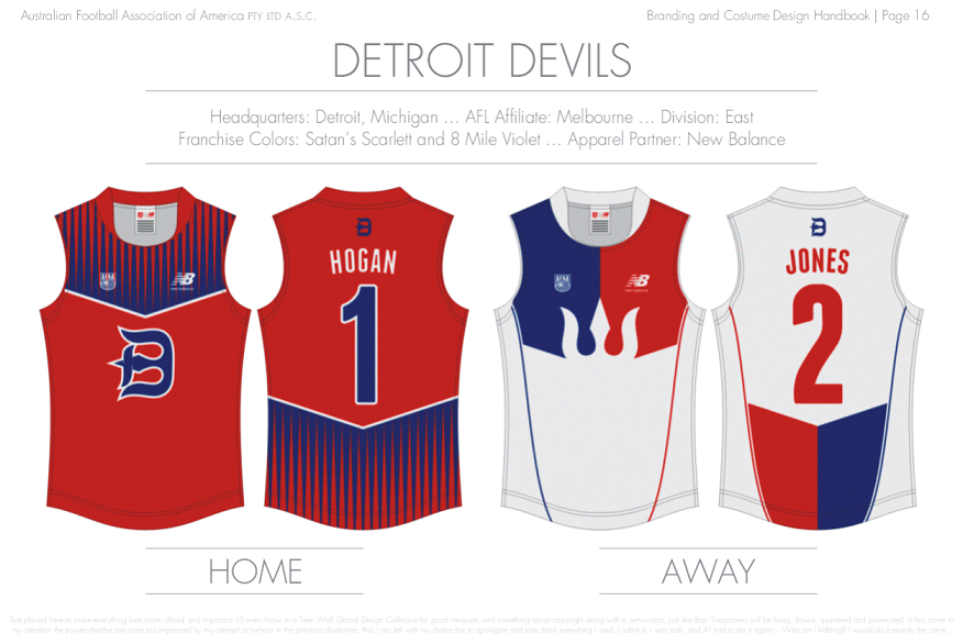
And now, since there's about seven months of wilderness to make up for, it's time for a double shot! This Detroit offering re-purposes a trident design I originally created in the Hobart leg of the old AFL Rebooted competition.

AFAADetroitDevils_zpsqd7xvdfd.png
 

(Log in to remove this ad.)

Alright, I think I can get this finished by the end of the year, otherwise it's just sad. Next up, we go back to California to check out the Dockers' Bay Area representation.

AFAASanFranciscoSailors_zpsg611kisu.png


And now, since there's about seven months of wilderness to make up for, it's time for a double shot! This Detroit offering re-purposes a trident design I originally created in the Hobart leg of the old AFL Rebooted competition.

AFAADetroitDevils_zpsqd7xvdfd.png

This is such a cool concept! The tangled rope, the old-school adidas basketball-style template, the hark back to the late 90s Freo number shield, the homosexual Navy implication... it's got it all.

Btw, I transcribed that text at the bottom for all to see – at least I think I'm correct. I laughed a few times. Nice one.

Text placed here to make everything look more official and important. I’ll even throw in a Teen Wolf Global Design Collection for good measure and something about copyright along with a semi colon; just like that. Trespassers will be hung, drawn, quartered and prosecuted.
The truth is I am very drunk right now and could not give a **** about what you think about that, man. I think it’s time for a taco. Alright, I’m back and I’m pretty sure the taco guy ripped me off. Next I go there I’m finna eyeball da cun and see who blinks first.
 
Not an entirely fresh premise in these parts, but I’d like to think I’ve added some distinctive specifications so as to not completely tread over old ground.

The general idea of this is to design a home (dark/coloured) and away (light/predominantly white) guernsey for 18 football teams based in the United States, with the following guidelines I’ve set for myself:
-No sponsor logos, except for clothing manufacturers.
-Consistent number and player name fonts on back of jumpers.
-Each team will have an affiliation with an AFL club. These alignments should be reflected in the concepts in at least one apparent way or another.
-Away jumpers must be more than a simple re-coloured version of the home.

Other things I’m focussing on:
-Controlled experimentation, or in other words, try and make these uniforms as whacked-out as possible (and more so as the portfolio progresses) while still trying to deliver something that looks decent.
-Having a second crack at some of my old designs that I think need it. It’s kind of a two-disc best-of compilation album in that sense—some remastered stuff, some new crap.
-Juxtaposing traditional Australian football jumpers with iconic American pro sport design elements, and maybe the occasional “modern graphic”.

Any feedback is welcome, but just know that I have killed before.

The first image I ought to plonk here is the league logo, which will launch our game afar.

It’s also a good example of what I alluded to earlier. This is similar to a logo I came up for the NAFL competition on here, only this one is better.

AFAALogo_zpsqowjqsn7.png


The first team I will present is the New York Knights. There was a competition on this board a few years ago called USFL, and I had an idea for a NY team but never fully fleshed it out. Introducing the Collingwood connection gave me the inspiration to finish it.

AFAANewYorkKnights_zpsbbtvcx14.png
I feel as though a New York team would stick to the New York colour scheme of Royal Blue and Orange. This seams more the colours of a team out of Pittsburgh.
 
This is such a cool concept! The tangled rope, the old-school adidas basketball-style template, the hark back to the late 90s Freo number shield, the homosexual Navy implication... it's got it all.

Thanks mate!

Btw, I transcribed that text at the bottom for all to see – at least I think I'm correct. I laughed a few times. Nice one.

Ohh dear, I forgot exactly what that said, so unprofessional. If your reading is accurate, Gibbsy, I sincerely apologise for my vulgarity and take back everything I said.

I feel as though a New York team would stick to the New York colour scheme of Royal Blue and Orange. This seams more the colours of a team out of Pittsburgh.

That is a reasonable feeling and certainly one way I considered going, but I also had to look ahead and decide if I'd prefer to use blue and orange for another team. These franchises are meant to be partners of some ambiguous nature with AFL teams, so I can imagine Collingwood/Eddie pushing for black and white, then hoping that incorporating a few different elements in a nod to the Yankees & Nets might be enough.

***

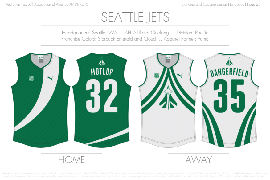
Moving on, look to the skies and wave hello to the eighth AFAA uniform reveal. I should stress that the AFL club connection here is approximately the flimsiest of all 18 teams. Geelong and Seattle are kinda out there all alone, west of (some of) the action, and 'Cats' is short and sharp just like 'Jets'... I'll pay it!

AFAASeattleJets_zpsiwwjvtk4.png


While I'm on a roll, who's ready to find out what's Hot In Cleveland?

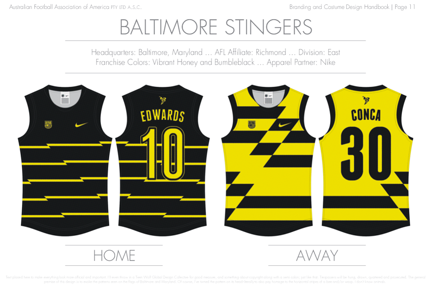
Turns out I buckeyed the trend of basing a team in an Ohioan city, so here's Baltimore instead. Hopefully the resemblance between the away jumper and Hawthorn's old diamond vest isn't as strong as I fear.

AFAABaltimoreStingers_zpsp1rojmh2.png


So there we go. Long post, but I'm halfway through the portfolio now, and I'll bet it's the same as what they say about running a marathon: the last 20kms are the easiest.
 
These are great. What fonts have been used?

Thanks! For the names and numbers on the jumper, I'm using a font called Franchise. The title and information text uses Futura LT.
 
Your design innovation is absolutely wonderful. You're managing to nail that difficult balance of having something look new and fresh while also looking like it belongs on a footy guernsey, and you're managing to nail it again and again and again.

I'm not exaggerating when I say this is the best portfolio of all time on these boards from a design innovation perspective. Absolutely brilliant work.

You'd probably have won the NAFL if you'd entered. I'd thoroughly recommend joining in in some of our league style competitions as they come up for bidding.
 
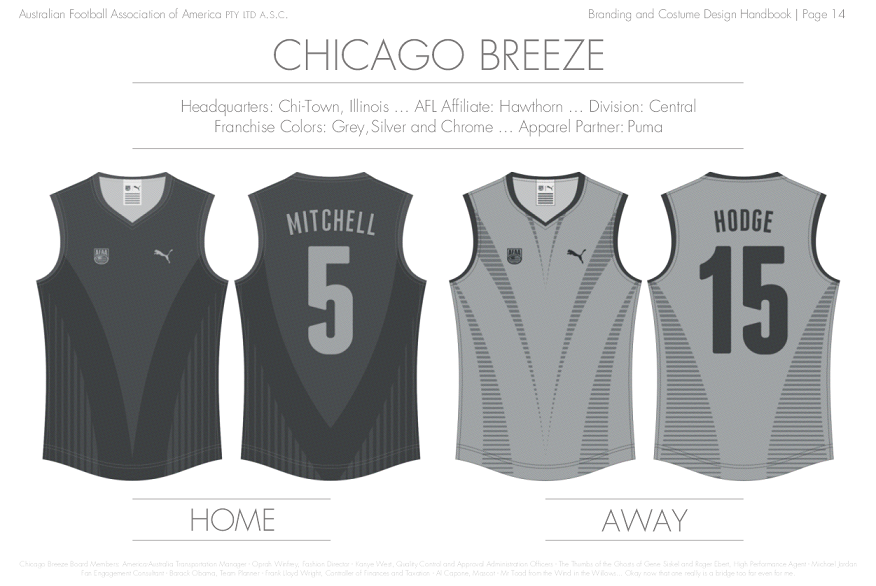
The US President has signed an executive order commanding the completion of my AFAA portfolio (topical reference six months ago). Well I did say it would be sad if I didn't finish this by the end of the year, but I didn't specify which year a-ha! It is time to stop dragging this out though, and wrapping it up in one fell swoop seems the most tolerable tactic.

I wanted Hawthorn's affiliate to feature an equally objectionable, but different, colour scheme and see if I could make something of it. Chicago consequently felt like a good fit once I considered the uninspiring Windy City moniker and bland White Sox baseball team.
AFAAChicagoBreeze_zpsthqfzors.png


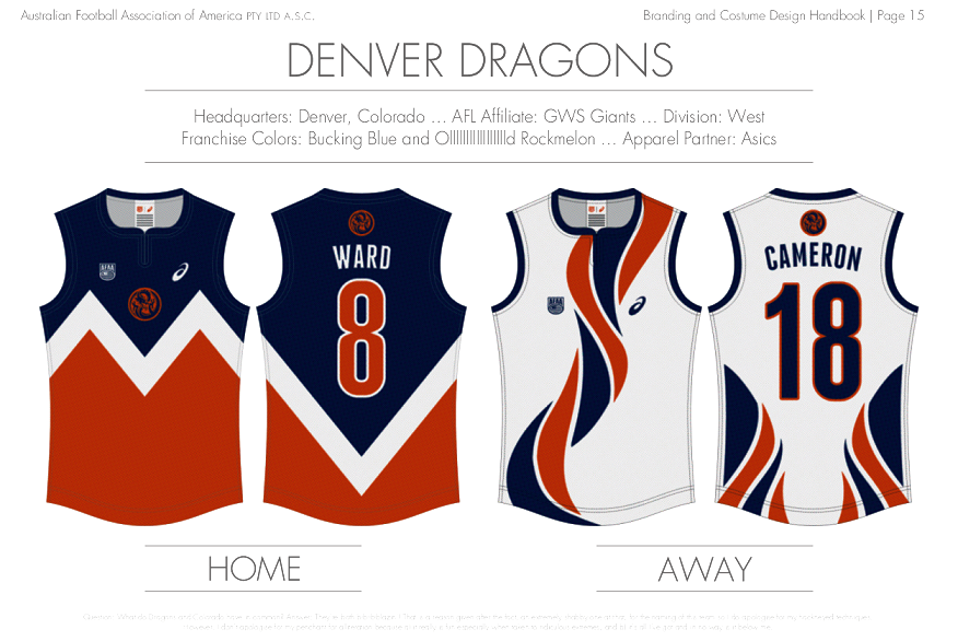
GWS were originally slated for a base in Texas along with Sydney's Houston Heart. Ultimately I couldn't go past the iconic Denver Broncos as the predominate fuel for my design:
AFAADenverDragons_zpsxhwrwusl.png


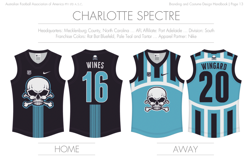
Port Adelaide's sister team had to have a vague "Power" kind of nickname to acknowledge their AFL presence. The away jumper started out as a nod to their extensive history, only the more I tinkered with the prison bars, the more it looked like an '04 Kangaroos tribute (wouldn't be the first time for me). It should also have more white for it to be a proper alternate. And although the skull-and-crossbones symbol is public domain, the particular drawing I've used for the logo isn't my creation (I just edited it for symmetry, colour etc). Despite those flaws it's probably my favourite jumper in here.
AFAACharlotteSpectre_zps3byk0rtq.png


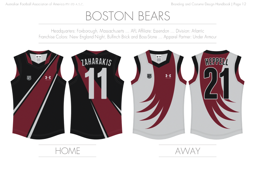
This was the last jumper set I made and any practicality with the collars/cuffs was out the window by then. As a point of difference from the St. Louis Angels I used a darker red for Essendon's partner. This resulted in what must be the most overused colour combo in American sports by my estimation (at least at college level):
AFAABostonBears_zpsqdxnbjut.png


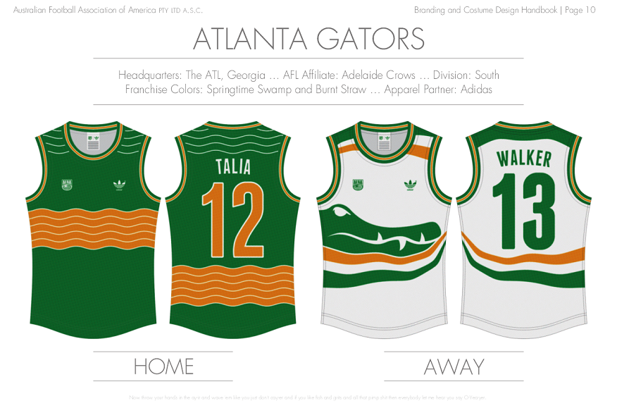
You couldn't exactly call Atlanta's away jumper as an example of great design, unfortunately it's hard to argue there isn't a certain Adelaide Crows vibe about it. I've used that crocodile head a few times, originally for my Darwin entry in AFL Rebooted, but this one is somewhat reasonable because it's actually green:
AFAAAtlantaGators_zpswhizj2lm.png


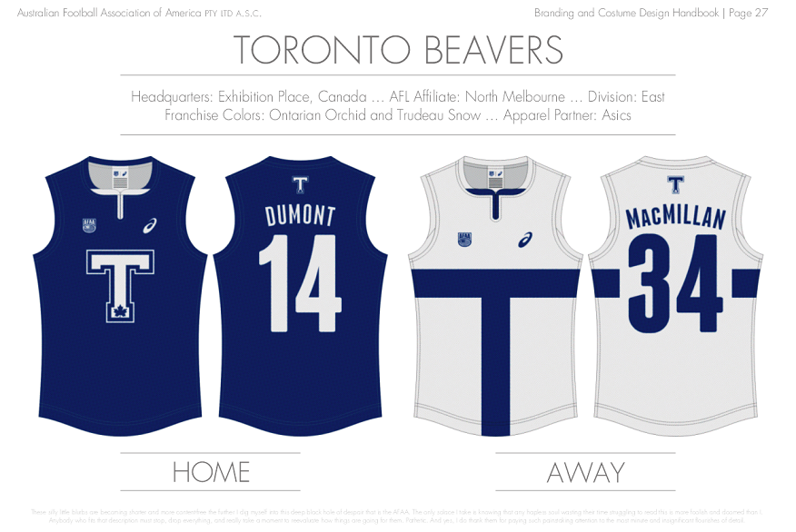
I could've added all kinds of accents and extravagant details to this one, instead I decided to change things up and go for a minimal look. I resisted the urge to include some silly beaver tail and teeth imprints because if any AFL club has to be associated with a Big T jumper, North Melbourne would make the most sense right now.
AFAATorontoBeavers_zpsmyvjbhzw.png


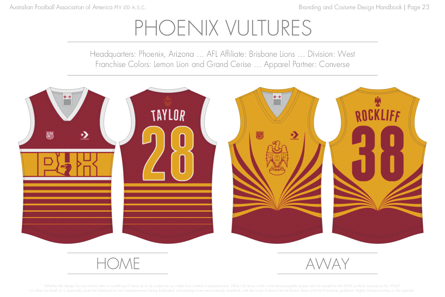
Brisbane used to have that BB wordmark (with a semi-hidden mascot) roughly mimicking their home state outline, and that's what I was trying to recreate here. The vulture I used is a done-up version of the KAOS logo from Get Smart.
AFAAPhoenixVultures_zpsh44vuebi.png


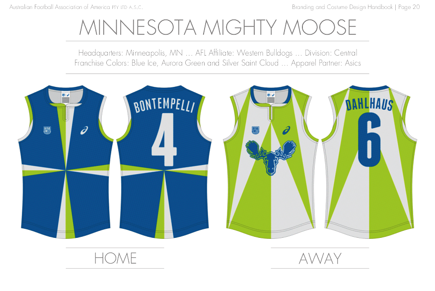
This would have enough Footscray to it if I exchanged the lime green with red, but then it'd be too samey as a few other teams which is what I want to avoid most. Thus my strongest link between the Western Bulldogs and the Minnesota Mighty Moose is that neither team represents a specific town, suburb or city. I know, this bow is longer than the Seattle Jets-Geelong Cats debacle, but I'll let anything slide if it looks good to me. The home jumper definitely succeeds on that count.
AFAAMinnesotaMightyMoose_zpsl48fefp1.png


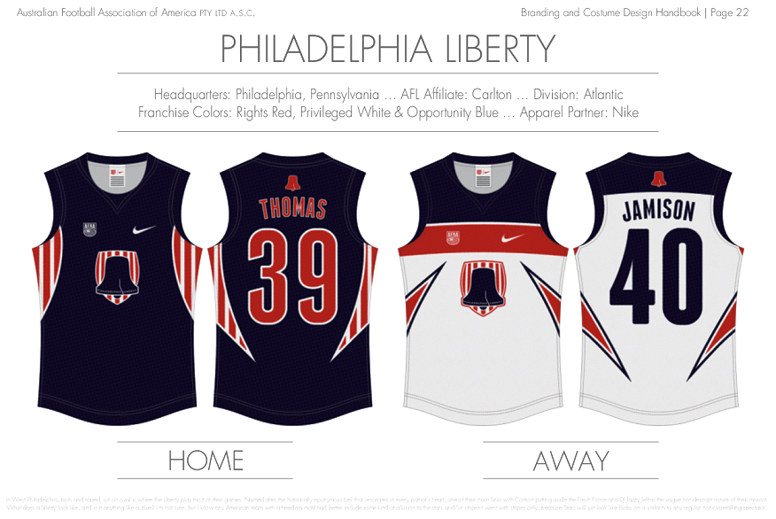
The Philadelphia Liberty brings this exercise to a full circle, what with its resemblance to the league logo and all:
AFAAPhiladelphiaLiberty_zpsuygiomb6.png


Finally, I went back over the league map and spiced it up a little bit:
AFAALeagueMap2_zpsc4zxwanf.png


That's it. Thanks for having a gander, gang. It was fun, and far too time-consuming. I have an idea for a workshop thread in the off-season which should be nice, easy and casual.

Teen Wolf out!
 

Remove this Banner Ad

Back
Top