News Carlton reportedly agree to 10 year deal with Puma

Remove this Banner Ad

definitely the longest, nobody knows what the other bigger clubs are on though
I seem to recall the Essendon/ISC deal was quite substantial and the figure was publicised.

EDIT:
its been confirmed by Herald Sun and Fox Footy, that Essendon have signed a 7 year deal with ISC to be the apparel sponsor once the current adidas deal ends. Its been said the deal is going to be worth 7 million dollars.

Will be interesting to see if ISC change anything with the guernseys?

news link

http://www.heraldsun.com.au/sport/a...n/news-story/a09fc63fa6935dc352eb8cb441165634
https://www.bigfooty.com/forum/threads/essendon-signing-with-isc.1127755/
 
Hmm Carlton wanting a plain, white away strip isn't that interesting. I didn't rate the baby blue and the grey was naff looking, but white never did it for me – it's just an easy default, but it lacks the simple appeal of other straight inverses like Freo's, Richmond's, even the old Hawks' one.

Chamois with the old yoke design (either predominantly white, but I think all chamois – even the shorts – with a navy yoke with a white outline on it could be bold looking and a bit more 'Bluesy') has been harked on about here. But with an iconic logo, they could play around with the base a lot more. All white with St Kilda-style candystripes in different shades of grey and a navy monogram could be a bit more interesting. Even an embossed pattern.
At least white is a Carlton colour :)
 

Log in to remove this ad.

puma would have got carlton dirt cheap being the reigning wooden spooners and if they finally pull their finger out they will sell a heap of merch. could be a good get for puma

I think you'll find that ladder position doesn't have a major impact, the old "big 4" would still demand a high price.
 
It's a Freo, Port Adelaide, Bulldogs colour too?
And Collingwood, Geelong, GWS, North, St Kilda and Sydney. Paired with some navy though it's only Geelong - and so long as they don't put the navy in a similar design I think we're good.

Similarly black is a Collingwood, Essendon, Port, Richmond and St Kilda colour.
 
As much as Nike have butchered the Blues, it was genuinely iconic and probably the longest, most generation-spanning partnership in footy. A real shame. I loved that look.

Still, Puma is a very good get, but I have a feeling they'll either nail the colour and make it that perfect navy blue that's properly dark but shades a blue tinge in the sun or else they'll **** it completely and make it black.
As someone who grew up with Puma and SGIO (And HJ's to a lesser extent), it feels so foreign seeing West Coast play without either of those two sponsors.
 

(Log in to remove this ad.)

I hope Nike don’t go anywhere near Sydney.

I assure you my fellow Swans fans likely don't want Nike if we were to leave ISC who have largely been pretty good with us. If we do leave ISC for whatever reason hopefully we go to either Puma or Adidas
 
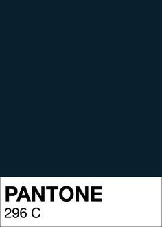
According to the AFL Branding Guide I have they are PMS 296.
d44382fbef4f4cd62e2bd025d31496b0.jpg


RGB 0,41,64

That said, sublimated dye is different to printing.
 
Last edited:
According to the AFL Branding Guide I have they are PMS 296.
d44382fbef4f4cd62e2bd025d31496b0.jpg


RGB 0,41,64

That said, sublimated dye is different to printing.
do you think that is what nike has been using the last few years where it has looked almost black and its a material issue or do you reckon nike changed the colour to a darker one?
 
do you think that is what nike has been using the last few years where it has looked almost black and its a material issue or do you reckon nike changed the colour to a darker one?

Essentially my opinion would be that they just wanted something that looked Navy Blue, enough, but was obviously a shade darker than 289 which is what all the other Navy Blue clubs use. (Adelaide, Geelong, Melbourne & until recently West Coast.)
 

Remove this Banner Ad

Back
Top