Workshop Create a Random AFL Guernsey

Remove this Banner Ad

This is my first effort at a jumper

It's for the Bulldogs but I've made it on the idea that they should revert to Footscray by 2012. Otherwise there will be too many 'Wests': West Coast, West Sydney and Western Bulldogs. I've ditched the current Bulldog logo because of this

WCKv_HvhW7k2JT1gjUpyJHfFfi5OUlKzxykcEwBnFWm1XxWIEbVs0hv5i4SOgj6IzIa7BpJ50EWi-3ymV4VlErD4tA=s512

leaf
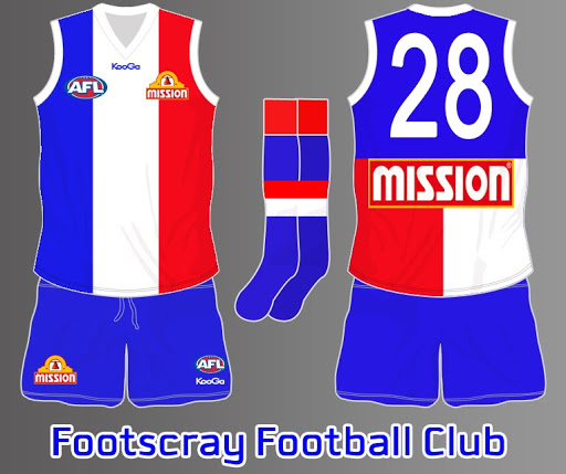
good idea. Too much like camberwell cobras in the old vfa tho.
 

Log in to remove this ad.

while I'm cleaning out my old designs, these are a set inspired by a fantastic alternate history portfolio (apologies to the artist i can't find the original; if any one can, please attach the link in a reply because the work was amazing and my homage to it is obvious) and was going to be part of a larger set of works I never finished.
Ballarat.png COMPLETED.png joondalup.png NT COMPLETED.png TAS COMPLETED.png
 
while I'm cleaning out my old designs, these are a set inspired by a fantastic alternate history portfolio (apologies to the artist i can't find the original; if any one can, please attach the link in a reply because the work was amazing and my homage to it is obvious) and was going to be part of a larger set of works I never finished.
View attachment 839953View attachment 839954View attachment 839955View attachment 839956View attachment 839957
I believe you are looking for fancyscum 's portfolio A Truly National Competition from 2018.
 
Attempted a slight re-brand for Gold Coast as a lot of people said it was impossible to make them look good haha. I've altered the colours slightly but tried to keep some kind of "history" there. It was a strange puzzle trying to make something look classic with no tradition, and not clash with Brisbane or the Crows. Let me know what you think or if you can see any reason why this wouldn't work? I've switched out the yellow for an actual Gold, which represents the Sun and the sun rays are also goal posts. Works in 3 colour ways to avoid clashing etc.

Gold Coast Re-Brand.png
 
Attempted a slight re-brand for Gold Coast as a lot of people said it was impossible to make them look good haha. I've altered the colours slightly but tried to keep some kind of "history" there. It was a strange puzzle trying to make something look classic with no tradition, and not clash with Brisbane or the Crows. Let me know what you think or if you can see any reason why this wouldn't work? I've switched out the yellow for an actual Gold, which represents the Sun and the sun rays are also goal posts. Works in 3 colour ways to avoid clashing etc.

View attachment 852622
I think the design might be a bit too busy, the goalposts are a little much. But I like the switch to the gold and navy, it isn't such a bad idea. Very Pelicans-like.
 

(Log in to remove this ad.)

Attempted a slight re-brand for Gold Coast as a lot of people said it was impossible to make them look good haha. I've altered the colours slightly but tried to keep some kind of "history" there. It was a strange puzzle trying to make something look classic with no tradition, and not clash with Brisbane or the Crows. Let me know what you think or if you can see any reason why this wouldn't work? I've switched out the yellow for an actual Gold, which represents the Sun and the sun rays are also goal posts. Works in 3 colour ways to avoid clashing etc.

View attachment 852622
Reminds me a bit of the Florida Panthers.
 
I think the design might be a bit too busy, the goalposts are a little much. But I like the switch to the gold and navy, it isn't such a bad idea. Very Pelicans-like.

True, I was trying to sort of slot in a golden sun and it sort of looked like goal posts anyway so I changed it to that. I would prob work with just the semi circles too. Thanks man, yeah the Pels did come to mind.
 
New Port Adelaide Clash.

Looks pretty awkward at first glance, I assume. But don't judge a book by its cover... I like our current clash jumper, but it just seems a little too plain and boring, and even though if it ain't broke, you shouldn't fix it, I did anyway. The reason Port chose teal as their tertiary colour when they joined the AFL was because it was the colour of the Port River. The awkward looking line in my guernsey is the exact shape of the river, and sort of resembles a lightning bolt... The two vertical lines in the right and the horizontal line give a nod to our historic prison-bar jumper, although I didn't want to do too many lines, I want to please Eddie. Enough from me...
2lmnuvs.png
What the * was wrong with me
 
Having a crack at a local footy team logo, Dunnstown in the Central Highlands.

Not much to go on except they are the Towners and they have a barrel chested bloke as the logo for the foot and netball team.
Went with the guernsey design on a shield with a Shamrock due to the strong Irish potato farming links to the district and the local Shamrock Hotel.

1594209893439.png
 

Remove this Banner Ad

Back
Top