I’m not overly fussed but yeah if I had my time over I’d have kept it cleanglad I went with a blank back...
Navigation
Install the app
How to install the app on iOS
Follow along with the video below to see how to install our site as a web app on your home screen.
Note: This feature may not be available in some browsers.
More options
You are using an out of date browser. It may not display this or other websites correctly.
You should upgrade or use an alternative browser.
You should upgrade or use an alternative browser.
Workshop Cricket Kit Designs/Discussion
- Thread starter jethro11
- Start date
- Tagged users None
- Oct 5, 2017
- 1,218
- 1,008
- AFL Club
- Sydney
- Other Teams
- Port Melbourne, Norwood, St George
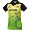
The shade of green across the Star's players kits and the pads is inconsistent tonight
Michael Scarn
Club Legend
i don't think it's supposed to be red, it's 'neon red' or somethingRenegedes away kit is atrocious. The red on it looks really washed out too, it looks like the sixers are playing the scorchers.
It would be like Gold Coast changing their blue to navy, way too close to Adelaide and in this case from a glance, they just looked like the sixers last night. It's lucky they have red helmets though I suppose.i don't think it's supposed to be red, it's 'neon red' or something
Teen Wolf
Norm Smith Medallist
- Jul 5, 2011
- 8,116
- 8,925
- AFL Club
- North Melbourne
- Other Teams
- Afghanistan women's cricket team
Another peculiarity was the Renegades wearing black pads. So we now know it's logistically feasible for the Scorchers, Thunder, Strikers and Sixers to have two sets to match whichever colour of pants they're wearing but they choose not to.
Michael Scarn
Club Legend
Another peculiarity was the Renegades wearing black pads. So we now know it's logistically feasible for the Scorchers, Thunder, Strikers and Sixers to have two sets to match whichever colour of pants they're wearing but they choose not to.
The different coloured pads is a design element i would've thought?
hitthepost
Norm Smith Medallist
Strikers' pads have always been dark blue on light pants.
Teen Wolf
Norm Smith Medallist
- Jul 5, 2011
- 8,116
- 8,925
- AFL Club
- North Melbourne
- Other Teams
- Afghanistan women's cricket team
I thought it was an oversight by whoever had the 'bright' idea to make every team wear coloured (non-black) pants this season, but now it seems perhaps not.The different coloured pads is a design element i would've thought?
They wore matching pants in WBBL|04, which looked way better. And they've always been black pads, just like Australia's T20I team or what the Hurricanes used to wear.Strikers' pads have always been dark blue on light pants.
- Sep 23, 2012
- 1,979
- 1,396
- AFL Club
- GWS
Another peculiarity was the Renegades wearing black pads. So we now know it's logistically feasible for the Scorchers, Thunder, Strikers and Sixers to have two sets to match whichever colour of pants they're wearing but they choose not to.
Chose not to or told not to? I suspect it's likely the latter.
amazing how much of a difference the black sleeves make to the scorchers uniform, the orange pants don’t actually look too bad with the black sleeves and side panels
- Jun 18, 2016
- 51,680
- 99,056
- AFL Club
- West Coast
- Other Teams
- Perth Scorchers
Yeah it definitely breaks up the Netherlands vibeamazing how much of a difference the black sleeves make to the scorchers uniform, the orange pants don’t actually look too bad with the black sleeves and side panels
Now that just depresses me...why do we have to cop this crap with the BBL when NZ and England are so much better??
- Oct 27, 2016
- 5,949
- 10,675
- AFL Club
- Collingwood

- Other Teams
- Packers, Raptors, Renegades
Hopefully this wakes the BBL up. The logos and kits far surpass the BBL.
Teen Wolf
Norm Smith Medallist
- Jul 5, 2011
- 8,116
- 8,925
- AFL Club
- North Melbourne
- Other Teams
- Afghanistan women's cricket team
BBL uniforms could be executed better (heaps better) but in terms of general branding, no other cricket league in the world is anywhere near as effective.
The Super Smash, the Hundred and the CPL etc all look like each other. And then in the IPL you have the Super Royals, the Mega Kings, the Giant Knights and the Royal Royalties all basically wearing blue with gold-plated accents. Terrible.
The Super Smash, the Hundred and the CPL etc all look like each other. And then in the IPL you have the Super Royals, the Mega Kings, the Giant Knights and the Royal Royalties all basically wearing blue with gold-plated accents. Terrible.
akkaps
Community Leader
- Mar 20, 2012
- 47,444
- 32,665
- AFL Club
- Carlton
- Moderator
- #3,370
What the BBL had going for it was that each team was to be defined by a colour that was not respresentive of the state or city they were situated in. However, the BBLs push to only have that colour on their kits is wrong, with need a secondary colour to help with identity. The BBL should have gone against the black/white trend and asked teams to pick a different secondary colour.BBL uniforms could be executed better (heaps better) but in terms of general branding, no other cricket league in the world is anywhere near as effective.
The Super Smash, the Hundred and the CPL etc all look like each other. And then in the IPL you have the Super Royals, the Mega Kings, the Giant Knights and the Royal Royalties all basically wearing blue with gold-plated accents. Terrible.
The SuperSmash, Hundred and CPL are all representative leagues. They represent the area they are from, and have a majority of the players from that district, county, and country. This means an identity is already there and must be retained. The IPL is purely a franchise league, with no state representation in teams. Virat is from Delhi, plays for RCB; MS from Jharkhand, plays for CSK.
I think the over use of blue in the IPL comes from blue being the main sporting colour in India, having that nation pride is what is important when setting up a new team. This is the main reason many of the Big 4 teams use red or blue as part of their kits or logos.
Mumbai, Delhi, Kolkata are the only teams to use blue as their primary colour in the IPL. Whilst Chennai and Rajasthan use blue as a secondary colour. Rajasthan changed its primary colour from Royal Blue to Pink at the start of the 2018 season as they felt too many teams had blue as a good primary colour.
Teen Wolf
Norm Smith Medallist
- Jul 5, 2011
- 8,116
- 8,925
- AFL Club
- North Melbourne
- Other Teams
- Afghanistan women's cricket team
I'm confident that's the best part. Secondary colours would only muddle each team's branding and consequently make the BBL look like every other league.However, the BBLs push to only have that colour on their kits is wrong, with need a secondary colour to help with identity.
The bad things about the current BBL uniforms are: team logos are under-utilised; no unique minor details; some teams wearing black pads with coloured pants; Majestic.
The Half Back
BC Approved
Are you suggesting the Scorchers and Sixers look better without the black elements of their strips?I'm confident that's the best part. Secondary colours would only muddle each team's branding and consequently make the BBL look like every other league.
The bad things about the current BBL uniforms are: team logos are under-utilised; no unique minor details; some teams wearing black pads with coloured pants; Majestic.
hitthepost
Norm Smith Medallist
I like these variations. Same for coloured pads with black pants. Mix it all up.some teams wearing black pads with coloured pants.
Teen Wolf
Norm Smith Medallist
- Jul 5, 2011
- 8,116
- 8,925
- AFL Club
- North Melbourne
- Other Teams
- Afghanistan women's cricket team
My humble suggestion is they (and any other team) should wear black pants if they're going to wear black pads.Are you suggesting the Scorchers and Sixers look better without the black elements of their strips?
I think it looks like try-hard local level stuff, could just be me.I like these variations. Same for coloured pads with black pants. Mix it all up.
Similar threads
- Replies
- 42
- Views
- 2K


