


- Joined
- Apr 17, 2007
- Posts
- 5,836
- Reaction score
- 7,021
- AFL Club
- Sydney
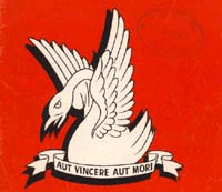
A) Early swans logo (Not sure of year)
B) 1977 - 1981

C)1982 - 1991

D)1992 - 1996

E)Current

F) That 'other' one

Is everyone happy with our current swans logo?
Personally, I was more happy with the 'look' of the swan in our logos between 1977-1991. In my opinion, this version was the best. I much prefer the spread wing swan to that of the Opera House wings. Nothing against Sydney itself, I just think the spread wings has a grander feel to it. Further, I like the jagged teeth it has and angry look.
Don't get me wrong, I like the newer version and the way it incorporates our traditional 'V,' but I just much prefer the older design.
End of the day, perhaps I'm being a little nostalgic with my choice.
PS. Does anyone know what the latin phrase, 'aut vincere aut mori' means in our old logo? I've been wondering about that for YEARS.
B) 1977 - 1981
C)1982 - 1991
D)1992 - 1996
E)Current
F) That 'other' one
Is everyone happy with our current swans logo?
Personally, I was more happy with the 'look' of the swan in our logos between 1977-1991. In my opinion, this version was the best. I much prefer the spread wing swan to that of the Opera House wings. Nothing against Sydney itself, I just think the spread wings has a grander feel to it. Further, I like the jagged teeth it has and angry look.
Don't get me wrong, I like the newer version and the way it incorporates our traditional 'V,' but I just much prefer the older design.
End of the day, perhaps I'm being a little nostalgic with my choice.
PS. Does anyone know what the latin phrase, 'aut vincere aut mori' means in our old logo? I've been wondering about that for YEARS.
")


