Gold Coast SUNS guernsey discussion

Remove this Banner Ad

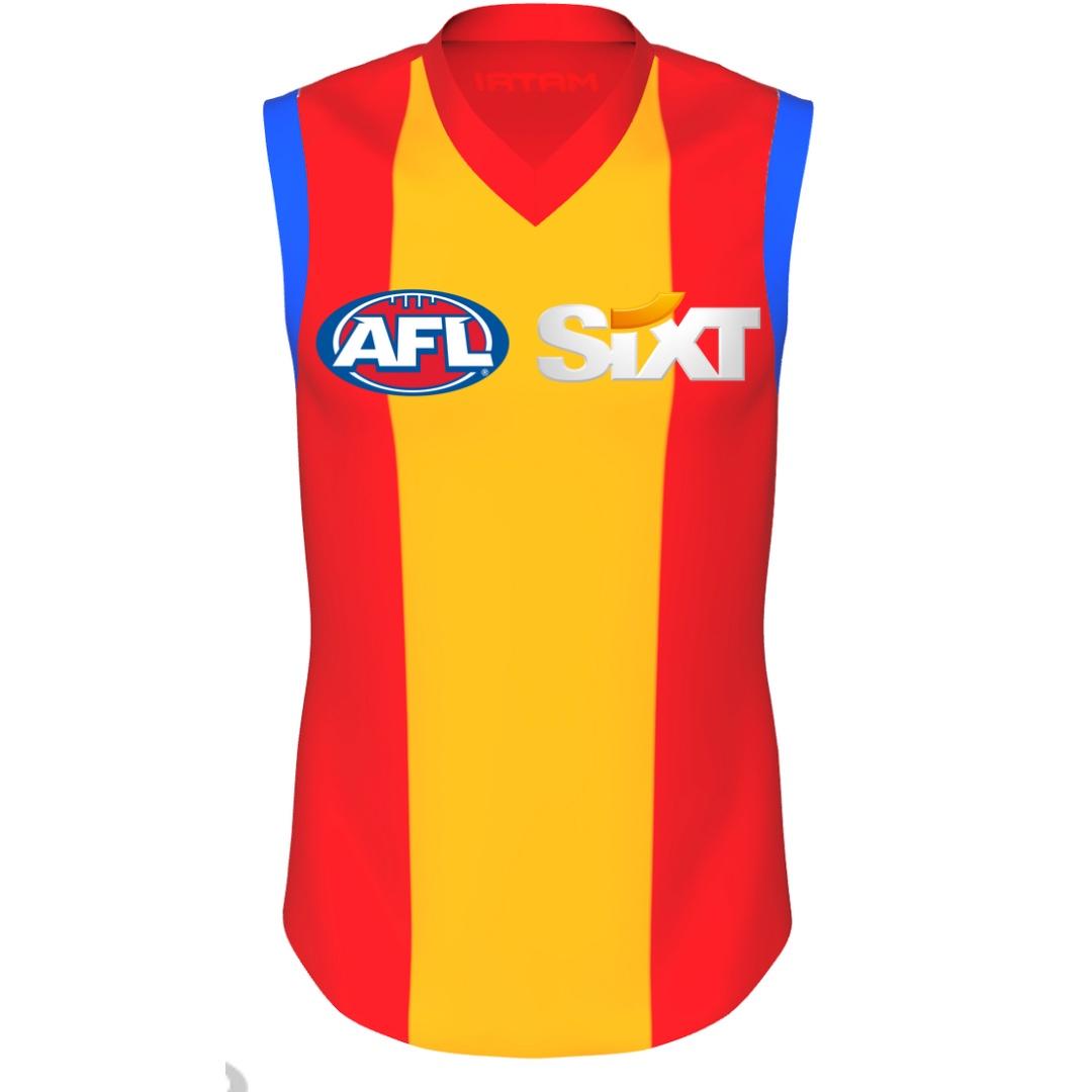
Yeah. Red probably needs to be our main colour, with blue and yellow as contrast. Don’t mind trying stripes or a more classic strip though. Whatever gets rid of the GC logo!

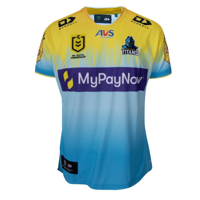
I don’t mind the logo but needs to be a different design it doesn’t suit the position on the jumper
 
Their Anzac jumper again looked better than their regular one. I particularly liked the orange fade.
 

Log in to remove this ad.

31a873322e911fe3a1d26ac08bdf4e88.jpg


Because I liked the blue sleeves yesterday


On iPhone using BigFooty.com mobile app
 
I had a conversation with Mark Evans about a redesign of the suns jumper last week and supplied him with a bunch of details as to why the jumper needs updating. Without copy pasting directly his response, because I wasn't given permission, he stated:
  • They are currently having internal discussions around brand.
  • A specific group is doing this.
  • He personally thinks the logo is dated, however not everybody at the club thinks the same.
  • In his time at the hawks yellow was the worst selling item, so he doesn't particularly like a yellow jumper for the suns.
 
31a873322e911fe3a1d26ac08bdf4e88.jpg


Because I liked the blue sleeves yesterday


On iPhone using BigFooty.com mobile app
I liked the blue sleeves as well, I don’t think 3 colours works personally unless it’s on a dark base colour

Personally I’d ditch the red and go a base blue with either yellow stripes or chevrons and the inverse for clash
 
I liked the blue sleeves as well, I don’t think 3 colours works personally unless it’s on a dark base colour

Personally I’d ditch the red and go a base blue with either yellow stripes or chevrons and the inverse for clash
Blue and Yellow is probably too close to West Coast. The red is our main colour for a reason (even though we are the Gold Coast Suns, so yellow/gold makes sense thematically)

We also have to be careful with our colours that we don’t look too much like Adelaide, which a few fans suggestion designs make us look like.

But of course if we are too red, we have a Sydney Swans problem…
 

(Log in to remove this ad.)

I had a conversation with Mark Evans about a redesign of the suns jumper last week and supplied him with a bunch of details as to why the jumper needs updating. Without copy pasting directly his response, because I wasn't given permission, he stated:
  • They are currently having internal discussions around brand.
  • A specific group is doing this.
  • He personally thinks the logo is dated, however not everybody at the club thinks the same.
  • In his time at the hawks yellow was the worst selling item, so he doesn't particularly like a yellow jumper for the suns.

Very interesting
 
Watch Tassie come up with a epic jersey and logo 😭
Oh hush you.

Tassie has countless years of "history" to draw from

I had a conversation with Mark Evans about a redesign of the suns jumper last week and supplied him with a bunch of details as to why the jumper needs updating. Without copy pasting directly his response, because I wasn't given permission, he stated:
  • They are currently having internal discussions around brand.
  • A specific group is doing this.
  • He personally thinks the logo is dated, however not everybody at the club thinks the same.
  • In his time at the hawks yellow was the worst selling item, so he doesn't particularly like a yellow jumper for the suns.
This is promising

I agree that yellow is not the way.

I maintain that just the "GC" part of the logo should be the basis of the new one without any of the extra gradient bullshit.
 
Another issue we have, is other teams have icons by that I mean animals
Tigers cats Kangaroos lions etc that they can use and market…
All Suns have is this guy and “GC” logo

Leaves very little wiggle room .

View attachment 1681750
At least we have a clearer icon than the Carlton Blues...

But really, our logo is the Sun. Like Dockers, Power or Bombers, it’s a thing.

The closest we have is Power, who at least make a lightning bolt out of it.
 
At least we have a clearer icon than the Carlton Blues...

But really, our logo is the Sun. Like Dockers, Power or Bombers, it’s a thing.

The closest we have is Power, who at least make a lightning bolt out of it.
I litruelly forgot we are meant to be the Suns…
cos u never see anything about any Sun graphics.
On occasion see this shitty thing…
Just look at how cool the Phoenix Suns brand is… 🙌🏽
IMG_4938.jpeg IMG_4939.jpeg IMG_4937.jpeg
 
Shoutout to our neighbours up the road in Parkwood who put together a cool jersey design for Magic Round this year that includes the city skyline. Good on the Titans for putting in the effort to try some new designs.

FCVHfkO.jpg
Up the Titans! They nailed their magic round jersey, also their Anzac jersey was epic too.
 
One thing Rugby League jerseys have going for them is they're not as beholden to tradition as footy is.

Which means you get some shockers but you often get some real pearlers too when the companies are given range to try things.

The Dynasty logo on both collarbones is shocking though
 
I know blue has been one of your colours since foundation but it never made sense to me. It doesn't fit the Suns motif and makes the team less distinct, not more, as it gives the club similar colours to both Adelaide and the Lions. Red and gold is a perfectly good colour scheme, and distinct from the rest of the competition. Freo simplified their colour scheme to have a more distinct identity, the Suns can too.
 
I know blue has been one of your colours since foundation but it never made sense to me. It doesn't fit the Suns motif and makes the team less distinct, not more, as it gives the club similar colours to both Adelaide and the Lions. Red and gold is a perfectly good colour scheme, and distinct from the rest of the competition. Freo simplified their colour scheme to have a more distinct identity, the Suns can too.
Blue is mostly for our clash colours at the moment. Obviously a re-design would consider that too though.
 

Remove this Banner Ad

Back
Top