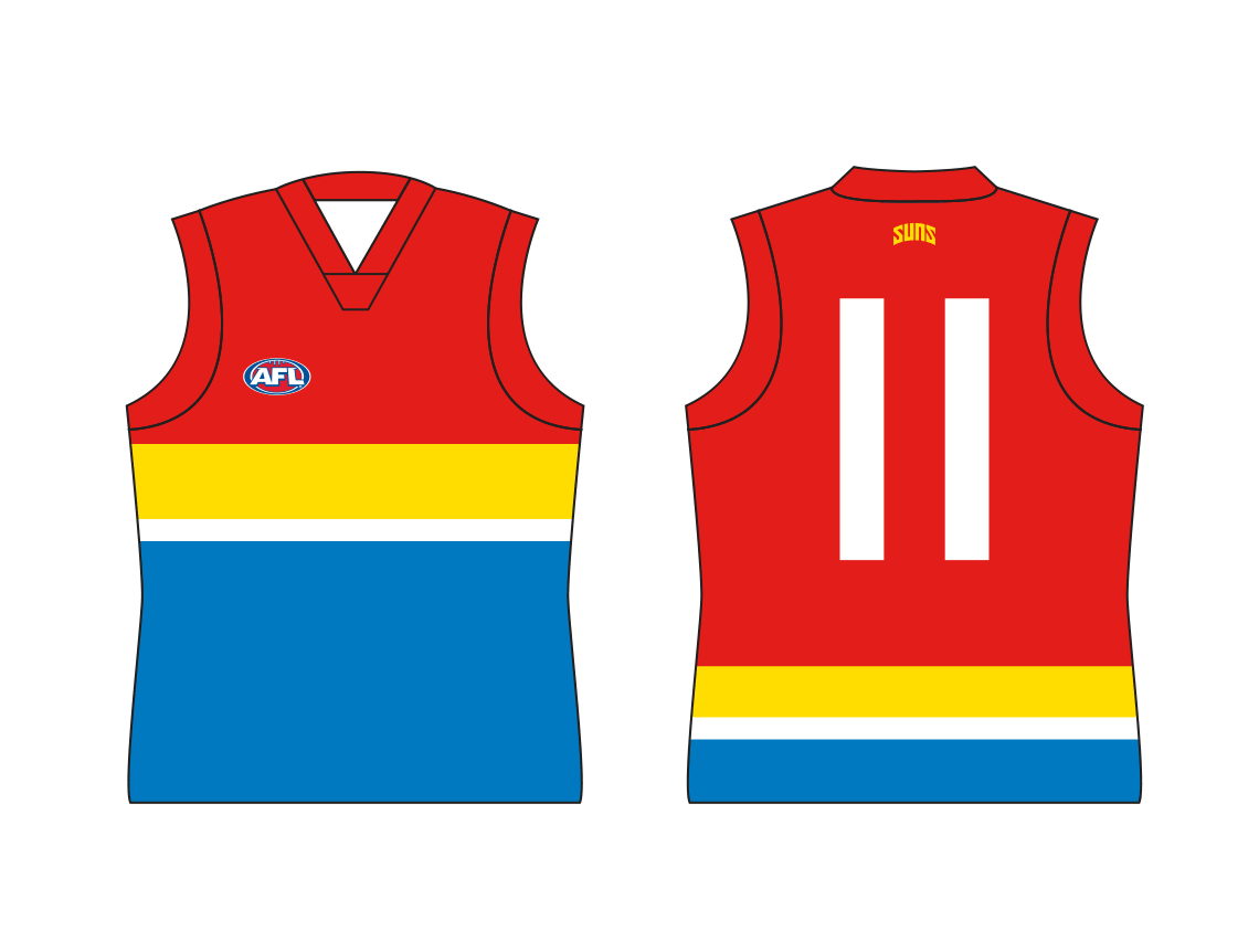
Gold Coast SUNS guernsey discussion

Remove this Banner Ad

Yourself or the club

No need for a re brand personally I'm very well oiled machine, but in all seriousness the pre game training singlet would make a great jumper if you took away the logo in the middle
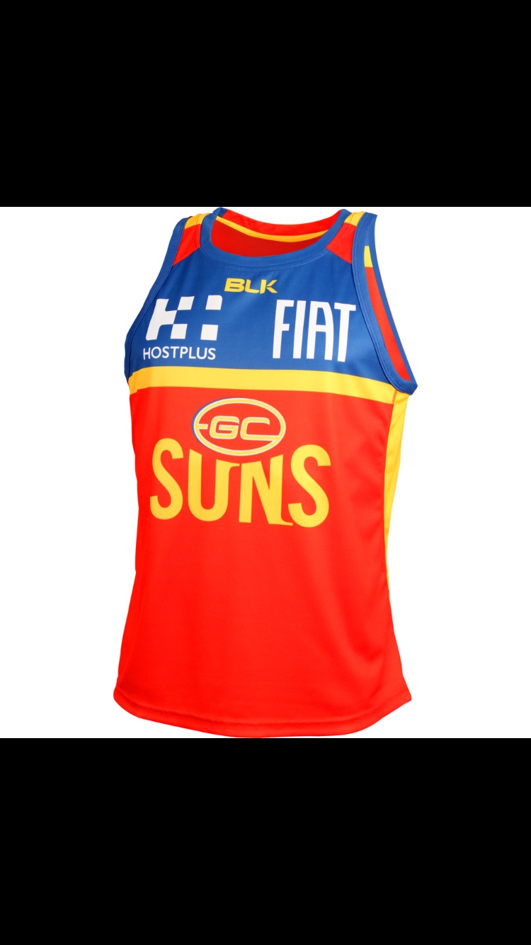
34aba039b1d5240141c4b9d6fb8014ad.jpg


Sent from my iPhone using Tapatalk
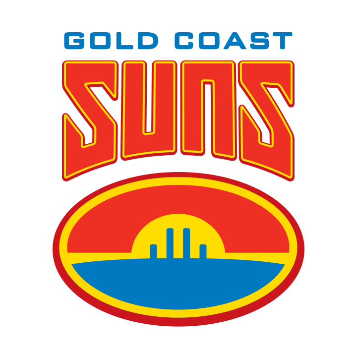
 
^ I think Brisbane might take issue with gc wearing that...

I don't really care about the logo so much, what you see most is the jumper. Never understood why they went with something so boring when attempting to be this new and exciting team. I've always thought going with a quartered design to mimic the surf life saving caps would look great, or at the very least make the socks gold on the current kit.

The red and gold looks great, just do something to make it a halfway interesting design.
 
Based on Rodney Eade's jacket at the Carlton game and club's new training jumper, I think it's fair to say the rebranding will involve navy blue. Red, gold and navy blue seem to be the way the club is going. They just have to be careful they don't steal the Melbourne Demons' design.
 

Log in to remove this ad.

who said that we are getting a rebrand?
Gold Coast. In their article when they announced XBlades as the new manufacture. Apparently it was meant to be this year but the crap with BLK meant it was too late to be done now and would be forced into 2018
 
I dont think we will, we are a brand and we need to stay for at least another 10 years before changing again
 

(Log in to remove this ad.)

its a joke that we are hardly on fta (4 games). I had a look at Brisbane's broadcast draw. Its even worse (only 1 game fta)
 
We get virtually no exposure outside of the Gold Coast
Big Money knows that
4.40pm Saturday/Sunday games on Foxtel
No FTA
It's a tough sell

Small clubs have to play well to get good sponsors.
And in pretty much every league, more than 50% of teams are small or medium. For those clubs, have to play well to get money off-field.

And that is not an AFL issue but happens with every league around the world. Only a handful of large teams get FTA for ratings reasons that have nothing to do with how they play. Pies, Dallas Cowboys, Lakers.

The GS Warriors in the NBA were a sponsors wasteland for years. Now they are the best team, on all the FTA they can handle, and sponsors and crowds follow.
Bulldogs had sponsor troubles for years, but now playing in big FTA games it would be much easier. Hawks are a small club that almost got merged. Audi followed once they started to play lots of finals and win most of them. Hawks will be like the Lions. If they stop playing well and making finals, crowds and sponsors will go elsewhere.

So it is pretty simple for us. Play well, make finals, get on FTA.
 
I was wondering what GC fans on this board thought of about the idea of changing the club's logo and guernsey.
The Suns branding has never been popular on the graphic design board but I'm interested to hear the opinions of people who actually support the team.

Ideas have been thrown around this thread lately which lead me to work on this new logo concept.
View attachment 266323
With this logo I'm trying to create a strong, memorable symbol that could be synonymous with the club's image. Similar to what Carlton have with their monogram.
The logo is in the shape of a sun that combines to create a G on the outside, while the C sits inside the centre. The left version features waves of red and yellow in the style of a life guard flag to represent the club's seaside identity. The right version is simplified to match the colour scheme of the home guernsey.

Along with this concept I've created a few redesigns for the club guernseys.
View attachment 266322
The top left and right designs are the same as the old jumpers, just with the new logo.
The top centre design is my own design which is a modern take on the yoke/sash, with sun rays shining from the club logo on the chest.
The bottom 2 show how the blue version of the logo could be adapted as a guernsey design. These might be better suited as clash/alternative guernseys.

Let me know what you think.
If the Suns really do have blue as one of their colours, where is it??? I like the top left jumper but would prefer either some blue trim around the arms and collar or blue behind the sun symbol on the chest, because to me the jumper is mostly red with some gold trim !!! The jumpers they sometimes wear during training have blue across the top and shoulders and looks ok........but for mine the match day ones have far too much red on them,especially with the red shorts............but even those are better than the Giants orange and charcoal day at the beach jumpers...........YUK!!!!!!!!!!!
 
Top left jumper but with blue panels on the side and collar and armpits..............blue goes with bright colours like red and gold, so why not be generous with it !!!!
Mainly because it always ends up looking like Fitzroy or a brighter version of Adelaide.
A lot of times it just doesn't end up working well anyway, the blue ends up taking away from the red and gold.
 
I was wondering if anyone could make a Gold Coast jersey with the Cronulla style, so red, yellow strip with blue outline, maybe put the logo or the letters GC in the strip. Anyone understand?


On iPhone using BigFooty.com mobile app
 

Remove this Banner Ad

Back
Top