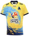
Interestingly, this is par for course with recent expansion clubs. Port Adelaide rebranded to their current chevron V design after their 13th season in the AFL (2010) and Fremantle rebranded to their purple with white Vs design after their 16th season in the AFL (2011). This is our 14th season in the AFL.Some members being invited to focus groups this week for a “brand refresh” but phones will be confiscated and it will include an NDA.
Navigation
Install the app
How to install the app on iOS
Follow along with the video below to see how to install our site as a web app on your home screen.
Note: This feature may not be available in some browsers.
More options
-


LIVE: Western Bulldogs v Sydney - 7:30PM Thu
Squiggle tips Dogs at 55% chance -- What's your tip? -- Team line-ups »
-
 BigFooty Tipping Notice Img
Weekly Prize - Join Any Time - Tip Round 11
The Golden Ticket - MCG and Marvel Medallion Club tickets and Corporate Box tickets at the Gabba, MCG and Marvel.
Round 10 Winner: Bulldog rick
-
You are using an out of date browser. It may not display this or other websites correctly.
You should upgrade or use an alternative browser.
You should upgrade or use an alternative browser.
Gold Coast SUNS guernsey discussion
Oh this must be the thing Mark Evans told me was happening last year, it must move at a snail's pace. Good to hear they are finally doing something though. Hopefully they go with something like these classics. The red being home, yellow away and the clash can be anything, it doesn't really matter.
View attachment 1975208
The black and gold looks good. I bought one of these recently

RowellAnderson12
Norm Smith Medallist
- Nov 4, 2019
- 6,888
- 9,168
- AFL Club
- Gold Coast
- Other Teams
- Liverpool, Max Verstappen, Pacers, DR3
The black and gold looks good. I bought one of these recently
A black guernsey with a big yellow/red sun in the middle would be lit
Big Red Machine
Der Sonnenkönig
- Moderator
- #1,504
I was just saying on the weekend to someone that a "solar eclipse" alt strip would be hot.A black guernsey with a big yellow/red sun in the middle would be lit
lommy
Team Captain
- Jun 27, 2021
- 479
- 902
- AFL Club
- Gold Coast
Hopefully they select the right fans to consult on this. I've seen a few nuffies on the suns social pages say 'we love the current strip'.
I’m in and I hate our current strip

Sent from my iPhone using BigFooty.com
Big Red Machine
Der Sonnenkönig
- Moderator
- #1,507
Hopefully they select the right fans to consult on this. I've seen a few nuffies on the suns social pages say 'we love the current strip'.

Bjo187
Premiership Player
- Apr 30, 2020
- 3,299
- 4,387
- AFL Club
- Essendon
I’m in and I hate our current strip
Sent from my iPhone using BigFooty.com
That's a relief. I don't trust the afl, clubs and it's management to come up with something that isn't s**t though. Look at the suns jumper and the latest Tasmanian releases as examples, baffling to say the least.
Has there been a design on these threads you have liked?I’m in and I hate our current strip
Sent from my iPhone using BigFooty.com
There’s been a few i like. There was a surfboard design i recall.
I’m in and I hate our current strip
Sent from my iPhone using BigFooty.com
Can you please print out this thread and present it for “additional data”?
lommy
Team Captain
- Jun 27, 2021
- 479
- 902
- AFL Club
- Gold Coast
Has there been a design on these threads you have liked?
There’s been a few i like. There was a surfboard design i recall.
Here is some of the stuff I’ve saved over the years that I liked

Sent from my iPhone using BigFooty.com
Please bring back the wave. Lose the logo, but bring back the wave
Southern Sun
Club Legend
- Mar 6, 2020
- 1,669
- 2,251
- AFL Club
- Gold Coast
Either of that middle row for mine.Here is some of the stuff I’ve saved over the years that I liked

Sent from my iPhone using BigFooty.com
There's so many cool designs they could go with. I always liked the idea of a city/skyline jumper, but I can't decide if I want it to be our regular home jumper or a special jumper that we wear once or twice a year for a particular reason like the ANZAC jumper.Either of that middle row for mine.

Last edited:
There's so many cool designs they could go with. I always liked the idea of a city/skyline jumper, but I can't decide if I want it to be our regular home jumper or a special jumper that we wear once or twice a year for a particular reason like the ANZAC jumper.

Titans done a similar one in 2021

Neon Lights City Jersey - Key Features
Jersey features highlights from across the city, including;
The Broadbeach Skyline, Warner Bros. Movie World, Cbus Super Stadium, iconic beaches, Burleigh Hill and more.
CanYouFeelTheSunburn
Sinkin Corona's
- Jun 9, 2018
- 1,524
- 3,314
- AFL Club
- Gold Coast
nooooooooo! bad news?
Sent from my iPhone using BigFooty.com
Oh ffs what they doing? Nothing? Or worse a terrible change?
Surely, it can't be worse than current design.
Sent from my iPhone using BigFooty.com
Is it just you?

- Mar 14, 2014
- 39,574
- 72,820
- AFL Club
- Gold Coast
- Other Teams
- Las Vegas Bears
Well that sounds about right
Sent from my iPhone using BigFooty.com
lommy
Team Captain
- Jun 27, 2021
- 479
- 902
- AFL Club
- Gold Coast
I’ll try and put my thoughts into words, sorry if it seems clunky.
So I walked out of the brand refresh feeling really flat.
They showed us 3 designs. Mostly focusing on the logo and putting it in a lineup with all other club logos for comparison.
Logo Design 1.
This was awful, really awful.
But, the guernsey they slapped it on was GREAT.
Red to Yellow gradient. Starting with red at the bottom changing into yellow around the chest and up, with red hems and collars!
The away was yellow and yellow gradient.
(Looked okay nothing great like the yellow training jumper)
The clash was blue and red gradient, looked really good - think phoenix suns but more blue than purple.
Logo Design 2.
This was the best logo that was offered up.
They had placed this on a 2 toned red jumper. Think soccer shirt where it’s red with darker red lines quite busy, I hated it.
And a yellow version - the same.
Logo Design 3.
This logo was also terrible.
On the guernseys they had changed the red and blue shades to almost lions colors. And the logo on this one was really big and quite low on the jumper in a darker shade of the same color of the jumpers.
I have written a lot about the different jumper designs they showed us and honestly if the put logo 2 onto guernsey 1 it would be pretty decent design.
But they didn’t seem to care about the actual guernsey design. Every time I asked about it or gave feed back they tried to put me back into talking about the logo. It seemed like it would be an after thought.
They did concede that they would be going with some type of gradient and all signs pointed to yellow being the away/clash.
Anyone who wants a “traditional” strip will be disappointed.
I should also say he did stress that these designs weren’t anywhere near completion before he showed us, to the point where he almost sounded defensive, almost like he had negative feedback all day.
It is happening. 2025 we will be in a new kit.
Members will be shown in November.
I didn’t end up signing any type of NDA and we didn’t have to give them our phones, just turn them off.
Sent from my iPhone using BigFooty.com
Thanks for sharing mateI’ll try and put my thoughts into words, sorry if it seems clunky.
So I walked out of the brand refresh feeling really flat.
They showed us 3 designs. Mostly focusing on the logo and putting it in a lineup with all other club logos for comparison.
Logo Design 1.
This was awful, really awful.
But, the guernsey they slapped it on was GREAT.
Red to Yellow gradient. Starting with red at the bottom changing into yellow around the chest and up, with red hems and collars!
The away was yellow and yellow gradient.
(Looked okay nothing great like the yellow training jumper)
The clash was blue and red gradient, looked really good - think phoenix suns but more blue than purple.
Logo Design 2.
This was the best logo that was offered up.
They had placed this on a 2 toned red jumper. Think soccer shirt where it’s red with darker red lines quite busy, I hated it.
And a yellow version - the same.
Logo Design 3.
This logo was also terrible.
On the guernseys they had changed the red and blue shades to almost lions colors. And the logo on this one was really big and quite low on the jumper in a darker shade of the same color of the jumpers.
I have written a lot about the different jumper designs they showed us and honestly if the put logo 2 onto guernsey 1 it would be pretty decent design.
But they didn’t seem to care about the actual guernsey design. Every time I asked about it or gave feed back they tried to put me back into talking about the logo. It seemed like it would be an after thought.
They did concede that they would be going with some type of gradient and all signs pointed to yellow being the away/clash.
Anyone who wants a “traditional” strip will be disappointed.
I should also say he did stress that these designs weren’t anywhere near completion before he showed us, to the point where he almost sounded defensive, almost like he had negative feedback all day.
It is happening. 2025 we will be in a new kit.
Members will be shown in November.
I didn’t end up signing any type of NDA and we didn’t have to give them our phones, just turn them off.
 The gradient one you've described with design 1 sounds really good. Like you said, throw the best logo from design 2 on the gradient jumper from design 1 and you've potentially got a winner. It also sounds like the club has listened to the fans' desire to use more yellow in the jumper after how popular the training kit was earlier this year. Any chance you could show us the comparable NBA jersey design you're referring to so we have a visual comparison?
Fingers crossed they nail it. We need this new jumper/logo design to be good!
Thanks for info. Did other people have the same view like you? I assume more supporters attended. Are you saying that 2 logos were worse than current one? That seems impossible, haha.I’ll try and put my thoughts into words, sorry if it seems clunky.
So I walked out of the brand refresh feeling really flat.
They showed us 3 designs. Mostly focusing on the logo and putting it in a lineup with all other club logos for comparison.
Logo Design 1.
This was awful, really awful.
But, the guernsey they slapped it on was GREAT.
Red to Yellow gradient. Starting with red at the bottom changing into yellow around the chest and up, with red hems and collars!
The away was yellow and yellow gradient.
(Looked okay nothing great like the yellow training jumper)
The clash was blue and red gradient, looked really good - think phoenix suns but more blue than purple.
Logo Design 2.
This was the best logo that was offered up.
They had placed this on a 2 toned red jumper. Think soccer shirt where it’s red with darker red lines quite busy, I hated it.
And a yellow version - the same.
Logo Design 3.
This logo was also terrible.
On the guernseys they had changed the red and blue shades to almost lions colors. And the logo on this one was really big and quite low on the jumper in a darker shade of the same color of the jumpers.
I have written a lot about the different jumper designs they showed us and honestly if the put logo 2 onto guernsey 1 it would be pretty decent design.
But they didn’t seem to care about the actual guernsey design. Every time I asked about it or gave feed back they tried to put me back into talking about the logo. It seemed like it would be an after thought.
They did concede that they would be going with some type of gradient and all signs pointed to yellow being the away/clash.
Anyone who wants a “traditional” strip will be disappointed.
I should also say he did stress that these designs weren’t anywhere near completion before he showed us, to the point where he almost sounded defensive, almost like he had negative feedback all day.
It is happening. 2025 we will be in a new kit.
Members will be shown in November.
I didn’t end up signing any type of NDA and we didn’t have to give them our phones, just turn them off.
Sent from my iPhone using BigFooty.com
Similar threads
- Replies
- 1
- Views
- 454


