Jones2ByrneJones
Hour of Pessimism
- Jul 27, 2012
- 15,820
- 27,995
- AFL Club
- Port Adelaide
You know I might be able to play around with these on AFL evolution. Ill report back briefly
Follow along with the video below to see how to install our site as a web app on your home screen.
Note: This feature may not be available in some browsers.
There is a few options as I see it:
A/ Both team logos on outer side;
B/ Return to style of previous years but have Telstra logos on the other "50" spot;
C/ Move club logos to an entirely different spot (on the wing either side of GF logo perhaps?);
D/ Ditch club logos altogether.
Will watch with interest.
Adelaide blue, Richmond red IMO.
I'll just fly my helicopter over and see brbSurely someone works/lives close enough to Richmond to take a peek at the MCG and the ground marking outlines!
Drone or gtfoI'll just fly my helicopter over and see brb
Been dreading it all yearYou just know the Telstra logos will stay on the broadcast side

That's on the outer wing, isn't it?
Yes it isThat's on the outer wing, isn't it?
Someone commented on the Instagram post saying that Richmond's logo is on the Punt Road end of the 'G, could just be coincidence though.I'm surprised Richmond is on the blue though, considering thats Adelaide's major colour.
Pretty much all the answer they can give, not like they'd ask questions.
confirmed.Dodo mobile?
Internet that diedDodo mobile?
And they areYou just know the Telstra logos will stay on the broadcast side
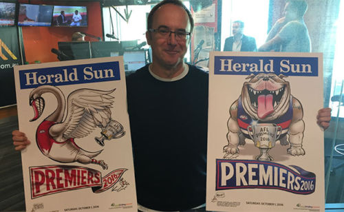
Has the 2017 Herald Sun artwork been released yet?