


Did you do this back in 2015? hah
Navigation
Install the app
How to install the app on iOS
Follow along with the video below to see how to install our site as a web app on your home screen.
Note: This feature may not be available in some browsers.
More options
You are using an out of date browser. It may not display this or other websites correctly.
You should upgrade or use an alternative browser.
You should upgrade or use an alternative browser.
Workshop Grand Final logo and on-field artwork designs and ideas
- Thread starter hitthepost
- Start date
- Tagged users None
- Aug 25, 2014
- 7,718
- 11,772
- AFL Club
- Richmond
2 years later...HA, Richmond playing in a Grand Final. My gosh, that'd be the day.
Here we are.
crow28 covered this already, but if fishing for likes helps you sleep at night, go ahead.2 years later...
Here we are.
My comment was educated when you look at the state the Tigers were in prior to this season.
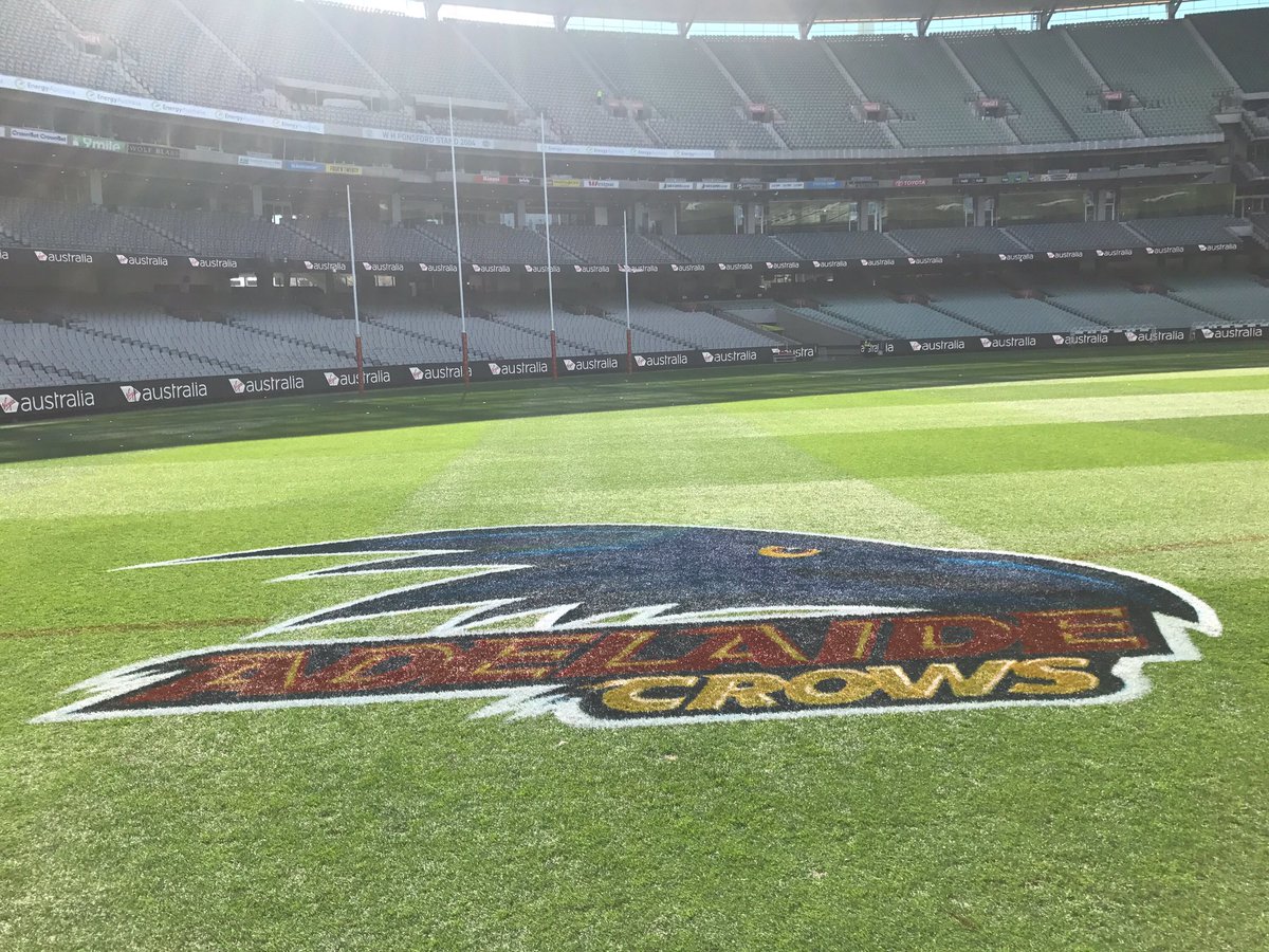
WOW... For years I have waited for this. I know its just a logo but to see the Crows logo on the G for the GF is unreal
Did you do this back in 2015? hah
First did it in 2014 I think, looking ahead to the next season. So at the time, even Adelaide were pretty average.
TheLoungeLizard
The world's most handsome man
Thank God they didn't put the logos in pointless white boxes
glebegreyhound
Debutant
- Dec 7, 2013
- 102
- 89
- AFL Club
- Sydney
Only for Swans...Thank God they didn't put the logos in pointless white boxes

glebegreyhound
Debutant
- Dec 7, 2013
- 102
- 89
- AFL Club
- Sydney
Btw is there real reasoning behind the white box?Only for Swans...
TheLoungeLizard
The world's most handsome man
Not that we can work outBtw is there real reasoning behind the white box?
2005, 2006, 2014 and 2016 all had it, and yet 2012 didn't
Unlike the Carlton logo from 2006-2014 the official Swans logo doesn't sit inside a box, nor does it ever appear on any merch or placements.
My best guess is they think it looks better, but it looked just as good as any other in 2012.
Interestingly, West Coast had it in 2005/2006 but not 2015...
Maybe it's because the version for multicoloured backgrounds has white text and it couldn't be seen well on the grass?Not that we can work out
2005, 2006, 2014 and 2016 all had it, and yet 2012 didn't
Unlike the Carlton logo from 2006-2014 the official Swans logo doesn't sit inside a box, nor does it ever appear on any merch or placements.
My best guess is they think it looks better, but it looked just as good as any other in 2012.
Interestingly, West Coast had it in 2005/2006 but not 2015...
lepphayden
Debutant
- Apr 5, 2017
- 67
- 30
- AFL Club
- Western Bulldogs
Does anyone have a losing team grand final jumper (or any for that manner) that they don't want and i can buy i've always wanted one. My team is Bulldogs so if anyone has last years that would be awesome!
hitthepost
Norm Smith Medallist
- Thread starter
- #438
...white shows up great on grass. That's why they paint all the lines using itMaybe it's because the version for multicoloured backgrounds has white text and it couldn't be seen well on the grass?
TheLoungeLizard
The world's most handsome man
Didn't effect it in 2012Maybe it's because the version for multicoloured backgrounds has white text and it couldn't be seen well on the grass?

- Sep 4, 2013
- 5,532
- 8,595
- AFL Club
- Carlton
Advertising > showcasing club logos.
Sickening
Sickening
chicken Caesar
Senior List
whats up with the purple seats in the opposite pocket?From a local Adelaide radio station View attachment 421603
Klim
Brownlow Medallist
- Sep 17, 2013
- 12,532
- 10,363
- AFL Club
- Sydney
That's what brings the cash in...Advertising > showcasing club logos.
Sickening
VelvetSledge
Moderator
- May 24, 2007
- 17,493
- 35,308
- AFL Club
- Essendon
- Other Teams
- Liverpool FC, Melbourne Storm
- Moderator
- #444
Kind of sort of related possibly...
After countless years of busting my arse trying to make design a career, I've finally done it. And I got to make this for my workplace. Yeeew.

After countless years of busting my arse trying to make design a career, I've finally done it. And I got to make this for my workplace. Yeeew.

Dean1
All Australian
- Jan 4, 2015
- 614
- 457
- AFL Club
- Adelaide
Love seeing the bright yellow LED signageFrom a local Adelaide radio station
- Sep 19, 2007
- 19,080
- 17,644
- AFL Club
- St Kilda
- Other Teams
- Anaheim Ducks, PSV Eindhoven
Why did you rotate the crows logo?Kind of sort of related possibly...
After countless years of busting my arse trying to make design a career, I've finally done it. And I got to make this for my workplace. Yeeew.
View attachment 421622
Gydafud
Premium Platinum
Probably related to the email I got...whats up with the purple seats in the opposite pocket?
Congratulations! Your seats are located in a special area during the Virgin Australia Pre-Game Show.
500 fans on the ground, 100,000 fans in the stand and millions at home will enjoy an amazing line-up of artists at the Virgin Pre-Game Show at the 2017 Toyota AFL Grand Final. With The Killers headlining, you have a front row seat to see them live.
On the day, you will find a giveaway on your seat, which you are encouraged to use and get into the spirit when The Killers are performing. Be in your seat by 1.30pm to enjoy the show.
VelvetSledge
Moderator
- May 24, 2007
- 17,493
- 35,308
- AFL Club
- Essendon
- Other Teams
- Liverpool FC, Melbourne Storm
- Moderator
- #448
The only part I don't like. Originally left it the way it was, but our creative director decided he wants it to "fill the space" more.Why did you rotate the crows logo?
Apparently this is design; doing what other people want even though you don't like it.
- Sep 19, 2007
- 19,080
- 17,644
- AFL Club
- St Kilda
- Other Teams
- Anaheim Ducks, PSV Eindhoven
I'm not sure how this fills the space more? Surely in the proper orientation you'd just be cropping the sides (as with the Richmond logo) not leaving "white" spaceThe only part I don't like. Originally left it the way it was, but our creative director decided he wants it to "fill the space" more.
Apparently this is design; doing what other people want even though you don't like it.
VelvetSledge
Moderator
- May 24, 2007
- 17,493
- 35,308
- AFL Club
- Essendon
- Other Teams
- Liverpool FC, Melbourne Storm
- Moderator
- #450
You're almost repeating what I said. Alas, he's happy, and I'm finally able to use Photoshop for something aside from putting Jake Stringer's head on Essendon player's bodies.I'm not sure how this fills the space more? Surely in the proper orientation you'd just be cropping the sides (as with the Richmond logo) not leaving "white" space
