Fizzler
BBTB
- Dec 26, 2013
- 12,781
- 16,367
- AFL Club
- Port Adelaide
- Other Teams
- OKC, Coburg, Werribee, Storm, QPR
Almost every idea so far in this thread is brand new. Well done everyone.
Follow along with the video below to see how to install our site as a web app on your home screen.
Note: This feature may not be available in some browsers.
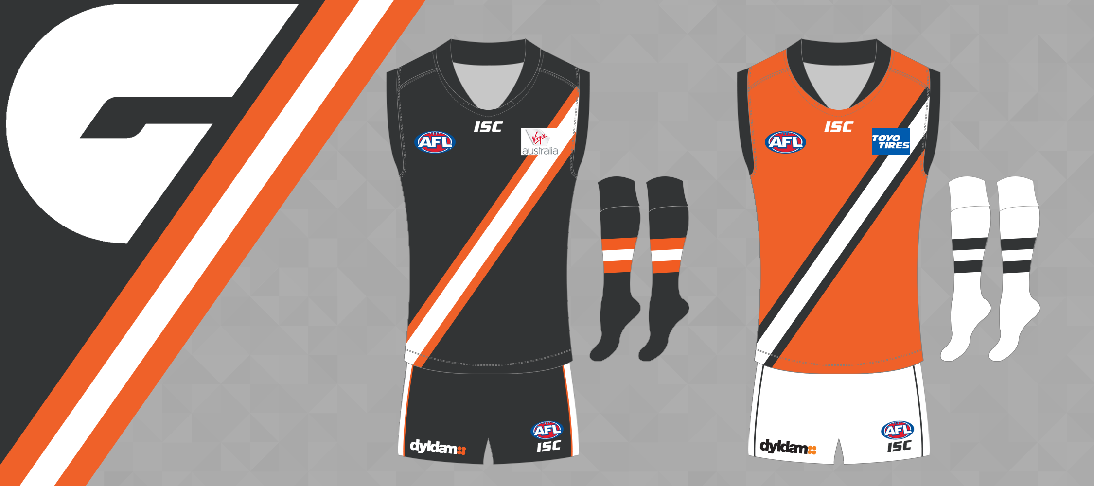
GWS, home, away and clash.
I question whether the white is needed, but I thought it was best to play it safe and include it.
View attachment 229793
View attachment 229794
View attachment 229795
Thank you, you kind sir.These are very, very nice.
I like them a lot.
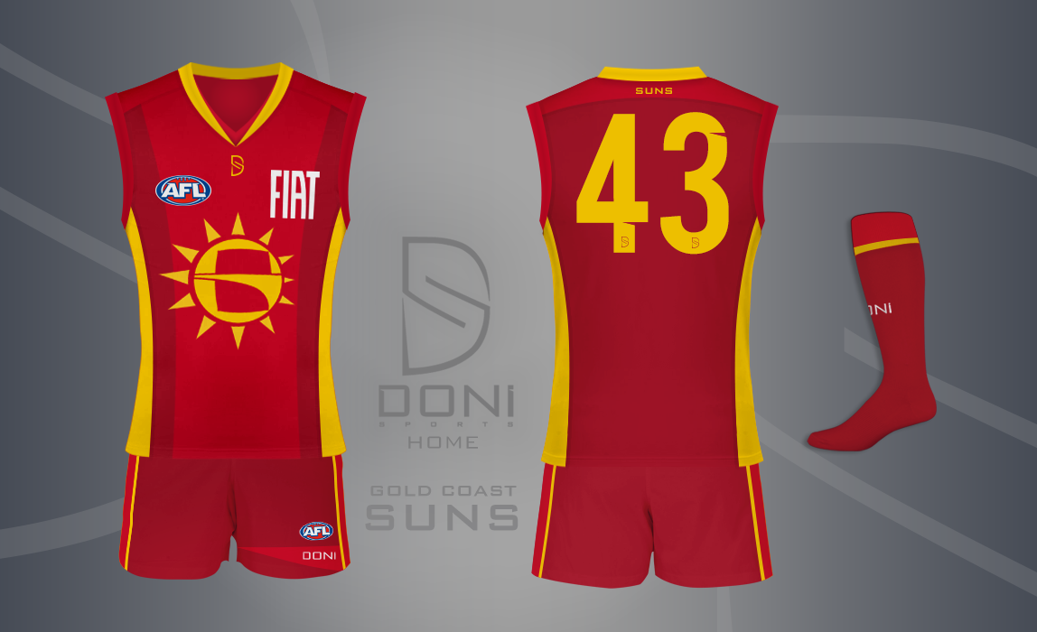
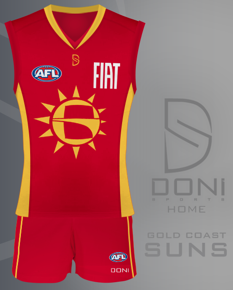
Can you remove the front dark red side panels? Would look better.So, I decided to try and improve possibly the most criticised home design in the AFL at the moment.. The Gold Coast Suns. In order to do this.. I started off with the logo itself.

It's a Sun and there's a (really well) hidden 'G' in the middle.. can you see it? Another thought of mine was: "how cool would it be if the sun's rays made the sun 3D?"
So, I did that. Not thinking about how it would look on a guernsey..
..So here's how it looks on a guernsey.
As you can see, there is now a two-tone red design along with a darker yellow, commonly known as gold. These are Adelaide's red and gold, with a darker shade of red added in the mix. I was hoping to achieve a design that would be simple (like the too-simple current design) but still be interesting, I guess.. I think I did that, but, eh. It's never getting used anyway.
It looks good, but the logo sort of looks like a B in the negative space. Out of curiosity, what does the jumper look like without the logo? I think you might be onto a winning design there


Can you remove the front dark red side panels? Would look better.

Both these requests insult me greatly.
View attachment 235585 View attachment 235591
View attachment 235592
Can you chuck the logo on with the stripes, but have it so it's small enough not to fall into the darker red?Both these requests insult me greatly.
View attachment 235585 View attachment 235591
View attachment 235592
Suuuuuuper.

Very nice. Traditional looking strip without looking too much like Essendon or Richmond.
Some form of a sash is definitely the way to go for GWS. I'm not sure why, but the colours seem to go well with it.
Unbelievable postAndonis1997 it kind of looks like your Sun is dabbing.
Shut upAndonis1997 it kind of looks like your Sun is dabbing.
Don't encourage himUnbelievable post
Shut up
Don't encourage him

Yeah for sure. It hasn't been taken en masse like chevrons. It's the sort of thing you can obscure and play with a fair bit, and Essendon/Richmond have sort of shown (by default) how strong of an emblem it can even if it's inverse or regular elements around it changed. I really dig the giant G as a logo and think it's a winner when combined with a bright orange strip – bold and unique and applicable to all merch and etcetera – so I would definitely keep the G to one side of the sash.Some form of a sash is definitely the way to go for GWS. I'm not sure why, but the colours seem to go well with it.


lighter sky blue would be ace
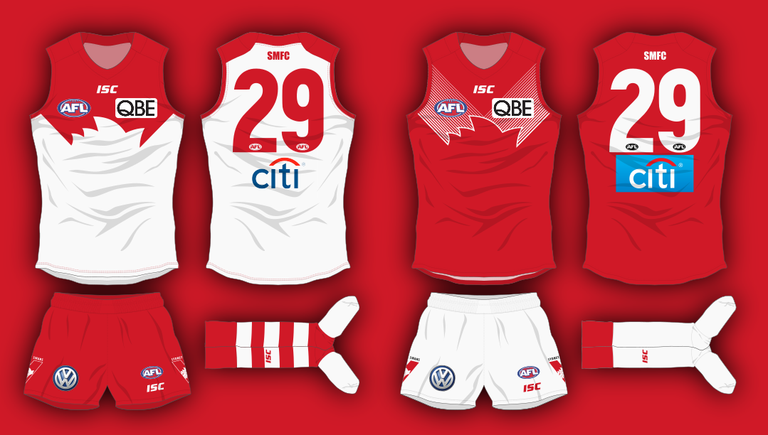
Sydney's home jumper would look better with a white back.