Navigation
Install the app
How to install the app on iOS
Follow along with the video below to see how to install our site as a web app on your home screen.
Note: This feature may not be available in some browsers.
More options
Style variation
You are using an out of date browser. It may not display this or other websites correctly.
You should upgrade or use an alternative browser.
You should upgrade or use an alternative browser.
Workshop Jumper Ideas For 2024
- Thread starter Swooping_Magpie
- Start date
- Tagged users None
🥰 Love BigFooty? Join now for free.
- Status
- Not open for further replies.
Liam Boy
Brownlow Medallist
- Joined
- Oct 12, 2008
- Posts
- 10,936
- Reaction score
- 27,263
- Location
- The Gasometer
- AFL Club
- North Melbourne
- Joined
- Jan 29, 2007
- Posts
- 912
- Reaction score
- 1,176
- AFL Club
- Melbourne
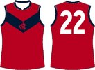
Melbourne need to bring back a mostly red clash option when playing teams like the Bulldogs and Eagles.
A simple red with the blue yoke would be best but there is potential for something else cool.
A simple red with the blue yoke would be best but there is potential for something else cool.
- Joined
- Jun 23, 2021
- Posts
- 2,874
- Reaction score
- 3,208
- AFL Club
- Melbourne
- Other Teams
- LA dodgers LA Kings Melbourne Aces
I agreeMelbourne need to bring back a mostly red clash option when playing teams like the Bulldogs and Eagles.
A simple red with the blue yoke would be best but there is potential for something else cool.
Log in to remove this Banner Ad
- Joined
- Jun 23, 2021
- Posts
- 2,874
- Reaction score
- 3,208
- AFL Club
- Melbourne
- Other Teams
- LA dodgers LA Kings Melbourne Aces
- Joined
- Mar 30, 2014
- Posts
- 3,095
- Reaction score
- 5,305
- AFL Club
- Brisbane Lions

- Other Teams
- Dolphins, Seattle Kraken
I would say you get close to Fitzroy-esque which is probably what they're trying to avoid.Melbourne need to bring back a mostly red clash option when playing teams like the Bulldogs and Eagles.
A simple red with the blue yoke would be best but there is potential for something else cool.
Supercheapgiants
I'm Blue
That first one is elite
Liam Boy
Brownlow Medallist
- Joined
- Oct 12, 2008
- Posts
- 10,936
- Reaction score
- 27,263
- Location
- The Gasometer
- AFL Club
- North Melbourne
always liked the original but I thought it'd look better if the semicircle thing connected, the stripes were pale blue instead of grey, and there were stripes on the back. I've posted similar versions before but this is on the new templateThat first one is elite
pattymalone00
Club Legend
- Joined
- Dec 6, 2021
- Posts
- 1,923
- Reaction score
- 3,633
- Location
- Melbourne, Victoria
- AFL Club
- Hawthorn
- Other Teams
- Utah Jazz (nba)
Always wanted to see this with a yellow front but maybe the could do an all brown or blackwith a brown and yellow hawk outline (or all brown) version of this…. Maybe next year for gather round


- Joined
- Dec 18, 2014
- Posts
- 5,116
- Reaction score
- 15,457
- Location
- Miami
- AFL Club
- North Melbourne
- Other Teams
- Galactic Empire, Tottenham
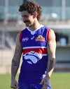
Bulldogs really should just go back to their 2016 premiership guernsey, which is the best uniform they ever had with the all blue collars and cuffs. View attachment 1654728
I think some variation of the Robodog would do fine.
- Joined
- Dec 18, 2014
- Posts
- 5,116
- Reaction score
- 15,457
- Location
- Miami
- AFL Club
- North Melbourne
- Other Teams
- Galactic Empire, Tottenham
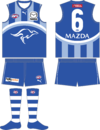
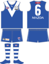
Have a feeling that the 2nd option will be worn in 2025 against Geelong to mark our 100th Season in the VFL (1st game and win against Geelong).
- Joined
- Apr 5, 2016
- Posts
- 9,890
- Reaction score
- 23,620
- AFL Club
- Western Bulldogs
- Other Teams
- Boston Celtics
Pls no.
- Joined
- Sep 30, 2015
- Posts
- 4,801
- Reaction score
- 6,832
- AFL Club
- West Coast
I use to think The Western Bulldogs had the worst looking guernseys like that one, until they switched back to their 1954/2016 premiership design. The 2015-2016 variation is their best design.
- Joined
- May 11, 2008
- Posts
- 4,716
- Reaction score
- 2,462
- AFL Club
- Essendon
I disagree completely. Red collar and cuffs was far better. I would like to see a version with a red collar and blue cuffs though.Bulldogs really should just go back to their 2016 premiership guernsey, which is the best uniform they ever had with the all blue collars and cuffs. View attachment 1654728
- Joined
- Mar 30, 2014
- Posts
- 3,095
- Reaction score
- 5,305
- AFL Club
- Brisbane Lions

- Other Teams
- Dolphins, Seattle Kraken
At least both of your preferences aren't the horrible toilet seat that it currently isI disagree completely. Red collar and cuffs was far better. I would like to see a version with a red collar and blue cuffs though.
- Joined
- Jan 3, 2017
- Posts
- 5,298
- Reaction score
- 7,411
- AFL Club
- Collingwood
- Other Teams
- Celtics, Packers
Dirty Bird
Pokémon Master
- Joined
- Aug 1, 2010
- Posts
- 36,393
- Reaction score
- 23,919
- Location
- Adelaide
- AFL Club
- Adelaide
- Other Teams
- #BostonStrong #RiseUp
Half time of adelaide-carlton and I'm watching the auskickers.
On the near side, there's enough yellow/red to avoid a clash of both teams in home kits+blue shorts.
Buy on the far side it's a clash. I wonder what it'd look like with yellow or red shorts. Is there enough "light" to make ot an adequate strip?
It's what I've always thought about ports "prison bar" strip. There's enough white in it that the shorts changes the base and is an adequate clash (only reason I'm against it is their attitude (sense of entitlement and "give an inch they'll take a mile"))
Just wondering if we can see crows home kit with yellow or red shorts. I feel it can work. (Especially yellow)
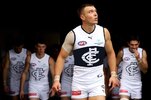
Have Carlton ever considered using cream instead of white for their clash?
If I’m not mistaken, it’s a colour used in their history and would be more interesting than the all white kit.
If I’m not mistaken, it’s a colour used in their history and would be more interesting than the all white kit.
🥰 Love BigFooty? Join now for free.
Andonis1997
Sporting masochist
- Joined
- Jun 24, 2011
- Posts
- 26,671
- Reaction score
- 17,342
- Location
- Adelaide
- AFL Club
- Carlton
- Other Teams
- ΠΓΣΣ LFC Sturt Steelers Nix
The chamois used for our guernseys back in the day were meant to be white but ended up cream.Have Carlton ever considered using cream instead of white for their clash?
If I’m not mistaken, it’s a colour used in their history and would be more interesting than the all white kit.
That being said, we made the yokes on our heritage guernseys yellow, so I'd consider cream to be a colour loosely connected to the team.
- Joined
- Oct 30, 2014
- Posts
- 5,405
- Reaction score
- 11,371
- AFL Club
- Western Bulldogs
I’ve thought for years that Melbourne and Bulldogs should be in similar to Grand Final match up, every game they play home or away. Melbourne in dark blue guernsey, shorts and dark blue socks. Bulldogs royal blue guernsey, white shorts, normal socks. Melbourne’s compromise dark socks, bulldogs white shorts and wear this always, everyone wins. When it’s a bulldogs home game it becomes a mess with Demons in white shorts.I agree
- Joined
- Sep 30, 2015
- Posts
- 4,801
- Reaction score
- 6,832
- AFL Club
- West Coast
There's uniformity, when it's all blue. The contrasting red looks distracting and unfitting, almost cheaper looking.I disagree completely. Red collar and cuffs was far better. I would like to see a version with a red collar and blue cuffs though.
- Joined
- Oct 27, 2016
- Posts
- 6,135
- Reaction score
- 11,298
- AFL Club
- Collingwood
- Other Teams
- Packers, Raptors, Renegades
MooreTreloar
Premiership Player
- Joined
- Apr 2, 2014
- Posts
- 4,090
- Reaction score
- 6,525
- AFL Club
- Collingwood
- Other Teams
- Rams, Raptors, Leafs, Blue Jays
Does anyone know how long Collingwood’s contract with Nike is?
Swooping_Magpie
it's swooping season
- Joined
- May 16, 2021
- Posts
- 599
- Reaction score
- 1,027
- Location
- Victoria Park
- AFL Club
- Collingwood
- Other Teams
- Liverpool, SM Hellas
- Thread starter
- #50
done a little bit of digging and the only thing i could find is that it's a 'long term deal'Does anyone know how long Collingwood’s contract with Nike is?
- Status
- Not open for further replies.


