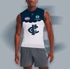
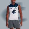
Workshop Jumper Ideas For 2024

Remove this Banner Ad

Status
Not open for further replies.
nice
can you please do a version with the monogram here?
1700101654880.png
 

Log in to remove this ad.


I appreciate the thought that goes into it, but to be honest all they needed to do was navy on white, with navy collar and cuffs. Don't overcomplicate it, Baggers :(
I think the yoke concept works really well but the heritage aspect not so much. Just bring the navy below the logos and push the monogram down. Navy cuffs and collar are absolutely essential though. Looks much cleaner than white.
 
I think the yoke concept works really well but the heritage aspect not so much. Just bring the navy below the logos and push the monogram down. Navy cuffs and collar are absolutely essential though. Looks much cleaner than white.
Yeah but even then, the yoke isn't really "Carlton" - that's why it sticks the landing i think, moreso than the yoke height
 
Yeah but even then, the yoke isn't really "Carlton" - that's why it sticks the landing i think, moreso than the yoke height
The yoke isn't Carlton but it's an easy and clean way to get more navy into a jumper without creating a clash
 
I appreciate the thought that goes into it, but to be honest all they needed to do was navy on white, with navy collar and cuffs. Don't overcomplicate it, Baggers :(
Oh 100% - I love the inverse guernseys and would prefer a straight inverse over my designs, I'd say 😜 I'm just offering alternatives to what they could have done with the 2024 guernsey, 'tis all 🙂
 

(Log in to remove this ad.)

There was something about the colour of the indigenous jumper this year that seemed to work against the Pies. Ideally they'd take inspiration from that for a baby blue concept. Would be interested if someone colour swatched the indigenous and compared it to the above - or maybe it's the combination of different blues that works.

images (85).jpeg images (86).jpeg
 
I wish Richmond would do something a bit crazy and have a throwback or a new design for gather round. Not just because I'm a collector, but it would be cool to have something left of field.

I know purist would complain but one day without the sash isn't going to kill anyone.
 
I wish Richmond would do something a bit crazy and have a throwback or a new design for gather round. Not just because I'm a collector, but it would be cool to have something left of field.

I know purist would complain but one day without the sash isn't going to kill anyone.
Biggest issue for the Tiges i think is that they have had so few unique designs in their time (exlcuding pre-season). Vertical stripes, the vfa kit and then sash. The sash has changed its mind about whether or not it's straight or not, but other than that they really done anything unique. On to a new design for GR, I say!
 
That monogram would make such a great club logo and design element on a Suns jumper. But because the AFL owns Gold Coast and can never admit to an error, it is probably unlikely that they would get rid of the current logo or bring back the brilliant wave design, given the AFL didn't want that to be the home jumper when it was first introduced.
 
Almost need to post this in 2025 already, Lions disappointed with the 2024 kits with the yellow cuffs on the away again, but our kits are still very strong. Here are some simple changes I would make.

View attachment 1870753

I would do the line that wraps around the jumper from the footy like it was on the 1987 to 1991 Bears Jumper for the alternative.
 
Status
Not open for further replies.

Remove this Banner Ad

Back
Top