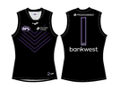
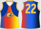
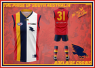
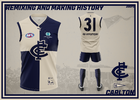
Workshop Jumper Ideas For 2024

Remove this Banner Ad

Status
Not open for further replies.
I reckon the compromise for a red strip is to wear a version of the 1898-1900 VFA era jumper as an alternative strip (Shown on the below).
Unlike the red hoops which saw us go 0-5 when wearing it, we won 3 VFA flags in it. (Also these aren't all my preference but it seems like ASICS changes our jumpers every two seasons so I hung onto this season's clash but moved the hoops a tad higher so the blue doesn't fold up and go missing at the bottom). I also think they should change the F.F.C. outline to the old dog holding a flag with F.F.C. on it.

View attachment 1675035
Love it. And I’ve always thought the FFC flag in dogs mouth was the best logo, same stout bulldog used in first 1970’s VFL shields logos.
 

Log in to remove this ad.

I believe 3 or 4 years. I heard one AFL store said they aren’t getting anymore Collingwood guernseys in because Nike aren’t making anymore.

I highly doubt we will continue with them.

The best choice going forward would be Puma
 
I believe 3 or 4 years. I heard one AFL store said they aren’t getting anymore Collingwood guernseys in because Nike aren’t making anymore.

I highly doubt we will continue with them.

That'd be great if we ditched Nike. They must be getting some new stock in as I got the indigenous jumper from there last night. Guess they’ll be getting some of special jumpers in.
 
It's a no brainer

Brings in $$$$

Why do you think World Football teams change kit each season? $$$$$$$$$$$$$
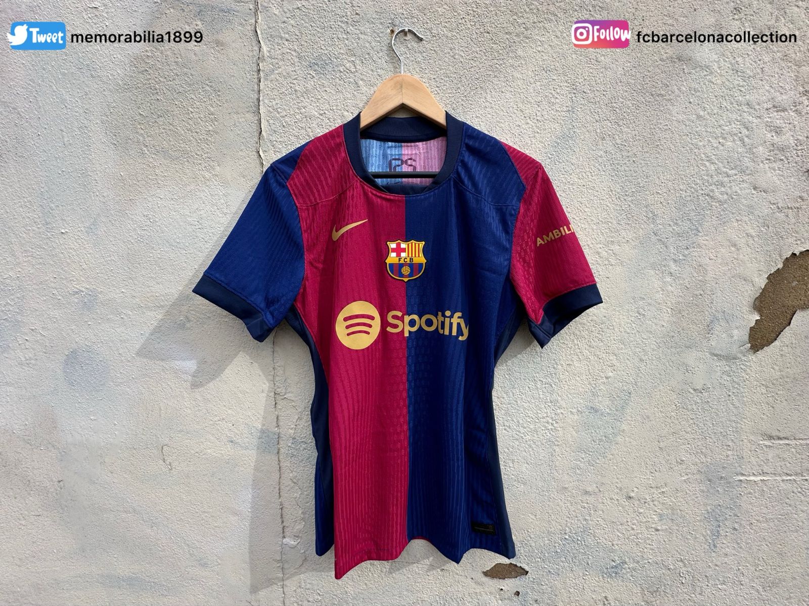
obviously but afl teams are less hesitant to change their kits like soccer teams. only have to look at barcelonas kits for example. the biggest changes essendon made to their jumper in 20 years was red piping in the collar and a curved sash.


barcelonas kit from each year look like they could represent a different team

Fair point but i am talking about fans wanting the new design each season

NRL have 4 or 5 these days
 

(Log in to remove this ad.)

Fair point but i am talking about fans wanting the new design each season

NRL have 4 or 5 these days
fair point also.

i would love to see the jumpers do like a crossover with the nrl9s jumpers they used to do. as long as they don’t go over the top(looking at you canterbury). could make the round a little more special
 
For a club in much need of a different and unique alternative strip.

Love the colour scheme. Reckon that colour and then a giant navy C over the front of the kit (can't remember who did the design a while ago with a white C on navy) but it would look mint with that colour
 
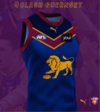
Initially designed this last year as a clash guernsey but thought this would be better suited being worn exclusively for both Qclash fixtures against Gold Coast.

Maroon shorts worn at the home game at the Gabba and white shorts for the game at Metricon / Heritage Bank Stadium. 20230521_215612.png
 
Initially designed this last year as a clash guernsey but thought this would be better suited being worn exclusively for both Qclash fixtures against Gold Coast.

Maroon shorts worn at the home game at the Gabba and white shorts for the game at Metricon / Heritage Bank Stadium.View attachment 1693446
👍Blue shorts home and away and we can wear our red with red shorts.
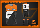
 
How much better does the SUNS jumper look without yellow side panels and that stupid yellow half circle on back collar
If you were a reaaaal suns supporter, you'd know the half circle was taken off the regular kits last yearrrrrr
 
Status
Not open for further replies.

Remove this Banner Ad

Back
Top