- Joined
- May 7, 2013
- Posts
- 3,534
- Reaction score
- 3,729
- Location
- Sydney
- AFL Club
- Sydney
- Other Teams
- Too many
The NRL has been asking/demanding/pushing clubs to rebrand their logos to something less complex for better digital display. This has been ongoing for the past few seasons and played a part in Wests Tigers and the Gold Coast Titans rebranding and is clearly visible here:

If you inspect the images, they are listed as "basic24" variants which only began appearing this season. You'll notice that most of the other teams' logos have been adapted to a similar format, without shields or badges, which is especially noticeable on the Bulldogs, Cowboys, Dragons and Eels, for example.
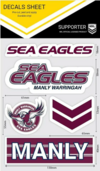
The text of the Manly logo actually matches some of their long term merchandise, using the Han(d/z)el font:

I also like that they've made the eagle face "forward" rather than "backward" as it did in the previous logo (and the 1998-99 variant).
Only change I might have preferred in the current logo would have been the retention of a shade of grey for the eagle's head to create a "shading" effect for emphasis. Other than that, for a mono logo, I think it's pretty good and retains a visual link to the previous logo in its overall aesthetic.
Don't be surprised to see other clubs rebranding over the next couple of years: Dragons, Sharks, Warriors and Roosters are the current "outliers" in my opinion and will likely see at least some reworking as the NRL continues to roll out its new strategy.


