Remove this Banner Ad

Discussion Logo Discussion Thread

  • Thread starter Thread starter akkaps
  • Start date Start date
  • Tagged users Tagged users None

🥰 Love BigFooty? Join now for free.

tennis ball is wrong colour - looks yellow


Ah that ol' debate.

FWIW this is my view.

Yellow at first.
Green when constantly used.
 
29064640_1669593696465230_8598812227887992522_o.jpg
 
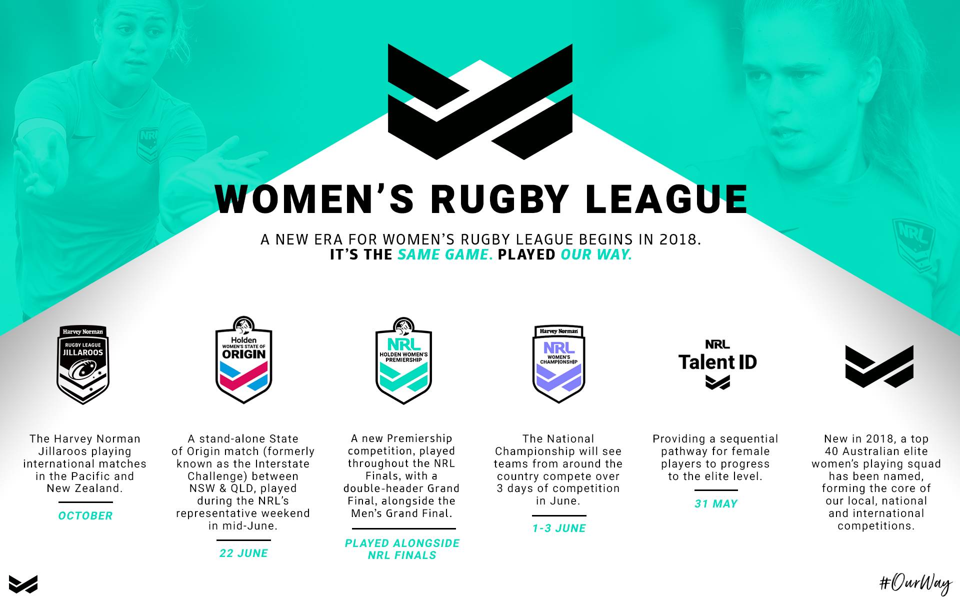
That's a really cool logo. Fits in with the universal logo setup they use and stands alone by itself well. A nice way of making it a W too, not like the weird abstract direction the AFL went in.
 

Log in to remove this Banner Ad

Remove this Banner Ad

Got bored and threw this concept for a new crows logo together in paint, using the left-hand side of the Adelaide United shield logo for the shield, the we fly as one logo for the crow and the Adelaide footy club text from the shield on the 2006 & 07 heritage jumpers:

Adelaide FC logo.png
 

🥰 Love BigFooty? Join now for free.

This might have been asked or even be the wrong place but has anyone seen/got hold of the 2018 AFL brand book/guide thing?
I tried.
Apparently "Design work" wasn't a good enough reason for them to send it to me :rolleyes: :D
 

Remove this Banner Ad

Remove this Banner Ad

🥰 Love BigFooty? Join now for free.

Back
Top Bottom