


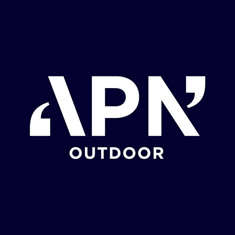
Why is every major corporate going to sans-serif single line logos? I've seen a tweet hanging around somewhere about the sanitisation of corporate logos lately. It sucksBefore.

After.

New logo.

Navigation
Install the app
How to install the app on iOS
Follow along with the video below to see how to install our site as a web app on your home screen.
Note: This feature may not be available in some browsers.
More options
Style variation
-
 BigFooty Tipping Notice Img
Weekly Prize - Join Any Time - Tip Round 13
The Golden Ticket - Corporate tickets, functions, Open Air Boxes at the Adelaide Oval, ENGIE, Gabba, MCG, Marvel, Optus & People First Stadiums. Corporate Suites at the Gabba, MCG and Marvel.
12 Winner: gab213
-
Witness 32 nations clash in your Graphic Design boards biggest competition yet: The 2026 FJGD World Cup!
You are using an out of date browser. It may not display this or other websites correctly.
You should upgrade or use an alternative browser.
You should upgrade or use an alternative browser.
Discussion Logo Discussion Thread
- Thread starter akkaps
- Start date
- Tagged users None
🥰 Love BigFooty? Join now for free.
RedmanWasHere
Rarely in kitchens at parties.
- Joined
- Aug 23, 2010
- Posts
- 31,116
- Reaction score
- 38,523
- Location
- Information Superhighway
- AFL Club
- Essendon
- Other Teams
- Exers, Gryffindor, Rich+Ess AFLW, Tassie
The logos.
They keep on dropping.
HSBC have gone down the Pinterest route.
Before.

After.

They keep on dropping.
HSBC have gone down the Pinterest route.
Before.
After.
RedmanWasHere
Rarely in kitchens at parties.
- Joined
- Aug 23, 2010
- Posts
- 31,116
- Reaction score
- 38,523
- Location
- Information Superhighway
- AFL Club
- Essendon
- Other Teams
- Exers, Gryffindor, Rich+Ess AFLW, Tassie
Before.

After.
After.
- Joined
- Oct 13, 2015
- Posts
- 11,629
- Reaction score
- 17,164
- Location
- Brisbane
- AFL Club
- Melbourne
- Other Teams
- Blackhawks, 76ers
Keep an eye out for a DFO rebrand in the coming months
Log in to remove this Banner Ad
RedmanWasHere
Rarely in kitchens at parties.
- Joined
- Aug 23, 2010
- Posts
- 31,116
- Reaction score
- 38,523
- Location
- Information Superhighway
- AFL Club
- Essendon
- Other Teams
- Exers, Gryffindor, Rich+Ess AFLW, Tassie
Keep an eye out for a DFO rebrand in the coming months
And, according to Under Consideration's branch Brand New, Volkswagen too.
- Joined
- Apr 23, 2012
- Posts
- 7,483
- Reaction score
- 5,428
- Location
- The Riff
- AFL Club
- GWS
- Other Teams
- Sydney Swans, St Kilda Saints
Is it this?Keep an eye out for a DFO rebrand in the coming months

- Joined
- Oct 13, 2015
- Posts
- 11,629
- Reaction score
- 17,164
- Location
- Brisbane
- AFL Club
- Melbourne
- Other Teams
- Blackhawks, 76ers
Yep thats it. They've gone part of the way with changing their previous logo to black and white alreadyIs it this?
View attachment 485879
- Joined
- Apr 23, 2012
- Posts
- 7,483
- Reaction score
- 5,428
- Location
- The Riff
- AFL Club
- GWS
- Other Teams
- Sydney Swans, St Kilda Saints
A quick google search produced this. It’s for our Homebush site showing all the new signs and where they goYep thats it. They've gone part of the way with changing their previous logo to black and white already
https://www.strathfield.nsw.gov.au/...A2018.013-Plans-1-5-Underwood-Rd-Homebush.pdf
RedmanWasHere
Rarely in kitchens at parties.
- Joined
- Aug 23, 2010
- Posts
- 31,116
- Reaction score
- 38,523
- Location
- Information Superhighway
- AFL Club
- Essendon
- Other Teams
- Exers, Gryffindor, Rich+Ess AFLW, Tassie
It's gone from standing out and having its own colour scheme to just another bloody dull B&W existence.
Not one bit of the new logo is uniquely DFO.
Could've kept the bags as its logo like TVSN which switched from a single bag logo to a 4 bag multi-colour job.
YUCK!
Not one bit of the new logo is uniquely DFO.
Could've kept the bags as its logo like TVSN which switched from a single bag logo to a 4 bag multi-colour job.
YUCK!
- Joined
- Oct 13, 2015
- Posts
- 11,629
- Reaction score
- 17,164
- Location
- Brisbane
- AFL Club
- Melbourne
- Other Teams
- Blackhawks, 76ers
Welcome to "Current Trends" ... if you aren't flattening, simplifying and muting, are you even rebranding?It's gone from standing out and having its own colour scheme to just another bloody dull B&W existence.
Not one bit of the new logo is uniquely DFO.
Could've kept the bags as its logo like TVSN which switched from a single bag logo to a 4 bag multi-colour job.
YUCK!
- Joined
- Sep 19, 2007
- Posts
- 19,595
- Reaction score
- 18,328
- Location
- Mornington Peninsula
- AFL Club
- St Kilda
- Other Teams
- Anaheim Ducks, PSV Eindhoven
FFS at least have the icon and text the same size!The logos.
They keep on dropping.
HSBC have gone down the Pinterest route.
Before.
After.
RedmanWasHere
Rarely in kitchens at parties.
- Joined
- Aug 23, 2010
- Posts
- 31,116
- Reaction score
- 38,523
- Location
- Information Superhighway
- AFL Club
- Essendon
- Other Teams
- Exers, Gryffindor, Rich+Ess AFLW, Tassie
FFS at least have the icon and text the same size!
Level that at HSBC and not me.
- Joined
- Sep 19, 2007
- Posts
- 19,595
- Reaction score
- 18,328
- Location
- Mornington Peninsula
- AFL Club
- St Kilda
- Other Teams
- Anaheim Ducks, PSV Eindhoven
It was.Level that at HSBC and not me.
RedmanWasHere
Rarely in kitchens at parties.
- Joined
- Aug 23, 2010
- Posts
- 31,116
- Reaction score
- 38,523
- Location
- Information Superhighway
- AFL Club
- Essendon
- Other Teams
- Exers, Gryffindor, Rich+Ess AFLW, Tassie
It was.

Phew!
That's a relief
I'd want there to be consistency with sizes too but logo designers don't think that way.
- Joined
- Sep 19, 2007
- Posts
- 19,595
- Reaction score
- 18,328
- Location
- Mornington Peninsula
- AFL Club
- St Kilda
- Other Teams
- Anaheim Ducks, PSV Eindhoven
If the HSBC was under the icon it would look right but the horizontal placing just doesn't work with the mismatched heights.
Phew!
That's a relief
I'd want there to be consistency with sizes too but logo designers don't think that way.
RedmanWasHere
Rarely in kitchens at parties.
- Joined
- Aug 23, 2010
- Posts
- 31,116
- Reaction score
- 38,523
- Location
- Information Superhighway
- AFL Club
- Essendon
- Other Teams
- Exers, Gryffindor, Rich+Ess AFLW, Tassie
If the HSBC was under the icon it would look right but the horizontal placing just doesn't work with the mismatched heights.
I agree with you there that it needs to be stacked.
Michael Scarn
Club Legend
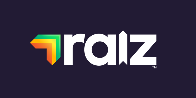
Acorns in Aus is now Raiz
RedmanWasHere
Rarely in kitchens at parties.
- Joined
- Aug 23, 2010
- Posts
- 31,116
- Reaction score
- 38,523
- Location
- Information Superhighway
- AFL Club
- Essendon
- Other Teams
- Exers, Gryffindor, Rich+Ess AFLW, Tassie
Original.

Before.

After.
Before.
After.
🥰 Love BigFooty? Join now for free.
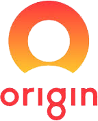
Red and yellow, and the number eight?? Chinese design 101.ori8in?
- Joined
- Jun 6, 2013
- Posts
- 849
- Reaction score
- 1,116
- AFL Club
- West Coast
This looks like it was designed for Sunrise and then re-purposed for Origin.
- Joined
- Oct 27, 2016
- Posts
- 6,135
- Reaction score
- 11,298
- AFL Club
- Collingwood
- Other Teams
- Packers, Raptors, Renegades
Even Collingwood's logo has more than just black and white in it, why cant DFO express some kind of personality.It's gone from standing out and having its own colour scheme to just another bloody dull B&W existence.
- Joined
- Sep 19, 2007
- Posts
- 19,595
- Reaction score
- 18,328
- Location
- Mornington Peninsula
- AFL Club
- St Kilda
- Other Teams
- Anaheim Ducks, PSV Eindhoven
Does DFO really need to express personality though isn't that the brands insides job?Even Collingwood's logo has more than just black and white in it, why cant DFO express some kind of personality.
RedmanWasHere
Rarely in kitchens at parties.
- Joined
- Aug 23, 2010
- Posts
- 31,116
- Reaction score
- 38,523
- Location
- Information Superhighway
- AFL Club
- Essendon
- Other Teams
- Exers, Gryffindor, Rich+Ess AFLW, Tassie
Only positive for me is I don't like that sort of shopping so I'm spared from being bombarded by it.
RedmanWasHere
Rarely in kitchens at parties.
- Joined
- Aug 23, 2010
- Posts
- 31,116
- Reaction score
- 38,523
- Location
- Information Superhighway
- AFL Club
- Essendon
- Other Teams
- Exers, Gryffindor, Rich+Ess AFLW, Tassie
Then.

Before.

After.

And that's where the AMF name ends in Australia.
This is what it'll be known as now.

Kept the same colours but lightened the colours and repositioned the triangle.
Before.
After.
And that's where the AMF name ends in Australia.
This is what it'll be known as now.
Kept the same colours but lightened the colours and repositioned the triangle.
