Jack Stevens
#2 Ticket Holder
Did craegus design this?Logo for the new Canadian Premier League

Follow along with the video below to see how to install our site as a web app on your home screen.
Note: This feature may not be available in some browsers.

 BigFooty Tipping Notice Img
Weekly Prize - Join Any Time - Tip Round 13
The Golden Ticket - Corporate tickets, functions, Open Air Boxes at the Adelaide Oval, ENGIE, Gabba, MCG, Marvel, Optus & People First Stadiums. Corporate Suites at the Gabba, MCG and Marvel.
Did craegus design this?Logo for the new Canadian Premier League
Did craegus design this?

Do what you do best. Sue themWell it does have shapes I am using in a current logo, and it is in my former brand colours.
")
Do what you do best. Sue them

Log in to remove this Banner Ad
new Carlton sponsor confirmedView attachment 491810
new Balfours logo
...*bites tongue*Nah I only do that to people who try to use my work to try and elevate their own brand.
...*bites tongue*


An American retailer's changed its logo after so many years.
and bega, and perfect italiano and mainland and woolworths select cheese & aldi butterThis is the company that makes the cheese for the McDonalds burgers. Yummo! (not)

I like your effort, but I really like Sydney's logo and I think there's is untouchable and never to be changed.View attachment 498930
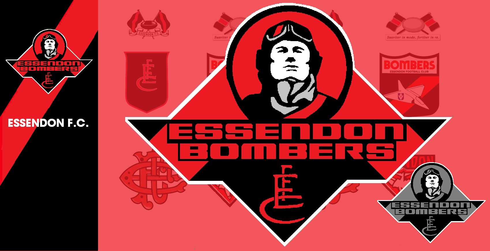
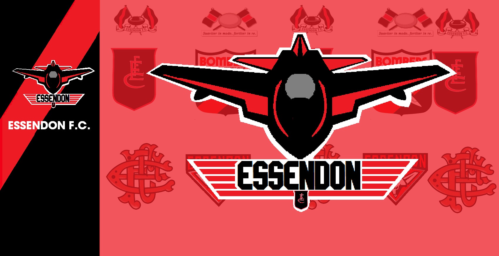
Had an epiphany today and decided to do a quick mock-up of a swans logo. It's sorta in the style of Geelong and Hawthorn's logo when they re did theirs. I quite like their current one but I think it needs a bit of modernizing. Might have a see if I can do a Bombers one next.
Yeah it's certainly better than others of that period. I may be one of a few who think this but I think the Bombers logo is in desperate need of a makeover.I like your effort, but I really like Sydney's logo and I think there's is untouchable and never to be changed.
I would agree with you there and have thought the bombers need one too. However they do have a pretty good logo, it's dated but not overly. I would say they should go through the process of seeing what they can get.Yeah it's certainly better than others of that period. I may be one of a few who think this but I think the Bombers logo is in desperate need of a makeover.
This is better, but what would it look like if the opera house was just thick outline cutting through a full red V?Another version which is a bit more minimalist but stays truer to the old logo.
View attachment 499257


Looks great to me, a nice point of difference from the overly corporate looks of Coles and Woolies.While the logo hasn't changed, the branding of IGA will change.
Just a smattering of the new IGA branding template.
Old.
New and, by far, the yuckiest of the lot.
Yep, colour replaced by fire pit designs.
Under Consideration's Brand New's take on the above.
https://www.underconsideration.com/..._logos_and_identity_for_iga_by_interbrand.php.