RedmanWasHere
Rarely in kitchens at parties.
- Joined
- Aug 23, 2010
- Posts
- 31,103
- Reaction score
- 38,508
- Location
- Information Superhighway
- AFL Club
- Essendon
- Other Teams
- Exers, Gryffindor, Rich+Ess AFLW, Tassie
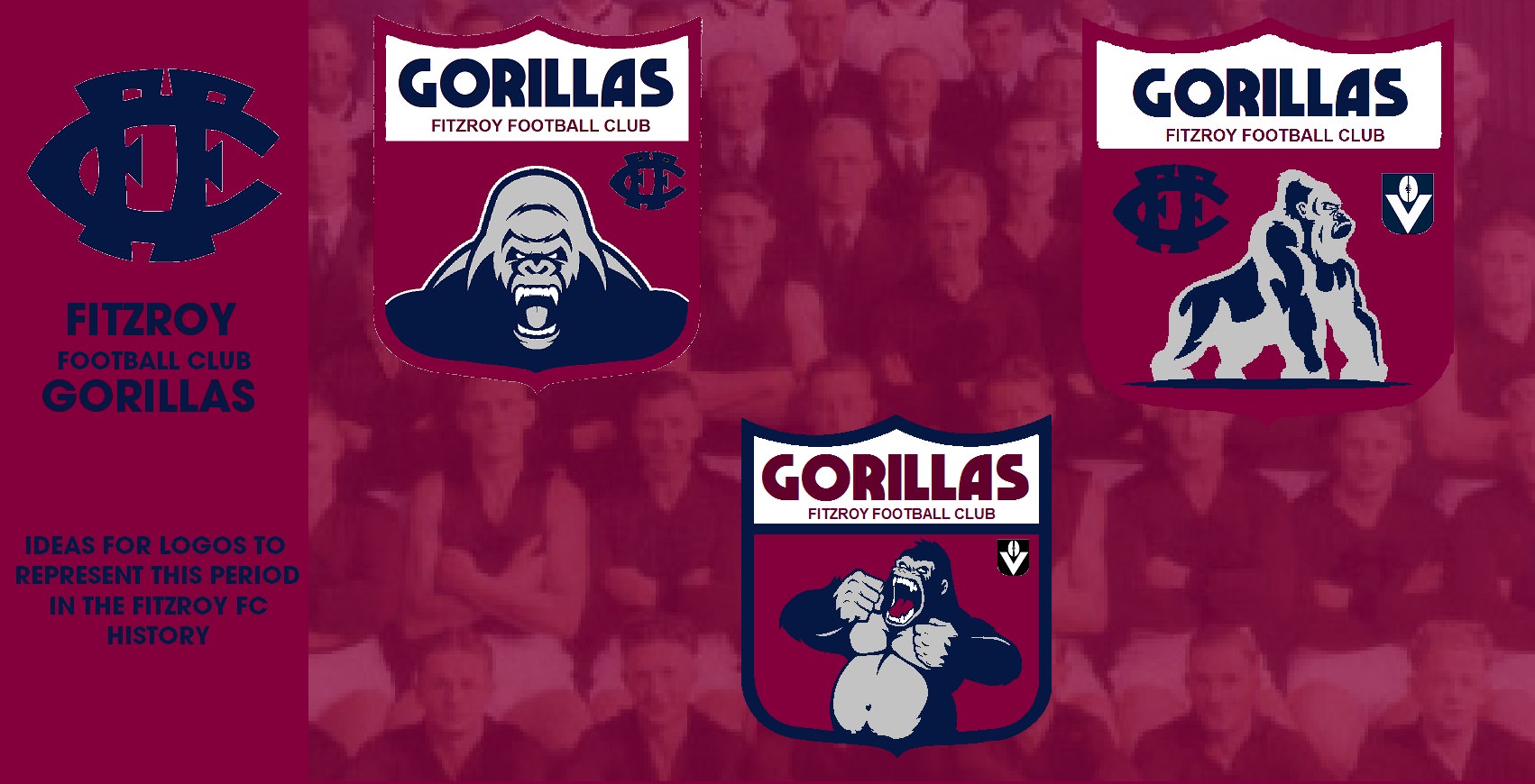
Top left my favourite but top right looks traditional.


.jpeg")
 ) and Ill post up the results!
 ")


")