Port Adelaide Pirates?

Remove this Banner Ad

Aspects of our brand identity that we definitely got wrong:
— Guernsey designs (now rectified)
— Teal colour hue (now rectified)
— Port Power (officially rectified but still used colloquially)
— est 1996 (biggest stuff up bar none)

Me personally, I don't have an issue with the nickname Power and I think Thunda Power is one of the better mascots in the AFL.

When we started we had too many consultants thing of the "hear and now". Unfortunately, as we have seen, gimmicky and novel fads date very quickly.

We need to continue to fix our branding to something that is timeless.

The changes we have done to date have improved our image. Let's keep up the good work and address our logo, nickname (or not) and song.
 
Power works for me....unless someone puts Port in front of it....Pirates just can not see an Australian connection there ...Mutineers maybe courtesy of the Bounty...although with our swamp background that's fairly certain to become mutants rather than Mutineers ....don't mind Sharks.
 
Power works for me....unless someone puts Port in front of it....Pirates just can not see an Australian connection there ...Mutineers maybe courtesy of the Bounty...although with our swamp background that's fairly certain to become mutants rather than Mutineers ....don't mind Sharks.

Port Adelaide Scurvy and 'SCURVY' is in italics with flames coming off it and multiple gradients.
 

Log in to remove this ad.

If lightning is good enough for them, it's good enough for us

AC-DC%20-%20Logo_002.jpg
 
When we started we had too many consultants think of the "here and now". Unfortunately, as we have seen, gimmicky and novel fads date very quickly.

The thing is though, it wasn't the consultants. (I know several people involved in the process, including board members and external consultants who worked on various aspects of the branding.) The problem wasn't with using consultants, it was not choosing the right consultants an the jobs for the boys approach that they took.

I'd even go so far as to say that if the club had listened to the people who were experts in their respective fields, instead of the guys that had a link to the club, they would have made far less mistakes.

We need to continue to fix our branding to something that is timeless.

I know what you're saying but doesn't the fact that you're wanting to change something to be timeless seem contradictory to you? "Timelessness" is a perception of something based on the fact that it hasn't changed for a long time. It's not something that can just be whipped up and every attempt to make something 'timeless' actually hinders any effort to attain it.

The changes we have done to date have improved our image. Let's keep up the good work and address our logo, nickname (or not) and song.


I agree with the first sentence, but on the second, I think the issues with our logo and song are overblown.


Someone mentioned that we need a crest but this is not something that can be created anew. A faux crest would be one of the worst things we could do.

Ideally, you'd need someone to audit the entire history of PAFC, reviewing all of the various logos, guernseys etc that were used and hope that you find something that resonates and resurrect it.

The other way is to head down the Fremantle path and design a completely new and modern looking brand identity but this would counteract the good work with linking back to our pre-AFL history.
 
Rucci mistakenly thinks that trying to revive this whole rebranding debate sells papers.

..... The reason we get called Port Power, or Power, at times, is because it's simply shorter and easier to say then Port Adelaide. ......
Nothing at all wrong with the latter.
 
Here's my opinion:

1. Pirates is not any better than Power.

2. Pirates does not have any link to our history. The argument that it relates to the maritime history of the Port region is even more spurious than the Port Adelaide Power banner link.

3. Pirates is even more of an "american-ism" than Power.

Also, the 'ponytailed branding consultant' that keeps getting brought up in regards to the mistakes we made with our identity was in fact one of our early board members. The vast majority of the decisions about our brand identity when shifting to the AFL was made by the board, not an external consultant, which included the name and the colour. (I know that one external consultant was adamant about NOT including "Port" atop the word Power in our logo but as overruled by the board.)

The colour was adjusted along the way based on market research, heading from a green teal to the blue teal that we have today. Not such a big issue in isolation but is added to the "we screwed everything up" argument to make it seem worse than it is.

Aspects of our brand identity that we definitely got wrong:
— Guernsey designs (now rectified)
— Teal colour hue (now rectified)
— Port Power (officially rectified but still used colloquially)
— est 1996 (biggest stuff up bar none)

Me personally, I don't have an issue with the nickname Power and I think Thunda Power is one of the better mascots in the AFL.


THIS GUY!!! Finally a great post to lock this thread on.

Saying we should change from the power to some random nickname is ridiculous. If we change it should be to the PAFC or the Magpies. Neither will happen.
 
Ideally, you'd need someone to audit the entire history of PAFC, reviewing all of the various logos, guernseys etc that were used and hope that you find something that resonates and resurrect it.

I've already done this... see the following.
2ugor2c.jpg

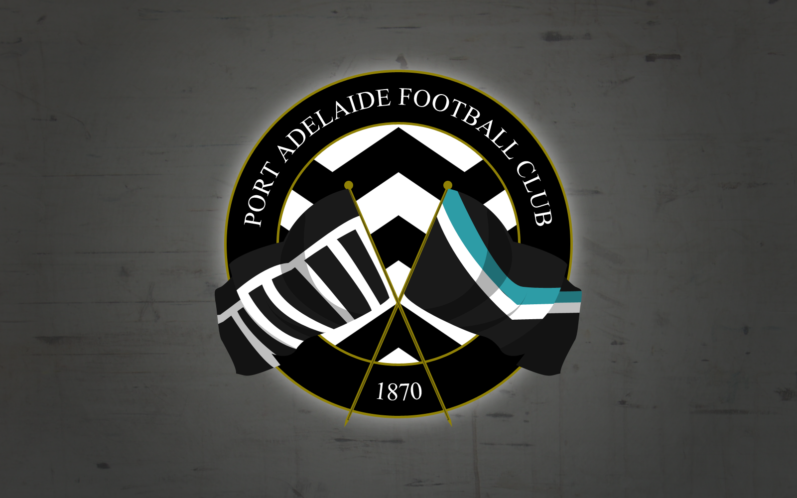
This crest/logo has multiple elements to it.

Port_logo.gif

Firstly, it's circular shape comes from the old Magpie logo we've been wearing since the 1970's and has been our logo for even longer before that.

oldlogo_zps063c8689.jpg

The flags come from this logo from 1910 I think.

The design in the inner circle is from Black Diamond Corner, which is uniquely Port Adelaide. The gold, of course, represents our winning culture and dominance dating back to 1870.

There are many other logos and crests that we've had, but none that were actually used in an official capacity, and it would have been odd to use them as inspiration.
 

(Log in to remove this ad.)

Port Adelaide = Good
Power = bad
Logo = actually good
Guernsey = fantastic

Simply change Power on logo to Port and stop referring to ourselves as Power, let others do do but make it unofficial.
 
Don't have the displacement map or whatever you've used on the flags Stormy. It doesn't work as well on a logo. Other than that I quite like it!

Displacement map? Nah i'm not that good at photoshop. Pen tool!
 
Would make it fun when Harrrrrrrrtlett and Wingarrrrrrrrrrrd play well. It would have been better when Josh Carrrrrrrrrrrr was still playing.
 
Port Adelaide Blacks?


haha and our team song could finish with

the blacks, the blacks
the blacks are fit,
the blacks, the blacks
the blacks suck piss.
 
Power is perfect, and always has been. What we have is class. Logo is strong and iconic and our guernsey's shouldn't be tampered with ever again. Love our song, too. Don't understand any negativity tbh.
 
Power is perfect, and always has been. What we have is class. Logo is strong and iconic and our guernsey's shouldn't be tampered with ever again. Love our song, too. Don't understand any negativity tbh.

nah the song is the weak link..its bad..i like the traditional songs like the old mapies one, bombers fly up, tiger land..we should get one like that.
 
nah the song is the weak link..its bad..i like the traditional songs like the old mapies one, bombers fly up, tiger land..we should get one like that.

Our song is fine, especially the often unsung verses. The only thing that needs to change is:
"We'll never stop, stop, stop til we're top, top, top" to "We'll never stop, stop, stop when we're top, top, top"
and
"We'll never give in til the flag is ours for the taking" to "We'll never give in when the flag is ours for the taking"
 
nah the song is the weak link..its bad..i like the traditional songs like the old mapies one, bombers fly up, tiger land..we should get one like that.


I think our current song is closer to the Tigerland than any of the other generic "team songs based on old marching tunes" that are out there. It's original, references our history and, barring the obvious flaw that Stormageddon mentioned, is suitable for the purpose.
 

Remove this Banner Ad

Back
Top