
RedmanWasHere
Rarely in kitchens at parties.
- Joined
- Aug 23, 2010
- Posts
- 31,033
- Reaction score
- 38,393
- Location
- Information Superhighway
- AFL Club
- Essendon
- Other Teams
- Exers, Gryffindor, Rich+Ess AFLW, Tassie
May as well leave it here.


Follow along with the video below to see how to install our site as a web app on your home screen.
Note: This feature may not be available in some browsers.

LIVE: Brisbane Lions v Geelong - Rd 10 - 7:30PM Thu
Squiggle tips Lions at 56% chance -- What's your tip? -- Injury Lists » -- All Rd 10 Games


I only recently discovered that West Coast weren't the only WA-based team to change their logo recently. I find it interesting that the Scorchers are focusing heavily on the 'S', as I don't really associate it with the team in any way.
View attachment 434016 View attachment 434017
Log in to remove this Banner Ad
Especially the Strikers, whose secondary logo is an S.In a league that also features The Sixers, The Strikers and The Stars...
That's unnecessary, isn't it. Totally agree with you, the 'S' is in no way associated with Perth Scorchers.I only recently discovered that West Coast weren't the only WA-based team to change their logo recently. I find it interesting that the Scorchers are focusing heavily on the 'S', as I don't really associate it with the team in any way.
View attachment 434016 View attachment 434017
I guess Essendon & Sydney really say something about good, elegant, timeless design compared to some of the shockers we see now.
& prison bars background too!
As a logo it is fine, on the jumper it wasn't (well, not the way the did it anyway)How long will Brisbane persist with PPL? There must be some seriously offended marketing guy who refuses to accept that it's horrible and should be gone.
Now, I know, I took the Lion from one of those places where people upload their artwork in the hope people will pay for them to download them.How long will Brisbane persist with PPL? There must be some seriously offended marketing guy who refuses to accept that it's horrible and should be gone.

That's a damn sight better than what they have today.Now, I know, I took the Lion from one of those places where people upload their artwork in the hope people will pay for them to download them.
So, I'm using this particular lion as an example of what could be done.
I don't know how long it took the original artist to come up with the drawing.
However, this took me about 10 minutes to tailor it to the Lions, and I think it's in front of the current Brisbane logo.
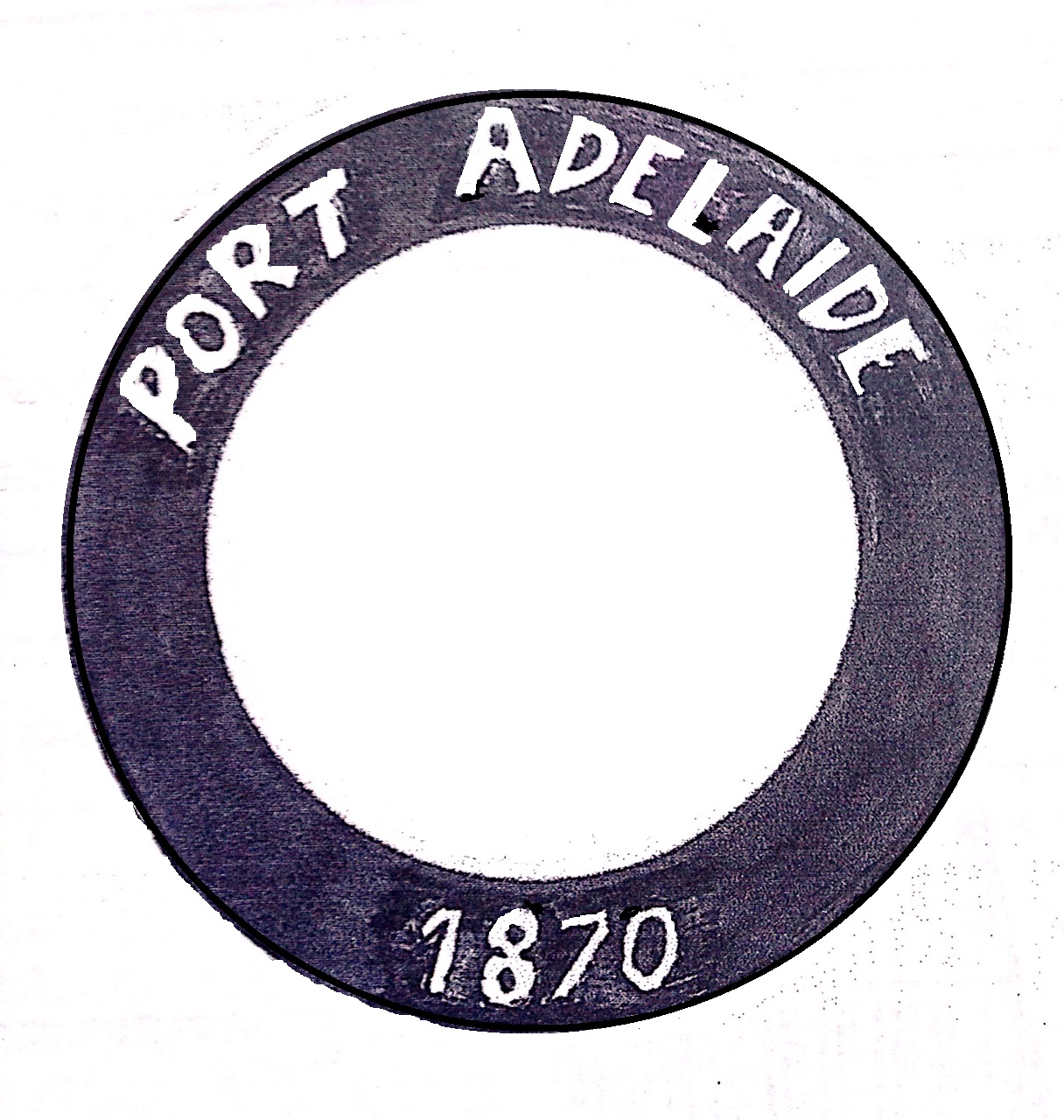
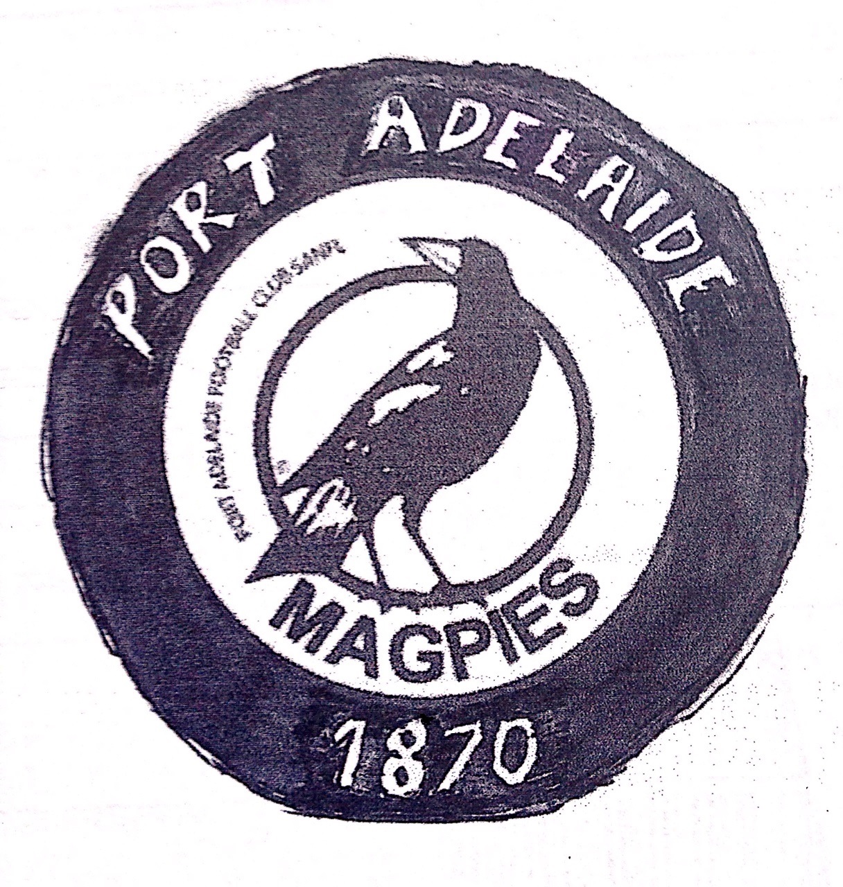
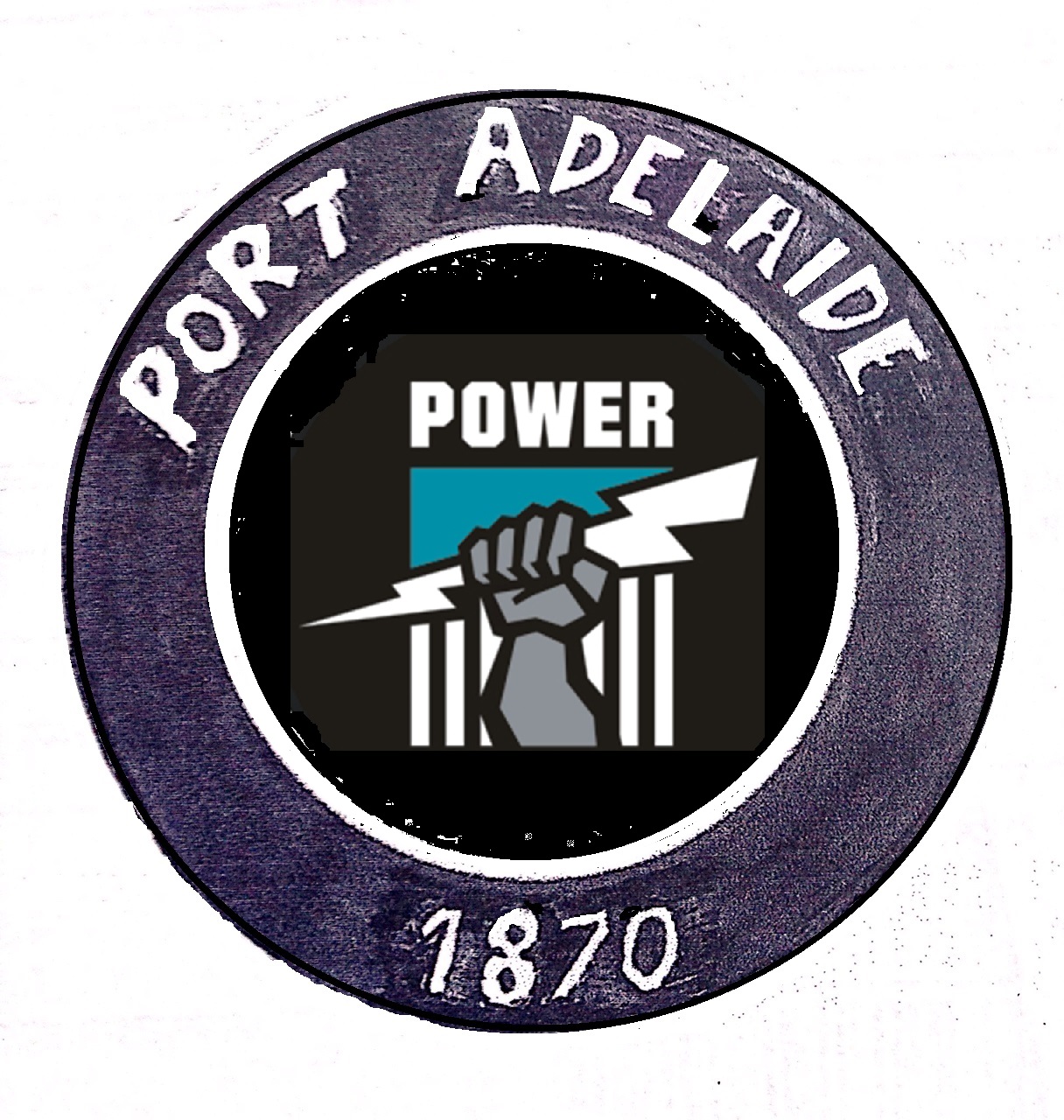
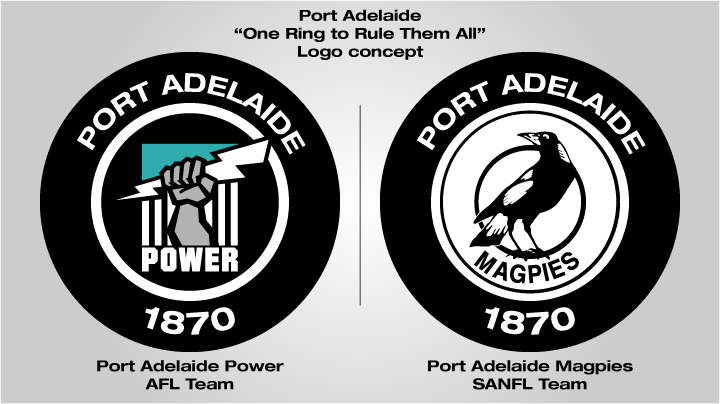
I think the roundel would be a good move in the AFL - it's unique and fits their one club brand tying it back to Port Adelaide Magpies.
Magpies obviously has the traditional magpie in it and Power has something else (either the lightning fist or chevron design).
Yeah, looks all right
Inb4 they don’t actually use a new logo next season becuase the club board votes it down.Saw this in my twitter feed and thought I’d share it here. I have no affiliation with this club.
Geez I wish it would just disappear.How long will Brisbane persist with PPL? There must be some seriously offended marketing guy who refuses to accept that it's horrible and should be gone.
Inb4 they don’t actually use a new logo next season becuase the club board votes it down.
A firm handshake and pride is my guess.Who wants to ask them what the prize is?

