

- Joined
- Apr 12, 2006
- Posts
- 2,148
- Reaction score
- 1,525
- Location
- Outeniqua Mountains
- AFL Club
- Sydney
- Other Teams
- Newcastle Utd, Miami Dolphins
Follow along with the video below to see how to install our site as a web app on your home screen.
Note: This feature may not be available in some browsers.


Log in to remove this Banner Ad
So so bad and pointless
You don't wanna know what it costSo so bad and pointless
Yeah, this is bad, and its not just about the execution of the logo. With something like this, the Australian Made logo has an authority to it, people see that logo and know that they can trust what it says. Having a massive change means that this could look like an imitation of the Australian Made logo and people won't trust it. With something like this, if you are going to change it, it still needs to be recognise-able as the 'Australian Made' logo that people know they can rely on.
reminds me of the nbn logo.
It isn’t actually replacing the Australian Made logo. It’s for use at trade shows as a ‘cohesive brand identifier’

It's for Australian products and brands, where as the roo is for those which are Aussie made (and I presume owned). It's new and we will likely rarely see it as its focus is not on those within.Hahah what is that
Surely/hopefully this is one of those ones where they deliberately adopt a bad change just so they can eventually change back and get the awareness
Essentially where ever Australian brands/services/goods etc are advertised overseas this will be the logo attached to it somewhere.Hahah what is that
gold's chemical symbol is Au: I guess that's what it's about. We make gold standard stuff presumably.

Wharfies unite!I've only just realised... These are very similar in composition. And it took them to be side-by-side for me to notice.
View attachment 905768


the fact that this logo from takeheed (he posted some AFL/band logo mashups a while ago that some may remember), didn't win proves people have no taste. Has all the same elements, isn't white (which is the main criticism of the current logo) and doesn't look like a knock off of the Melbourne city logo.We have a winner in the Adelaide logo comp.View attachment 908265
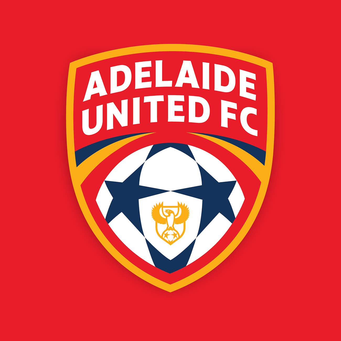
Underwhelming is an understatement. Can clubs stop copying Man City pleaseWe have a winner in the Adelaide logo comp.View attachment 908265


