Yeah that sounds about rightFreight Train and El_Scorcho keep winning these things so you're well and truly forked?
")
But also...
Follow along with the video below to see how to install our site as a web app on your home screen.
Note: This feature may not be available in some browsers.
Yeah that sounds about rightFreight Train and El_Scorcho keep winning these things so you're well and truly forked?
Cheers mate. Im thinking of using it as a secondary logo of sorts. Fun Fact: Its actually my badge I use on my Warhammer 40k Space Marine army, the Emperor's Navigators.Solid effort on the 'M'. Logo probably needs more depth (if it is in fact the logo) but it's solid.
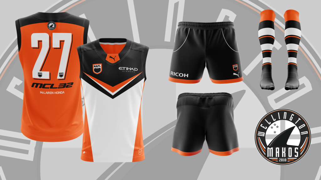
To be placed in the NAFL Jumpers That Never Were thread.
the giants should look at this
Which is already the issue, so it doesn't fix anything on their guernsey.The issue from a practical sense is that the back and front are totally and completely different colours.
It'd be like the Eagles tripanel where they look like a different team depending on what way they are facing.
Looks good, probably don’t need the laces on every facing of the ball though, just two
Yeah, good habit to get into.My thoughts are you should ask people if you can use their work and edit it for yourself before you just go ahead and do it. Its much more polite, and you'll probably get a yes.


There's no need for name calling, but that would be me.which one of you jabronis hasnt submitted nuthin
come aaaaarnThere's no need for name calling, but that would be me.
Nah, it just means I can't settle on a location design, nothing is really clicking. The rest of my stuff is done though.come aaaaarn
i hope this means youre making some moves on your template or something. that'd be cool.