Navigation
Install the app
How to install the app on iOS
Follow along with the video below to see how to install our site as a web app on your home screen.
Note: This feature may not be available in some browsers.
More options
Style variation

-
 Fantasy Footy Notice Image Round 12
SuperCoach Rd 12 SC Talk - Trade Talk - Capt/VC - 2026 Fight MND Comp ,//, AFL Fantasy Rd 12 AFF Talk - AF Trades - Capt/VC


You are using an out of date browser. It may not display this or other websites correctly.
You should upgrade or use an alternative browser.
You should upgrade or use an alternative browser.
Portfolio NEAFL Re-imagining
- Thread starter Bryce_Jersey17
- Start date
- Tagged users None
🥰 Love BigFooty? Join now for free.


Heato
Rookie
- Joined
- Sep 9, 2014
- Posts
- 32
- Reaction score
- 76
- Location
- Brisbane
- AFL Club
- Brisbane Lions

- Other Teams
- Coorparoo Kings, Tottenham Hotspur
These are fantastic, basically all of them toe that line of being both fresh and original whilst retaining tradition. Much better than some of the portfolios that pop up on the board featuring nothing but recoloured stripes, sashes etc. Great attention to detail too, keep it up!


- Joined
- Apr 23, 2012
- Posts
- 7,483
- Reaction score
- 5,428
- Location
- The Riff
- AFL Club
- GWS
- Other Teams
- Sydney Swans, St Kilda Saints
- Thread starter
- #54
Hahaha. Cheers manBryce, so far, this is amazing. You are able to execute an identity for the clubs while they maintain their traditional colours. The Redland and Queanbeyan sets are simply eellogofusciouhipoppokunurious! Keep up the good work!
 There are teams out there, not just in the NEAFL which could definitely benefit from their own guernsey design to add to their identity. Id just like to see some unique stuff in the leagues.
 The name maybe, maybe not the placeSaid no-one. Ever.
/Canberra humour

Thanks mate. You've hit the nail on the head with what Im trying to do. Basically take what they currently wear and add a new layer to that by giving each club a unique identity (compared to clubs like Redland and Eastlake who wear Essendon guernseys).These are fantastic, basically all of them toe that line of being both fresh and original whilst retaining tradition. Much better than some of the portfolios that pop up on the board featuring nothing but recoloured stripes, sashes etc. Great attention to detail too, keep it up!
Much appreciated mate. Glad to see you're enjoying thisAwesome thread mate
/subbed
Log in to remove this Banner Ad


fumbler
Lazy, Very Very Lazy


- Joined
- Jun 28, 2012
- Posts
- 33,843
- Reaction score
- 33,955
- Location
- (っ◔◡◔)っ ♥ Cairns ♥
- AFL Club
- Richmond
With your Redlands Bombers, the reasoning behind their Red stripe goes back to when they were originally the Victoria Point Sharks (juniors still called this).
One of their original guernsey's had a red stripe with a black shark popping it's head out similar to the Sharks of the EFL.
One of their original guernsey's had a red stripe with a black shark popping it's head out similar to the Sharks of the EFL.
- Joined
- Apr 23, 2012
- Posts
- 7,483
- Reaction score
- 5,428
- Location
- The Riff
- AFL Club
- GWS
- Other Teams
- Sydney Swans, St Kilda Saints
- Thread starter
- #56
And heres the next installment with the Southport Sharks.I like what they already have as a set (guernseys and logo), but as this is a rebrand, lets change some stuff up.
Im not too sure about the logo but until it gets some feedback or a new idea Im happy with how it is. It is the exact same shape as the current one and uses the black V as per normal. The text has been updated at the top, and Ive changed the Shark to one rising up, sort of a way of symbolising them rising to the top and win the flag. The gold is a lot more prominent now, with the yoke at the bottom, but with what was meant to be shark teeth biting through (somehow they turned into shark fins now).

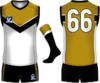
The home is basically status quo, but like I said, the gold is now a lot more prominent,so Ive added it to the collar, cuffs and the outside of the V. Ive also added an extension of the V to the back to break up the colour, or lack thereof, of the guernsey.
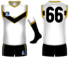
The clash is where the majority of changes are. As far as I know (and can see on Google Images), Southport dont have a clash strip; just the home with white shorts instead of black. Ive kept the black shorts, and made a Sydney-esque clash with a gold base that I feel is enough of a contrast against a white based team.
And thats the end of all the Queensland and Canberra teams. Now for the Sydney teams starting with the Sydney Hills Eagles
Im not too sure about the logo but until it gets some feedback or a new idea Im happy with how it is. It is the exact same shape as the current one and uses the black V as per normal. The text has been updated at the top, and Ive changed the Shark to one rising up, sort of a way of symbolising them rising to the top and win the flag. The gold is a lot more prominent now, with the yoke at the bottom, but with what was meant to be shark teeth biting through (somehow they turned into shark fins now).
The home is basically status quo, but like I said, the gold is now a lot more prominent,so Ive added it to the collar, cuffs and the outside of the V. Ive also added an extension of the V to the back to break up the colour, or lack thereof, of the guernsey.
And thats the end of all the Queensland and Canberra teams. Now for the Sydney teams starting with the Sydney Hills Eagles


- Joined
- Aug 28, 2013
- Posts
- 3,514
- Reaction score
- 10,583
- AFL Club
- North Melbourne
- Other Teams
- Arsenal
You've done a pretty great job here overall. But you simply can't beat the current Eastlake logo.

I think its a brilliant logo personally. Very memorable. It's my local club so I see it all the time, maybe that's why.
I think its a brilliant logo personally. Very memorable. It's my local club so I see it all the time, maybe that's why.


- Joined
- Apr 23, 2012
- Posts
- 7,483
- Reaction score
- 5,428
- Location
- The Riff
- AFL Club
- GWS
- Other Teams
- Sydney Swans, St Kilda Saints
- Thread starter
- #62
My apologies. I was going to reply but mustve gotten sidetracked.
 I was on a designing hiatus during my teaching prac, but now Im back to designing.
It is a memorable logo, but IMO very messy. The demon head could be cleaned up and modernised for sure.You've done a pretty great job here overall. But you simply can't beat the current Eastlake logo.
View attachment 124912
I think its a brilliant logo personally. Very memorable. It's my local club so I see it all the time, maybe that's why.
Right hereWhere are the other teams
I was on a designing hiatus during my teaching prac, but now Im back to designing.
- Joined
- Apr 23, 2012
- Posts
- 7,483
- Reaction score
- 5,428
- Location
- The Riff
- AFL Club
- GWS
- Other Teams
- Sydney Swans, St Kilda Saints
- Thread starter
- #63
With that post, I will now unveil my next set- Sydney Hills Eagles.
Previously the logo was being used for something else (and still will be) I saw its potential to be used in this portfolio. By adding the head of the eagle from the logo of Marvel's SHIELD and turning it to face from the East (as the club was previously known as the East Coast Eagles) and a few goalposts. I was ready. The logo is a simple roundel with multiple rings. The maroon and gold rings are a nod to their heritage from when they wore those colours as Baulkaum Hills Falcons. This logo is the first colour change in this portfolio, with royal blue being replaced by a dark Navy, to match their real life affiliates, West Coast.

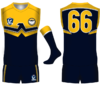
The home is simple enough. The stylised eagle from the logo is here as a yoke, with the head again facing the players "east" (A reverse of what West Coast, and themselves wear, as they are at the opposite side of the country. The home is a light base with the clash a dark recolour. The wings are featured on the back as a nod to their current strip, but made to match the front design.
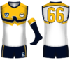
The clash is again a recolour, simply with navy replacing white.
Im doing a lot of my league based competition designs, but will definitely try to fit this in soon. Next up are our friends the Swans Reserves. So stay tuned.
Previously the logo was being used for something else (and still will be) I saw its potential to be used in this portfolio. By adding the head of the eagle from the logo of Marvel's SHIELD and turning it to face from the East (as the club was previously known as the East Coast Eagles) and a few goalposts. I was ready. The logo is a simple roundel with multiple rings. The maroon and gold rings are a nod to their heritage from when they wore those colours as Baulkaum Hills Falcons. This logo is the first colour change in this portfolio, with royal blue being replaced by a dark Navy, to match their real life affiliates, West Coast.
The home is simple enough. The stylised eagle from the logo is here as a yoke, with the head again facing the players "east" (A reverse of what West Coast, and themselves wear, as they are at the opposite side of the country. The home is a light base with the clash a dark recolour. The wings are featured on the back as a nod to their current strip, but made to match the front design.
The clash is again a recolour, simply with navy replacing white.
Im doing a lot of my league based competition designs, but will definitely try to fit this in soon. Next up are our friends the Swans Reserves. So stay tuned.
Last edited:
fumbler
Lazy, Very Very Lazy
- Joined
- Jun 28, 2012
- Posts
- 33,843
- Reaction score
- 33,955
- Location
- (っ◔◡◔)っ ♥ Cairns ♥
- AFL Club
- Richmond
East Coast Eagles ..... Sydney Hills Eagles - East Coast Eagles - Baulkham Hills Falcons
Current 2015 Clubs
Ainslie
Aspley
Brisbane
Eastlake
Gold coast
NT Thunder
Redland
Southport
Sydney
Sydney Uni
Uni WS
Current 2015 Clubs
Ainslie
Aspley
Brisbane
Eastlake
Gold coast
NT Thunder
Redland
Southport
Sydney
Sydney Uni
Uni WS
- Joined
- Apr 23, 2012
- Posts
- 7,483
- Reaction score
- 5,428
- Location
- The Riff
- AFL Club
- GWS
- Other Teams
- Sydney Swans, St Kilda Saints
- Thread starter
- #65
???East Coast Eagles ..... Sydney Hills Eagles - East Coast Eagles - Baulkham Hills Falcons
If you're trying to point out that certain clubs in this portfolio aren't in the NEAFL, have a read of the OPCurrent 2015 Clubs
Ainslie
Aspley
Brisbane
Eastlake
Gold coast
NT Thunder
Redland
Southport
Sydney
Sydney Uni
Uni WS
This is all based on teams in the 2014 season (as there are teams who have left for the upcoming season
fumbler
Lazy, Very Very Lazy
- Joined
- Jun 28, 2012
- Posts
- 33,843
- Reaction score
- 33,955
- Location
- (っ◔◡◔)っ ♥ Cairns ♥
- AFL Club
- Richmond
???
If you're trying to point out that certain clubs in this portfolio aren't in the NEAFL, have a read of the OP
Those were the names from present to past of the Eagles, and yes i realised that after i posted it but i thought it was still valid.


Andonis1997
Sporting masochist

- Joined
- Jun 24, 2011
- Posts
- 26,687
- Reaction score
- 17,364
- Location
- Adelaide
- AFL Club
- Carlton
- Other Teams
- ΠΓΣΣ LFC Sturt Steelers Nix
Ahhh, Bryce.. the eagle's facing West..By adding the head of the eagle from the logo of Marvel's SHIELD and turning it to face East
- Joined
- Apr 23, 2012
- Posts
- 7,483
- Reaction score
- 5,428
- Location
- The Riff
- AFL Club
- GWS
- Other Teams
- Sydney Swans, St Kilda Saints
- Thread starter
- #68
Ahhh, Bryce.. the eagle's facing West..
Edited none the lessThe stylised eagle from the logo is here as a yoke, with the head again facing the players "east" (A reverse of what West Coast, and themselves wear, as they are at the opposite side of the country.
- Joined
- Jul 1, 2014
- Posts
- 1,170
- Reaction score
- 1,886
- AFL Club
- Carlton
With that post, I will now unveil my next set- Sydney Hills Eagles.
The clash is again a recolour, simply with navy replacing white.
Im doing a lot of my league based competition designs, but will definitely try to fit this in soon. Next up are our friends the Swans Reserves. So stay tuned.
That's an outstanding effort. It's something WCE should look at - a stylised update that keeps a wing design and lets them move away from an animal head to a more traditional style of guernsey.
Great work. You shold work some wings into it, make a peril version and try it out on the WC Guernsey thread.
🥰 Love BigFooty? Join now for free.


Spanna_
The secret ingredient is crime


- Joined
- Jul 3, 2014
- Posts
- 4,827
- Reaction score
- 4,565
- Location
- Perth
- AFL Club
- West Coast
- Other Teams
- West Perth, Wildcats, Scorchers
This looks alot like my WI?W Adelaide Falcons entry.With that post, I will now unveil my next set- Sydney Hills Eagles.
Previously the logo was being used for something else (and still will be) I saw its potential to be used in this portfolio. By adding the head of the eagle from the logo of Marvel's SHIELD and turning it to face from the East (as the club was previously known as the East Coast Eagles) and a few goalposts. I was ready. The logo is a simple roundel with multiple rings. The maroon and gold rings are a nod to their heritage from when they wore those colours as Baulkaum Hills Falcons. This logo is the first colour change in this portfolio, with royal blue being replaced by a dark Navy, to match their real life affiliates, West Coast.
The home is simple enough. The stylised eagle from the logo is here as a yoke, with the head again facing the players "east" (A reverse of what West Coast, and themselves wear, as they are at the opposite side of the country. The home is a light base with the clash a dark recolour. The wings are featured on the back as a nod to their current strip, but made to match the front design.
The clash is again a recolour, simply with navy replacing white.
Im doing a lot of my league based competition designs, but will definitely try to fit this in soon. Next up are our friends the Swans Reserves. So stay tuned.
( Not saying you copied at all, you've probably never seen it, but the concept is quite similar)
- Joined
- Apr 23, 2012
- Posts
- 7,483
- Reaction score
- 5,428
- Location
- The Riff
- AFL Club
- GWS
- Other Teams
- Sydney Swans, St Kilda Saints
- Thread starter
- #71
My apologies mate, I dont recall it at all. Ill have a lookThis looks alot like my WI?W Adelaide Falcons entry.
( Not saying you copied at all, you've probably never seen it, but the concept is quite similar)

- Joined
- Apr 23, 2012
- Posts
- 7,483
- Reaction score
- 5,428
- Location
- The Riff
- AFL Club
- GWS
- Other Teams
- Sydney Swans, St Kilda Saints
- Thread starter
- #73
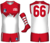
Here is my entry for Sydneys Reserves side. This idea works with the idea that the AFL side adopts a similar home strip to this, and is similar to a few designs we have seen on this board. The logo is a simple bar shape, with the Swans logo in the center. Each side of the bar references some part of Sydney/South Melbourne's history with the SM monogram and the 5 hoops. The hoops not only reference the hoops worn by South Melbourne, but also the teams 5 premierships that they have won.

The Home is essentially the same as what we currently have, however, the white back has come back, to create a lighter home kit. The 5 hoops have returned in three ways as a nod to the Swans premierships, in the number of hoops on the socks, the lines above the numbers and on the chest, which is topped with a SM Monogram as well.
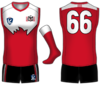
The clash is once again a simple inverse, but includes black to help make the kit a bot more darker, namely with the shorts. Black has also outlined the yoke, and the numbers, simply to help them stand out on the design once more.
Next up is Sydney Uni, and then UWS. So we're almost done!
The Home is essentially the same as what we currently have, however, the white back has come back, to create a lighter home kit. The 5 hoops have returned in three ways as a nod to the Swans premierships, in the number of hoops on the socks, the lines above the numbers and on the chest, which is topped with a SM Monogram as well.
The clash is once again a simple inverse, but includes black to help make the kit a bot more darker, namely with the shorts. Black has also outlined the yoke, and the numbers, simply to help them stand out on the design once more.

- Joined
- May 3, 2014
- Posts
- 5,141
- Reaction score
- 6,056
- Location
- #westside
- AFL Club
- North Melbourne
- Other Teams
- We put the U in CGU
I don't see any reason aesthetically to include Sydney swans on the logo, though, for branding it's probably needed, I think only having 'swans' and it being over the normal logo would look better.
- Joined
- Apr 23, 2012
- Posts
- 7,483
- Reaction score
- 5,428
- Location
- The Riff
- AFL Club
- GWS
- Other Teams
- Sydney Swans, St Kilda Saints
- Thread starter
- #75
Well they are the Sydney Swans Reserves, so Sydney would probably make sense to be included (in my mind at least). I see what you mean though.I don't see any reason aesthetically to include Sydney swans on the logo, though, for branding it's probably needed, I think only having 'swans' and it being over the normal logo would look better.
Similar threads


- Replies
- 0
- Views
- 2K

- Replies
- 1
- Views
- 156
- Poll
- Replies
- 2
- Views
- 361


