Remove this Banner Ad

Portfolio NEAFL Re-imagining

🥰 Love BigFooty? Join now for free.

So I've been contemplating this for a few days, having seen the leak for about a week now, but I'd love to get people's opinion.

The University of Western Sydney is having a rebrand to become Western Sydney University. Now while this won't change the design much, it does affect the logo. So my question is this; Do I keep the UWS Giants moniker or change it to WSU?

http://m.smh.com.au/national/educat...to-get-new-name-and-logo-20150806-gisv3l.html
 
So I've been contemplating this for a few days, having seen the leak for about a week now, but I'd love to get people's opinion.

The University of Western Sydney is having a rebrand to become Western Sydney University. Now while this won't change the design much, it does affect the logo. So my question is this; Do I keep the UWS Giants moniker or change it to WSU?

http://m.smh.com.au/national/educat...to-get-new-name-and-logo-20150806-gisv3l.html
I'd hate to be a nuisance, but do one for each
 
I'd hate to be a nuisance, but do one for each
I was thinking along those lines and put it in a gif or something to show it changing. It's simply a switching around of letters (if it works)
 

Log in to remove this Banner Ad

Well now that my assignments is out of the way for the time being, I can upload my idea for Sydney University. As always, Id love to hear and recommendations and such. But first, many thanks to Saint Mick for his providing of documents and files regarding USYD's clash policies and logos.

The logo here is a recreation of the Uni's logo and their sporting logo combined. Im not as happy with this as some of my other logos, and am happy to change it, but Ive changed the book and given the star more prominence. In hindsight, I should probably re size them.
Logo.png
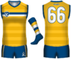
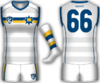
The current home and clash guernseys are perfect in my opinion, and so Ive kept the idea of a yellow home and white clash. However, the hoops are now watermarked and Ive given The hoops around the chest colour in blue and white. The clash is a white version.
Home.png
Clash.png
 
The current home and clash guernseys are perfect in my opinion, and so Ive kept the idea of a yellow home and white clash.

Love the clash strip. Would be quite happy to change it from our current one tomorrow but our current one is very popular so I'd have no chance of getting that through. Home probably needs a little more blue for my liking though! Glad to hear that you think our current strips are perfect as is - it's taken years of template tweaks and changes to get to where we are, even down to the stripes on the shorts which have changed a few times. Only thing I'd change is to have white in the alternate socks but it's hard enough to get blokes to bring the right shorts to games let alone make them think about socks as well!
 
All of these jumpers are excellent mate. Really good stuff all round.
 
Canberra-Demons.jpg
 

Remove this Banner Ad

And we're back! The final installment, way too long overdue. The last piece of the puzzle is UWS Giants, in all their youthful glory. Taking on the 2016 mantra used by the GWS Giants "Stand Tall", the logo is suitably tall. I used an arrow pointing upwards to make this, continuing the idea that the Giants are heading up the ladder to the top. Underneath is "Giants" in a similar font that their parent club has used in the past.
Logo.png

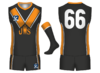
On to the home guernsey, it was designed to hark back to the days of the V, that some still think GWS should've adopted. The old Team GWS jumper and a past UWS jumper can both be seen here. This design takes on the Tri-V and the logo intruding but using to new logo in its place. The side panels have also been used with an outline, so as the break up the colour a bit on the back.
Home.png

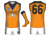
The clash/away kit is a more GWS kit in its use of orange but doesnt have strange parts where the orange and charcoal dont meet correctly, which has been replaced by a shoulder panel on the back. White shorts have been used mostly to lighten up the kit a bit more but also because orange didnt look so great with it (this could be easily changed though).
Away.png


And thats it! I will go through and change some designs that need the change, especially some that received certain critiques, so stay tuned!
 
And we're back! The final installment, way too long overdue. The last piece of the puzzle is UWS Giants, in all their youthful glory. Taking on the 2016 mantra used by the GWS Giants "Stand Tall", the logo is suitably tall. I used an arrow pointing upwards to make this, continuing the idea that the Giants are heading up the ladder to the top. Underneath is "Giants" in a similar font that their parent club has used in the past.

On to the home guernsey, it was designed to hark back to the days of the V, that some still think GWS should've adopted. The old Team GWS jumper and a past UWS jumper can both be seen here. This design takes on the Tri-V and the logo intruding but using to new logo in its place. The side panels have also been used with an outline, so as the break up the colour a bit on the back.

The clash/away kit is a more GWS kit in its use of orange but doesnt have strange parts where the orange and charcoal dont meet correctly, which has been replaced by a shoulder panel on the back. White shorts have been used mostly to lighten up the kit a bit more but also because orange didnt look so great with it (this could be easily changed though).


And thats it! I will go through and change some designs that need the change, especially some that received certain critiques, so stay tuned!

A great concept but it is already out of date as you know they are the WSU Giants now (still sounds wrong to me).
 
A great concept but it is already out of date as you know they are the WSU Giants now (still sounds wrong to me).
I was originally planning to do one for UWS and then WSU, but the irritation that making the logo caused in the first place convinced me not to. I might do it later though
 

Remove this Banner Ad

Remove this Banner Ad

🥰 Love BigFooty? Join now for free.

Back
Top Bottom