Discussion New $5 Note Design

Do you like the new 5 dollar note?


  • Total voters
    77

Remove this Banner Ad

Maxwell110

Premiership Player
May 29, 2011
4,487
4,857
batcave
AFL Club
Fremantle
Other Teams
sc freiburg
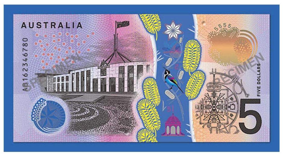
What's everyone's thoughts here about the new five dollar note? I've seen mixed reactions so far, but slightly more negative. I don't really mind it myself, but it could be much better.

It will be introduced on the 1st of September this year, and the higher denomination notes are still to come.

Here's the RBA article on it: http://banknotes.rba.gov.au/australias-banknotes/next-generation-banknotes-program/
7318798-16x9-940x529.jpg

12993488_10155000136794988_9079156254799009623_n.jpg

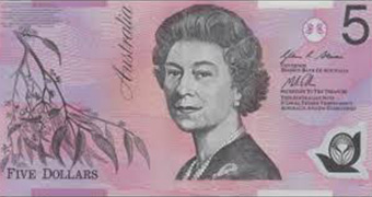
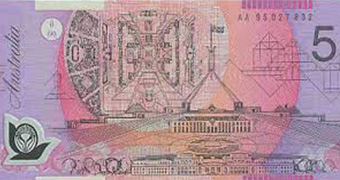
Old note for comparison:
front-of-five-dollar-bill-data.jpg

picture-of-five-dollar-note-data.jpg
 
Last edited:

Log in to remove this ad.

The interesting thing following the release of the new notes will be counterfeits making their way into circulation.

Our plastic polymer notes are some of the hardest in the world to reproduce fraudulently. However, it is the year 2016 and the required technology is out there in the hands of the wrong people, so they'll be out to take advantage of the new release. Of course it's relatively easy to tell a fake note from a real one in their current incarnation, but when the new notes come out, they'll be glossy, shiny and stiff, and for some, much harder to distinguish from a counterfeit.
 
Permanent.

Interesting.


That makes me feel better about it. I thought that was supposed to be some sort of blue river through it, but its actually a top to bottom clear section, so in real life I think it will look quite good.

Definitely thought the $5 was looking dated. I thought that even way back over ten years ago when that one I posted was introduced (what was the story with that anyway?). I quite liked those ones. Looking forward to more of these being rolled out.
 

(Log in to remove this ad.)

I actually like it.

Monarchy thing is a bit stuffed but that will exist always here. the lighter shade of pink on the left is better, less ugly, and the aboriginal element is important and should be more pronounce din our country's things. Maybe not classically beautiful but it is unique – for one note, it works.
 
Back
Top