Navigation
Install the app
How to install the app on iOS
Follow along with the video below to see how to install our site as a web app on your home screen.
Note: This feature may not be available in some browsers.
More options
-
Mobile App Discontinued
Due to a number of factors, support for the current BigFooty mobile app has been discontinued. Your BigFooty login will no longer work on the Tapatalk or the BigFooty App - which is based on Tapatalk.
Apologies for any inconvenience. We will try to find a replacement.
You are using an out of date browser. It may not display this or other websites correctly.
You should upgrade or use an alternative browser.
You should upgrade or use an alternative browser.
News New Jumpers for 2023
- Thread starter TheLoungeLizard
- Start date
- Tagged users None
🥰 Love BigFooty? Join now for free.
- Mar 30, 2014
- 3,024
- 5,178
- AFL Club
- Brisbane Lions

- Other Teams
- Dolphins, Seattle Kraken
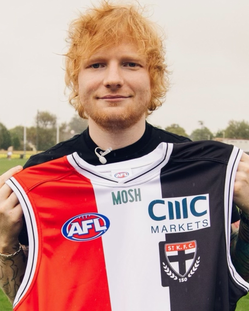
Which club are you talking about? Lions have a yellow M and Moshi is still green (only single colours, though).I thought AFL was ruling out coloured logos in that neck spot?
WCE ditched theirs
Eagles retails differ from their PI's, Lions makes sense as yellow fits with their scheme but green on saints feels so out of placeWhich club are you talking about? Lions have a yellow M and Moshi is still green (only single colours, though).
- Mar 30, 2014
- 3,024
- 5,178
- AFL Club
- Brisbane Lions

- Other Teams
- Dolphins, Seattle Kraken
Yeah the difference in the PI was pointed out when they were doing the team photo i think, not sure if there is any requirement, but definitely a good choice of change for the Weagles, no idea why the Saints think green is a good ideaEagles retails differ from their PI's, Lions makes sense as yellow fits with their scheme but green on saints feels so out of place
Log in to remove this Banner Ad
Red Crow
Modrarator
Yeah the difference in the PI was pointed out when they were doing the team photo i think, not sure if there is any requirement, but definitely a good choice of change for the Weagles, no idea why the Saints think green is a good idea
Probably because they’re millions in debt and Mosh either paid more to have their logo in their corporate colours or possibly even the sponsorship was contingent on it.
- Mar 30, 2014
- 3,024
- 5,178
- AFL Club
- Brisbane Lions

- Other Teams
- Dolphins, Seattle Kraken
But wouldn't white have stood out better than green? When players are running around all people see is green mush, and no-one immediately goes "that green mush clearly means greenProbably because they’re millions in debt and Mosh either paid more to have their logo in their corporate colours or possibly even the sponsorship was contingent on it.
fegz222
Senior List
- Aug 6, 2020
- 241
- 220
- AFL Club
- Richmond
Anyone notice players numbers on guernseys have become smaller to accommodate sponsorship to the top and bottom of the back of guernsey ? .. apologies if similar already posted
I haven’t noticed it tbh, at least for Richmond I don’t believe that’s the case. Numbers for us are just lower than they used to be.
Sent from my iPhone using BigFooty.com
Andonis1997
Sporting masochist
Seems like if it's one colour, regardless of white, green or yellow, it's fine.I thought AFL was ruling out coloured logos in that neck spot?
WCE ditched theirs
Red Crow
Modrarator
But wouldn't white have stood out better than green? When players are running around all people see is green mush, and no-one immediately goes "that green mush clearly means greenmushI mean Mosh"
Perhaps, but they probably didn’t think/care about it. Similar to Red Rooster on the shorts. An inverted white logo on the red background would have stood out a lot better than what they went with.
Seems like if it's one colour, regardless of white, green or yellow, it's fine.
Mosh isn’t all one colour. It’s white outlined in green. So I think the one-colour theory floated on here was just that, a theory, unless it gets changed before round one.
But wouldn't white have stood out better than green? When players are running around all people see is green mush, and no-one immediately goes "that green mush clearly means greenmushI mean Mosh"
As opposed to a white mush?
Do you really think people notice or are reading any sponsor when they are running around?
It’s for the close ups, still shots and apparel. Of which the sponsor is clear as day.
- Mar 30, 2014
- 3,024
- 5,178
- AFL Club
- Brisbane Lions

- Other Teams
- Dolphins, Seattle Kraken
I'm just pointing out that both are useless as no one instinctively associates Mosh with green as it is not a massive brand. Realistically green just ruins the jumper aesthetic more than anything.As opposed to a white mush?
Do you really think people notice or are reading any sponsor when they are running around?
It’s for the close ups, still shots and apparel. Of which the sponsor is clear as day.
Also, neck sponsors this year (I think that's all of them)
Suns - Plungie - NB
Eagles - Caltex - NB
Saints - Mosh - NB
Hawks - Skechers - ISC
Lions - McDonalds - NB
Demons - IG - NB
Last edited:
Expect a 1966 remake for this match tooIn round 3 at the G though St Kilda is the home team as part of their 150th anniversary celebrations
Tbh I've never heard of Mosh till folk here started complaining about the logo.
They're mentioned at least 10 times on this page alone.
I bet a few people visited their website to see what colours they use.
Not such thing as bad publicity etc.
They're mentioned at least 10 times on this page alone.
I bet a few people visited their website to see what colours they use.
Not such thing as bad publicity etc.
- Mar 30, 2014
- 3,024
- 5,178
- AFL Club
- Brisbane Lions

- Other Teams
- Dolphins, Seattle Kraken
Don't you understand? We're Guernsey NerdsTbh I've never heard of Mosh till folk here started complaining about the logo.
They're mentioned at least 10 times on this page alone.
I bet a few people visited their website to see what colours they use.
Not such thing as bad publicity etc.
- Dec 13, 2016
- 1,217
- 2,640
- AFL Club
- Brisbane Lions

- Other Teams
- Arsenal, Melb City, Storm, Stars
so, take away its advertising, how does it become a massive brand?Mosh with green as it is not a massive brand
- Mar 30, 2014
- 3,024
- 5,178
- AFL Club
- Brisbane Lions

- Other Teams
- Dolphins, Seattle Kraken
TBH sell different products. Their market is incredibly limited and is specifically for men's health subscriptions. If they pivoted and approached women's health in the same way, or even offer products that aren't limited to only males with specific issues, they may see their customer-base grow.so, take away its advertising, how does it become a massive brand?
Without looking at products, given that St Kilda is one of the smaller-watched Vic teams, they could maybe not advertise on a small-viewership team. I feel like their product is bizarrely placed in that it MAY work in the football industry with a larger team perhaps, but their target market would be the older Facebook/Instagram user, with which you can specifcally target your advertising to that demographic, and not limit it to football fans AND older male products. They would more than likely find more advertising benefit online, given that their entire product is online-based.
Just a final gripe - we wouldn't actually complain if it was a massive MOSH logo on the back, as everyone is used to the large logos in varying colours. The issue people have is that it's a bright green logo on the collar, may as well go back to the poo-brown of Dare.
It doesn't look as bad on the home kit as they used the muted dark green (apologies for posting a pic of Rupert Grint)

Last edited:
🥰 Love BigFooty? Join now for free.
Rubber Arm
Prestige 10 - Rank 70
- Oct 10, 2018
- 1,991
- 4,496
- AFL Club
- Geelong
- Other Teams
- Borussia VfL 1900 e.V. Mönchengladbach
My WaNd... LoOk aT mY wAnDTBH sell different products. Their market is incredibly limited and is specifically for men's health subscriptions. If they pivoted and approached women's health in the same way, or even offer products that aren't limited to only males with specific issues, they may see their customer-base grow.
Without looking at products, given that St Kilda is one of the smaller-watched Vic teams, they could maybe not advertise on a small-viewership team. I feel like their product is bizarrely placed in that it MAY work in the football industry with a larger team perhaps, but their target market would be the older Facebook/Instagram user, with which you can specifcally target your advertising to that demographic, and not limit it to football fans AND older male products. They would more than likely find more advertising benefit online, given that their entire product is online-based.
Just a final gripe - we wouldn't actually complain if it was a massive MOSH logo on the back, as everyone is used to the large logos in varying colours. The issue people have is that it's a bright green logo on the collar, may as well go back to the poo-brown of Dare.
It doesn't look as bad on the home kit as they used the muted dark green (apologies for posting a pic of Rupert Grint)

This is a bizarre take.TBH sell different products. Their market is incredibly limited and is specifically for men's health subscriptions. If they pivoted and approached women's health in the same way, or even offer products that aren't limited to only males with specific issues, they may see their customer-base grow.
Hard enough to get men into any clinical setting, these guys have actually found a fantastic market by creating a one stop telehealth platform specifically for men, tackling relatively taboo topics.
shanemcshane4
Draftee
- Jan 19, 2023
- 2
- 7
- AFL Club
- Collingwood
- Mar 30, 2014
- 3,024
- 5,178
- AFL Club
- Brisbane Lions

- Other Teams
- Dolphins, Seattle Kraken
He said "take away advertising", that's what I came up with in that very specific scenario, there is nothing inheritantly wrong with what they offer currently.This is a bizarre take.
Hard enough to get men into any clinical setting, these guys have actually found a fantastic market by creating a one stop telehealth platform specifically for men, tackling relatively taboo topics.
Isn’t it dick pills site?What is mosh?
Hmm i’m assuming the same will be for West Coast with their academies but I wonder what logo will be under their WAFL teams jumperLions academy jumper by Belgravia Apparel (New Balance) pictured along with last year's design by Classic
View attachment 1623262


