
This one reminded me that Adelaide parking inspectors used to be called "Brown Bombers". Useless trivia item for the day!
Navigation
Install the app
How to install the app on iOS
Follow along with the video below to see how to install our site as a web app on your home screen.
Note: This feature may not be available in some browsers.
More options
You are using an out of date browser. It may not display this or other websites correctly.
You should upgrade or use an alternative browser.
You should upgrade or use an alternative browser.
News New Jumpers for 2024
- Thread starter RedmanWasHere
- Start date
- Tagged users None


cannavo
Something's Coming...


Nike strikes again. Gotta say the size of the Premiers logo is disappointing, It's ever so slightly larger than the Emirates logo. I don't recall seeing previous premiers jumpers having the logo that small, this one looks like it should've been put on the infant size ones. I assumed since it's a 2XL jumper it just makes the logos appear smaller, but here's Hawthorns 2013 premiers jumper, same size and a much more prominent premiers logo.
.jpg")
Recent premiers jumpers for comparison


.jpg")
View attachment 1867514View attachment 1867513
Nike strikes again. Gotta say the size of the Premiers logo is disappointing, It's ever so slightly larger than the Emirates logo. I don't recall seeing previous premiers jumpers having the logo that small, this one looks like it should've been put on the infant size ones. I assumed since it's a 2XL jumper it just makes the logos appear smaller, but here's Hawthorns 2013 premiers jumper, same size and a much more prominent premiers logo.
View attachment 1867525
Recent premiers jumpers for comparison
View attachment 1867538
View attachment 1867539
View attachment 1867537
You sure that’s not a Bali knock off?
cannavo
Something's Coming...
Straight from the club shop website but I wouldn't be surprised if they had to resort to thatYou sure that’s not a Bali knock off?
jdeezy
Premiership Player
- Jul 6, 2013
- 4,378
- 11,525
- AFL Club
- Port Adelaide
Rate that if it's the home jumper and Richmond are wearing yellow, but if that's an away and it's supposed to be going against Richmond in black I reckon it'll be a dog's breakfast. I suspect I know the answer to this, but who is home this year?
- Jun 23, 2021
- 1,724
- 1,345
- AFL Club
- Melbourne
- Other Teams
- LA dodgers LA Kings Melbourne Aces
Tigers are the home teamRate that if it's the home jumper and Richmond are wearing yellow, but if that's an away and it's supposed to be going against Richmond in black I reckon it'll be a dog's breakfast. I suspect I know the answer to this, but who is home this year?
Heardy_101
LET'S GO BRANDON
Constitution also says they'll wear whatever the AFL directs as well.Something in their constitution prevents them from using a black sash for some reason.
Xanthippus
Team Captain
- Oct 7, 2020
- 478
- 297
- AFL Club
- Collingwood

that premiership logo is straight ass. how very disappointing.View attachment 1867514View attachment 1867513
Nike strikes again. Gotta say the size of the Premiers logo is disappointing, It's ever so slightly larger than the Emirates logo. I don't recall seeing previous premiers jumpers having the logo that small, this one looks like it should've been put on the infant size ones. I assumed since it's a 2XL jumper it just makes the logos appear smaller, but here's Hawthorns 2013 premiers jumper, same size and a much more prominent premiers logo.
View attachment 1867525
Recent premiers jumpers for comparison
View attachment 1867538
View attachment 1867539
View attachment 1867537
- Moderator
- #784
View attachment 1867514View attachment 1867513
Nike strikes again. Gotta say the size of the Premiers logo is disappointing, It's ever so slightly larger than the Emirates logo. I don't recall seeing previous premiers jumpers having the logo that small, this one looks like it should've been put on the infant size ones. I assumed since it's a 2XL jumper it just makes the logos appear smaller, but here's Hawthorns 2013 premiers jumper, same size and a much more prominent premiers logo.
View attachment 1867525
Recent premiers jumpers for comparison
View attachment 1867538
View attachment 1867539
View attachment 1867537
Five stripes on the wide guernsey looks pretty strange too. Another Nike failure. Such a shame really!
- May 3, 2004
- 643
- 1,210
- AFL Club
- Geelong
The jumper's material looks thin
The logos look terrible - size and placement
The stripes' pattern is clearly not what the players wore this year
Looks more like a Bali knock-off
If I was Craig Kelly, I would be embarrassed by that. For a club that always likes to claim they're the biggest and best, the above is abysmal
This shouts cheap manufacturing, sell for max price, for max profit
- Mar 30, 2014
- 2,606
- 4,274
- AFL Club
- Brisbane Lions
- Other Teams
- Dolphins, Seattle Kraken
Maybe the Lions can do you a solid and get Classic to make you some dodgier ones?The jumper's material looks thin
The logos look terrible - size and placement
The stripes' pattern is clearly not what the players wore this year
Looks more like a Bali knock-off
If I was Craig Kelly, I would be embarrassed by that. For a club that always likes to claim they're the biggest and best, the above is abysmal
This shouts cheap manufacturing, sell for max price, for max profit
- Feb 5, 2018
- 14,128
- 34,071
- AFL Club
- Hawthorn
- Other Teams
- Chicago Blackhawks Melb Renegades
The jumper's material looks thin
The logos look terrible - size and placement
The stripes' pattern is clearly not what the players wore this year
Looks more like a Bali knock-off
If I was Craig Kelly, I would be embarrassed by that. For a club that always likes to claim they're the biggest and best, the above is abysmal
This shouts cheap manufacturing, sell for max price, for max profit
And yet, Billy Frampton's name is the still the most egregious thing on there.
Last edited:
Munners
Senior List
View attachment 1867514View attachment 1867513
Nike strikes again. Gotta say the size of the Premiers logo is disappointing, It's ever so slightly larger than the Emirates logo. I don't recall seeing previous premiers jumpers having the logo that small, this one looks like it should've been put on the infant size ones. I assumed since it's a 2XL jumper it just makes the logos appear smaller, but here's Hawthorns 2013 premiers jumper, same size and a much more prominent premiers logo
Just like the signed premiership jumpers, they look like Nike rip offs. I'm not sure if Nike can actually produce anything in such a period of time.

- Jul 1, 2014
- 1,138
- 1,840
- AFL Club
- Carlton
So glad we're not with Nike any more. How does such a big brand perform so poorly - they must have internal QC?
If they care so little I wonder why they even bother with AFL...
If they care so little I wonder why they even bother with AFL...
Rubber Arm
AFL Sucks
- Oct 10, 2018
- 1,643
- 3,577
- AFL Club
- North Melbourne
- Other Teams
- ^ I don't actually go for North.
That's exactly it. They don't care about the AFL. Just like how the top tier soccer teams get the best of the best templates and the lower tier soccer teams get cheap templatesSo glad we're not with Nike any more. How does such a big brand perform so poorly - they must have internal QC?
If they care so little I wonder why they even bother with AFL...
Zoops
Club Legend
- Apr 20, 2017
- 1,406
- 5,415
- AFL Club
- Melbourne
- Other Teams
- Vancouver Canucks, Southampton FC
Slightly off-topic with the example I'll provide but its exactly why Adelaide United have consistently produced arguably their best-ever kits with a smaller company like Ucan. In contrast, Melbourne City too often gets shafted with Puma templates which result in a 33% strike rate of a quality shirt.That's exactly it. They don't care about the AFL. Just like how the top tier soccer teams get the best of the best templates and the lower tier soccer teams get cheap templates
Fizzler
BBTB
- Dec 26, 2013
- 12,781
- 16,367
- AFL Club
- Port Adelaide
- Other Teams
- OKC, Coburg, Werribee, Storm, QPR
Port 2024 Home jumper. No changes to the template, design appears to be the same, though the teal lighting has washed out the colour from the teal hem stitching. KFC logo is still red which you can only tell from one of the small logos. The only change is that it says “Home 2024 Edition” which makes no sense grammatically and is in the horrible Brush Script font. Don’t mind the idea of putting some sort of indicator of the year on the jumper though, would’ve been handy in the 2000s especially.
What better way to present a product than to completely distort the colouring?
And Brush Script? Oh dear.
And Brush Script? Oh dear.
I think the stiching is actually white this year.Port 2024 Home jumper. No changes to the template, design appears to be the same, though the teal lighting has washed out the colour from the teal hem stitching. KFC logo is still red which you can only tell from one of the small logos. The only change is that it says “Home 2024 Edition” which makes no sense grammatically and is in the horrible Brush Script font. Don’t mind the idea of putting some sort of indicator of the year on the jumper though, would’ve been handy in the 2000s especially.
Jumper is now up on the port store. Looks white in normal lighting there.
Sent from my SM-N981B using Tapatalk
View attachment 1868630View attachment 1868631
Fizzler
BBTB
- Dec 26, 2013
- 12,781
- 16,367
- AFL Club
- Port Adelaide
- Other Teams
- OKC, Coburg, Werribee, Storm, QPR
100% right. I find the graphic presentation is cool and fits with what we’ve been posting, but with the background having black and teal you could still go with just white lighting on Ollie and it’d still have all our main colours. Just a bit of an oversight.What better way to present a product than to completely distort the colouring?
And Brush Script? Oh dear.
Looks like you’re right, well there’s another reason why they shouldn’t have done the teal lighting!I think the stiching is actually white this year.
Jumper is now up on the port store. Looks white in normal lighting there.
Sent from my SM-N981B using Tapatalk
View attachment 1868630View attachment 1868631

Freight Train
Once hit the sign at the Mercantile Mutual Cup
- Moderator
- #796
Holy **** they actually used Brush Script MT. Worse than Comic Sans, not sure if worse than Lobster though…
Also, that white stitching looks terrible. I get it, it creates a point of difference for this seasons merch so people know they’re buying a unique product (hence “Home 2024 Edition”) and have a reason to buy, but yeah, so unnecessary and just not a fan of contrast stitching, makes it look like it’s supposed to be swimwear.
2/10, bring back thebars 1997 away diagonal bolts
Also, that white stitching looks terrible. I get it, it creates a point of difference for this seasons merch so people know they’re buying a unique product (hence “Home 2024 Edition”) and have a reason to buy, but yeah, so unnecessary and just not a fan of contrast stitching, makes it look like it’s supposed to be swimwear.
2/10, bring back the
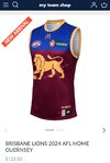
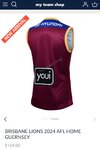
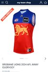
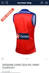
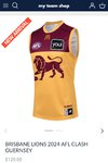
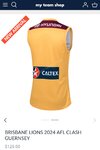
Possible brisbane leaks, source - myteamshop.com.au. Blue cuffs on away strip and writing on the inner collar of all guernseys.
Attachments
- Jun 3, 2015
- 743
- 761
- AFL Club
- Port Adelaide
Was a huge fan of they yellow cuffs last yearPossible brisbane leaks, source - myteamshop.com.au. Blue cuffs on away strip and writing on the inner collar of all guernseys.
Totally agree. Even if it's just hidden on the inside of the jumper somewhere (like the collar).Don’t mind the idea of putting some sort of indicator of the year on the jumper though
- Sep 30, 2015
- 3,231
- 4,991
- AFL Club
- West Coast
This should have been adopted as their AFL home guernsey from the beginning.bring back the 1997 away diagonal bolts

Similar threads
- Replies
- 726
- Views
- 78K
