Swooping_Magpie
it's swooping season
- Joined
- May 16, 2021
- Posts
- 599
- Reaction score
- 1,027
- Location
- Victoria Park
- AFL Club
- Collingwood
- Other Teams
- Liverpool, SM Hellas
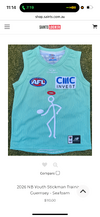
Origin kits on the players (though they appear to be retail versions)
white shorts

Follow along with the video below to see how to install our site as a web app on your home screen.
Note: This feature may not be available in some browsers.

 BigFooty Tipping Notice Img
Weekly Prize - Join Any Time - Tip Round 9
The Golden Ticket - Corporate tickets, functions, Open Air Boxes at the Adelaide Oval, ENGIE, Gabba, MCG, Marvel, Optus & People First Stadiums. Corporate Suites at the Gabba, MCG and Marvel.
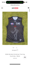
Origin kits on the players (though they appear to be retail versions)
Log in to remove this Banner Ad
unfortunately our SA sea foam can have a nasty tinge of red/brown in it nowadaysNo, it's definitely seafoam.
I want to see Gold Coast succeed. But not until they have an AFL standard guernsey.A gold 100% opacity traditional monogram is all they had to do to make it look mint.
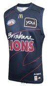
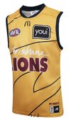
Couple of new lions training guernseys


the collar with the G along with the Yeti sponsor looks ****ing awful
The G spot really isn’t meant to be that obvious.the collar with the G along with the Yeti sponsor looks ****ing awful
This is one of those Illustrator image trace situations, undoubtedlyI'm curious as to how and why they smoothed out the 'Brisbane' text. I know the old version had jagged edges which look a little shitty now, but this 'auto-trace' version they have decided to go with doesn't look that much better.
These style sheets and stamps are fascinating and show how the text of the time used to look. It also contains the PMS colours of the day!
What G spot? I can't see one nor find it if i wanted toThe G spot really isn’t meant to be that obvious.

its mythWhat G spot? I can't see one nor find it if i wanted to

the collar with the G along with the Yeti sponsor looks ****ing awful
God this template is atrocious.
Cats training jumper


Did Abbey chatfiled and her cuck bf design this?