Remove this Banner Ad

News New Melbourne Logo

Do you like the new logo?

  • More than Bruce's love for Cyril

    Votes: 14 14.9%
  • A huge improvement, could be hornier

    Votes: 43 45.7%
  • Pretty good, but where's the 'F' in that monogram?

    Votes: 26 27.7%
  • Terrible, why did they ditch the Southern Cross?

    Votes: 11 11.7%

  • Total voters
    94

🥰 Love BigFooty? Join now for free.

Joined
Aug 4, 2013
Posts
1,004
Reaction score
2,066
AFL Club
West Coast
Other Teams
Perth Scorchers, Gladbach, Kyoto Sanga
Confirmed!
410589-tlsnewslandscape.jpg

http://www.afl.com.au/news/2015-11-...s-and-a-new-logo-demons-launch-unique-rebrand

_________________

If not the right place yada yada feel free to move blah blah.

Anyway, saw a bloke over on Reddit who reckons Melbourne might have filed a new trademark on June 16.
Here's the screengrab before it got lost in the internet wasteland


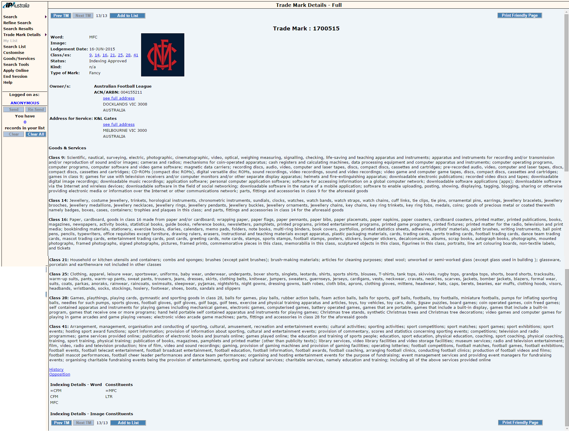
And here's a shot of the actual new (?) logo. Notice that it's a bit more 'modern' than the current monogram.
0AXfGto.png


IMO this would be much nicer than the current shield. Much classier.
 
Last edited by a moderator:
Trying hard to be Carlton
Terrible comment

Good. Much better than their current mess which is a total Homer, and the monogram perpetuates their image as an old, storied traditional club, which I think is what they've been going for.

Personally I prefer the current untouched monogram, this is sort of like when Carlton changed their monogram in the early 2000s and made it smoother - it took out character.
 

Log in to remove this Banner Ad

They've been running with just the monogram pretty much all year, and last year too IIRC.

Monogram on square is a bit boring, though. Would have liked them to put it a simplified shield.
 
This seems to be in in line with their strategy from earlier this year/last year? of having a "New York Yankee" type presence in their marketing and uniforms. Going the Monogram route would be a start. I like it, but also prefer the current monogram they use. Interesting to see if any Jumper changes are in teh works
 
This seems to be in in line with their strategy from earlier this year/last year? of having a "New York Yankee" type presence in their marketing and uniforms. Going the Monogram route would be a start. I like it, but also prefer the current monogram they use. Interesting to see if any Jumper changes are in teh works
I think removing the logo from the jumper and simplifying it to just the plain red yoke on navy was their only move. Classic and uncluttered.
 
Agree, apart from going to a very dark blue jumper with the monogram similar to their indigenous and training jumpers, this year has been as good as they have gotten for a few years.
 

Remove this Banner Ad

🥰 Love BigFooty? Join now for free.

I like it. Intentionally or not it mirrors the guernsey yoke.

That has to be it.

Big advocate of the monogram for Melbourne, all of their apparel has been uber classy this year.

Not sure this is an improvemenT on the old monogram.
 

Remove this Banner Ad

Remove this Banner Ad

🥰 Love BigFooty? Join now for free.

Back
Top Bottom