Dylan8
Bar Up
- Joined
- Apr 7, 2013
- Posts
- 42,113
- Reaction score
- 85,173
- Location
- Burn City
- AFL Club
- Port Adelaide
- Other Teams
- Liverpool FC
I think that was Stewart2Austinsaw this one a while ago

Follow along with the video below to see how to install our site as a web app on your home screen.
Note: This feature may not be available in some browsers.

I think that was Stewart2Austinsaw this one a while ago
Thanks for your input. It's a tough look to get right, but I don't think it's impossible. Will try something different next time.Good effort though, but I'd drop the glare/shadow look hammertime#8
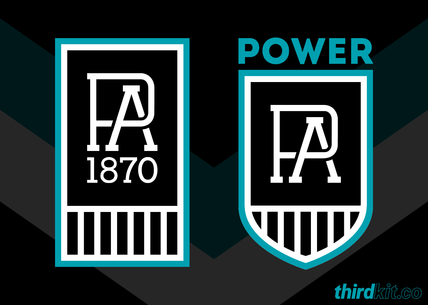
The bottom one is the best I think. The top coming in at second. The dominant monogram in the shield just isn't doing it for meA few more I tried out;


I'd almost say that monogram is better than the current one. I love that the P takes massive precedence over the A

Log in to remove this Banner Ad
One toned.


The prison bars and the double vee just does not work it looks way too busy.


When we go down that route, or the basic monogram, I hope we revert to our oldest nickname, 'Ports'.View attachment 180436
I like the idea of having a single symbol to represent the club rather than two symbols joined together, mainly because it went through a reunification process rather than a merger. The Port Adelaide lighthouse does this really well, as it speaks to the heritage of the area and there's a bit of tenuous power/light connection as well. It also puts the 'Prison Bars' in their proper context, as they actually represent the wharf and pylons down at the docks.
I also think it's important to showcase Port's unique position in the competition as the only traditional club from outside Victoria to be elevated to the national competition. This was achieved on merit alone, by winning more state-level premierships than any other club in the country, and this is represented by the two flags either side of the lighthouse. The silver flag on the left represents the titles won in our monochrome-clad past, whilst the teal flag on the right represents our success in the AFL and our efforts to continue our winning tradition. The two pennant shapes together also form a subtle 'W', which speaks to our mantra and our reason for being; We exist to Win premierships.
View attachment 180439 View attachment 180440
View attachment 180436
I like the idea of having a single symbol to represent the club rather than two symbols joined together, mainly because it went through a reunification process rather than a merger. The Port Adelaide lighthouse does this really well, as it speaks to the heritage of the area and there's a bit of tenuous power/light connection as well. It also puts the 'Prison Bars' in their proper context, as they actually represent the wharf and pylons down at the docks.
I also think it's important to showcase Port's unique position in the competition as the only traditional club from outside Victoria to be elevated to the national competition. This was achieved on merit alone, by winning more state-level premierships than any other club in the country, and this is represented by the two flags either side of the lighthouse. The silver flag on the left represents the titles won in our monochrome-clad past, whilst the teal flag on the right represents our success in the AFL and our efforts to continue our winning tradition. The two pennant shapes together also form a subtle 'W', which speaks to our mantra and our reason for being; We exist to Win premierships.
View attachment 180439 View attachment 180440
I like the concept more then the execution- can you simplify the design? Think practical- the logo has to be sewn onto merchandise etc. However I really like the idea.

I like the subtle lightning bolt thereView attachment 181180
I made some amendments to try and clean up the lighthouse a bit and give it some dimension.
We needed you in 1995.View attachment 180436
I like the idea of having a single symbol to represent the club rather than two symbols joined together, mainly because it went through a reunification process rather than a merger. The Port Adelaide lighthouse does this really well, as it speaks to the heritage of the area and there's a bit of tenuous power/light connection as well. It also puts the 'Prison Bars' in their proper context, as they actually represent the wharf and pylons down at the docks.
I also think it's important to showcase Port's unique position in the competition as the only traditional club from outside Victoria to be elevated to the national competition. This was achieved on merit alone, by winning more state-level premierships than any other club in the country, and this is represented by the two flags either side of the lighthouse. The silver flag on the left represents the titles won in our monochrome-clad past, whilst the teal flag on the right represents our success in the AFL and our efforts to continue our winning tradition. The two pennant shapes together also form a subtle 'W', which speaks to our mantra and our reason for being; We exist to Win premierships.
View attachment 180439 View attachment 180440


I agree with everything you just said.Funny you say that, I was having a play with the logo this morning trying to fit them in. I've found it hard to do without crowding the design though, but I'll keep trying different things to see if something clicks.
So far it looks better without them.
I agree with everything you just said.