Discussion Rugby League/Union Kits discussion

Remove this Banner Ad

Looks decent but the gradient ruins it. It's been a BLK obsession if you will. I also hate the new vitara sponsor. FFS just leave Suzuki on. Also there will be no more Star for next year as ISC will take over for both the Pies and the Storm.
Just when star decided to do great uniforms.
 
Jersey that never was. Bottom right.
udqd44V.png
 

Log in to remove this ad.

Surely that's not official.
Official concept jersey that was meant to go into production. Got the pic off Lovell sports site in the UK who were taking pre-orders. Bought one but was given a refund 2 weeks later. My guess is the studio pulled the pin at the last minute. Bound to be a couple sample jerseys after a couple colour runs out there...
 
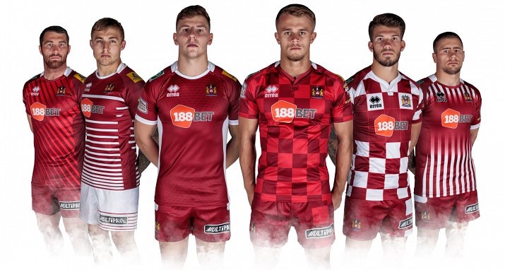
Wigan are letting fans vote on next year's home jersey.
AE40495C-7664-4139-8154-E73FAC0DD3C0.jpg
NONE OF THE ABOVE!
How they manage to consistently mess up one of the best jumpers out there is beyond me!
 

(Log in to remove this ad.)

Official concept jersey that was meant to go into production. Got the pic off Lovell sports site in the UK who were taking pre-orders. Bought one but was given a refund 2 weeks later. My guess is the studio pulled the pin at the last minute. Bound to be a couple sample jerseys after a couple colour runs out there...
This was before the ISC superman contract or after?
 
Was thinking of the old leather rugby ball with the black spots on the end and how it used to look when it was spun.
IMAGE_239.jpeg ballon_rugby_pointe_noire.jpg il_570xN.1029629657_mdpb.jpg
Seeing as Japan always comes up with cool retro stuff, I thought of an extremely simple retro idea for the Rugby World Cup 2019 match-ball in Japan; utilising the red sun from the flag.
Image 1.png Image 2.png

Photoshopped a spiral from a Kyoto parasol just as an idea for when the ball spins:
Image 3.png

I dunno if Gilbert would be able to make it though, as the spot idea might be trademarked by Adidas.
 
Last edited:
L-R
  • Rays - never going to take off with that colour set -, they should go back to what they wore in 2007 (Central Coast Rays) and wear Green (with a Black or Navy, and white trim).
  • Rebels - Looked better with the pink, it's still a pretty average kit though.
  • Eagles - perfect, the Orange is classic NSW Country and the black shorts and socks is simple and elegant.
  • Vikings - Shithouse, another reason why any self respecting sports organisation should avoid Classic sports (see NSW Origin)
  • Brisbane City - Nice colour scheme, the trim on the shorts is a great touch but the collar still haunts me.
  • Spirit - not bad execution of a pretty classic style kit, I think that the Force blue could be used in better ways as the trim.
  • Rams - Hasn't changed much since 07, I don't mind it - but never going to be a classic - look to the way the Eagles are using the Orange on its own, much more powerful like Randwick or NZ.
  • QLD Country - see Brisbane City
 

Remove this Banner Ad

Back
Top