Navigation
Install the app
How to install the app on iOS
Follow along with the video below to see how to install our site as a web app on your home screen.
Note: This feature may not be available in some browsers.
More options


You are using an out of date browser. It may not display this or other websites correctly.
You should upgrade or use an alternative browser.
You should upgrade or use an alternative browser.
Discussion Rugby League/Union Kits discussion
- Thread starter Jones2ByrneJones
- Start date
- Tagged users None
Klim
Brownlow Medallist
- Sep 17, 2013
- 12,532
- 10,363
- AFL Club
- Sydney
The wording is too high on the uniforms.I prefer the more traditional shade of "baggy green" green. Here's the sevens kit and some other Olympic stuff
View attachment 266540 View attachment 266541
That's the point of the design, I like it.The wording is too high on the uniforms.
Our Olympic event uniforms are decent this time
The wording is too high on the uniforms.
It makes sense for some of the events as the athletes will have bibs attached to the front (athletics) so the high placement of the wording means it wont get covered up. I guess the rest have it up high as well to keep the designs consistent across the entire Olympic team, plus some sports may also have front numbers.
It also may be a play on "down under" having text immediately after the yokeIt makes sense for some of the events as the athletes will have bibs attached to the front (athletics) so the high placement of the wording means it wont get covered up. I guess the rest have it up high as well to keep the designs consistent across the entire Olympic team, plus some sports may also have front numbers.
Klim
Brownlow Medallist
- Sep 17, 2013
- 12,532
- 10,363
- AFL Club
- Sydney
Artie Beetson tribute jersey.


Klim
Brownlow Medallist
- Sep 17, 2013
- 12,532
- 10,363
- AFL Club
- Sydney
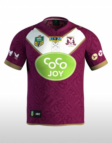
Manly heritage jersey. Also the 20th anniversary of their sponsorship with URM.
Klim
Brownlow Medallist
- Sep 17, 2013
- 12,532
- 10,363
- AFL Club
- Sydney

Klim
Brownlow Medallist
- Sep 17, 2013
- 12,532
- 10,363
- AFL Club
- Sydney
Looks like there will be a new back sponsor and a new jersey next year.


Last edited:
Klim
Brownlow Medallist
- Sep 17, 2013
- 12,532
- 10,363
- AFL Club
- Sydney
Also Penrith are looking to do a SuperLeague throw next year.

Also Penrith are looking to do a SuperLeague throw next year.
When did they ever wear that?
also no, no, no, no, no. Never go back to those days.
sjohnson
Rory Lobbster
- Mar 9, 2015
- 555
- 1,181
- AFL Club
- Fremantle
The Steggles rooster nearly blends in with all the other grasshopper-looking thingsArtie Beetson tribute jersey.
God I hope they wear that against the Warriors, just for the laughsAlso Penrith are looking to do a SuperLeague throw next year.
GasometerCourage
Senior List
Reckon they'll go with completely-illegible white numbers on the bath, or slightly-less-illegible red numbers?God I hope they wear that against the Warriors, just for the laughs
mtwellington
Debutant
- Oct 1, 2013
- 114
- 124
- AFL Club
- Collingwood

1997.When did they ever wear that?
also no, no, no, no, no. Never go back to those days.
IMHO the Panthers Super League was the single worst jersey ever conceived, designed, produced and worn. Truly a disgrace...
Klim
Brownlow Medallist
- Sep 17, 2013
- 12,532
- 10,363
- AFL Club
- Sydney
Another concept.

1997.
IMHO the Panthers Super League was the single worst jersey ever conceived, designed, produced and worn. Truly a disgrace...
Was well aware of when. I do not regard that competition as being real (due to how it damaged the game then through to now) and as such I act as if it never existed.
The panther looks like it was busted sneaking past some horizontal blindsAnother concept.
So teal is now out???
Consistency, thy name is not Penrith...
Klim
Brownlow Medallist
- Sep 17, 2013
- 12,532
- 10,363
- AFL Club
- Sydney
More concepts from Penrith.

http://www.foxsports.com.au/nrl/nrl...s/news-story/afe3d7cc6441efd66673cccad6c995ac
Thought something looked different...
...the sponsorship deal worth $1 million a year to the club quickly fell apart when it was claimed by FAL that the person who signed the deal on its behalf, former chief executive Tim Xenos, lacked the authority to do so because he was an undischarged bankrupt.
FAL claimed the sponsorship deal therefore did not exist and demanded the Sea Eagles removed the CoCo Joy logo from its jerseys.
Thought something looked different...
- May 23, 2016
- 713
- 836
- AFL Club
- St Kilda
- Other Teams
- Port Melbourne; Kalkee; Horsham Demons
Storms WiL jersey for Saturday Nights game will not feature the increasingly intrusive Crown sponsorship, but a special Ovarian Cancer Australia logo. The actual design is pretty good as well, wouldn't mind using a version of this as the away strip. Star really appear to make good stuff.


Klim
Brownlow Medallist
- Sep 17, 2013
- 12,532
- 10,363
- AFL Club
- Sydney
Looks decent but the gradient ruins it. It's been a BLK obsession if you will. I also hate the new vitara sponsor. FFS just leave Suzuki on. Also there will be no more Star for next year as ISC will take over for both the Pies and the Storm.Storms WiL jersey for Saturday Nights game will not feature the increasingly intrusive Crown sponsorship, but a special Ovarian Cancer Australia logo. The actual design is pretty good as well, wouldn't mind using a version of this as the away strip. Star really appear to make good stuff. View attachment 273205
Similar threads
- Replies
- 42
- Views
- 2K
