


Fizzler
BBTB
- Dec 26, 2013
- 12,781
- 16,367
- AFL Club
- Port Adelaide
- Other Teams
- OKC, Coburg, Werribee, Storm, QPR
Not too keen on that.Only just came across this, but it was announced months ago. New Sheff Wednesday badge.
I reckon it's a belter!

Follow along with the video below to see how to install our site as a web app on your home screen.
Note: This feature may not be available in some browsers.
Not too keen on that.Only just came across this, but it was announced months ago. New Sheff Wednesday badge.
I reckon it's a belter!
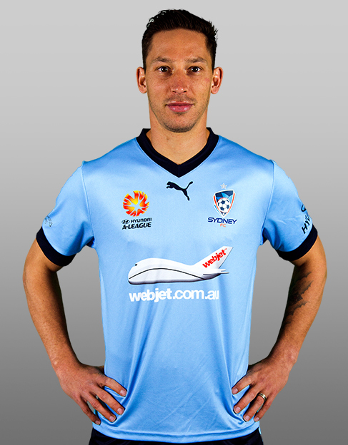


I swear to God, if that Hyundai logo is white on white...
City called, they want their kit back! (minus the Hyundai logo of course) In all seriousness though, hate it when a club uses two different templates especially here where it forces logos to be repositioned.
I'm not too keen on that collar.
Yeah cause Sydney haven't worn that before.City called, they want their kit back! (minus the Hyundai logo of course) In all seriousness though, hate it when a club uses two different templates especially here where it forces logos to be repositioned.
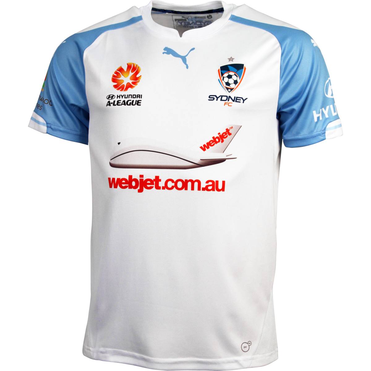
Thought it was clear that I was taking the piss, will make it clearer in future.Yeah cause Sydney haven't worn that before.
White Hyundai logo looks good on white


Would have been great if the Mariners had a toned down version of this.Everton third kit.
The Umbro on the sleeves is lame but I seriously dig this. The fluro yellow and bright blue is classic, plenty of clubs have looked good in itEverton third kit.
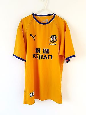
Better then liverpools atrocious Ronald McDonald looking kits a few years agoThe Umbro on the sleeves is lame but I seriously dig this. The fluro yellow and bright blue is classic, plenty of clubs have looked good in it
And yeah that new Wednesday crest is a corker, I liked the old one too for its simplicity but this one works even though it looks so cartoony. The shade of blue is nice. They're well overdue for a Premier League stint...
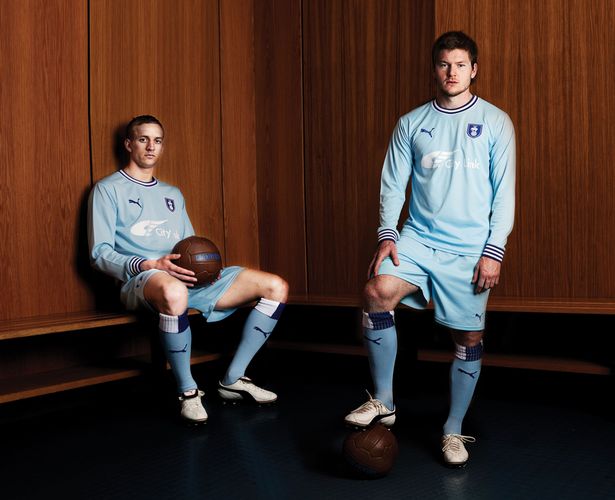
Just saw Cahill training with Melbourne City on the tele, this is their new home strip (I guess):
Pity about the big logo on the back because I actually like this. The light socks don't look jarring as a completely different colour, basically it's not a big colour contrast. It works for me, much better than their last one. People have an issue with them looking temporary and like an away strip (because white = away team here in Australia), but it sort of works... in the hot bright summer, it looks cool and relaxed.

That Wednesday get up is exactly what I think Melbourne City should wear too. Plain white top, sky shorts.
EFA...God Damn it.... the plastic "vi$ion" franchise fuelled by ******* oil money is actually proud of this effort...

https://premier.sportsubs.com.au/aleague/perthglory/products/productdetails?productid=7001
Pre-order for a Perth Glory Heritage Shirt 'based on the original strip worn in 1996 but with a modern twist'
To be worn first home game of the 2016/17 season.
Do we know anything about this?
For reference, 1996:

