
In retrospect, I reckon the tartan patterned United kit from Ferguson's last season was one of their best.
Navigation
Install the app
How to install the app on iOS
Follow along with the video below to see how to install our site as a web app on your home screen.
Note: This feature may not be available in some browsers.
More options
You are using an out of date browser. It may not display this or other websites correctly.
You should upgrade or use an alternative browser.
You should upgrade or use an alternative browser.
Discussion Soccer/Association Football New Kits
- Thread starter Silent Alarm
- Start date
- Tagged users None
- Status
- Not open for further replies.
Francesco Totti
Rookie
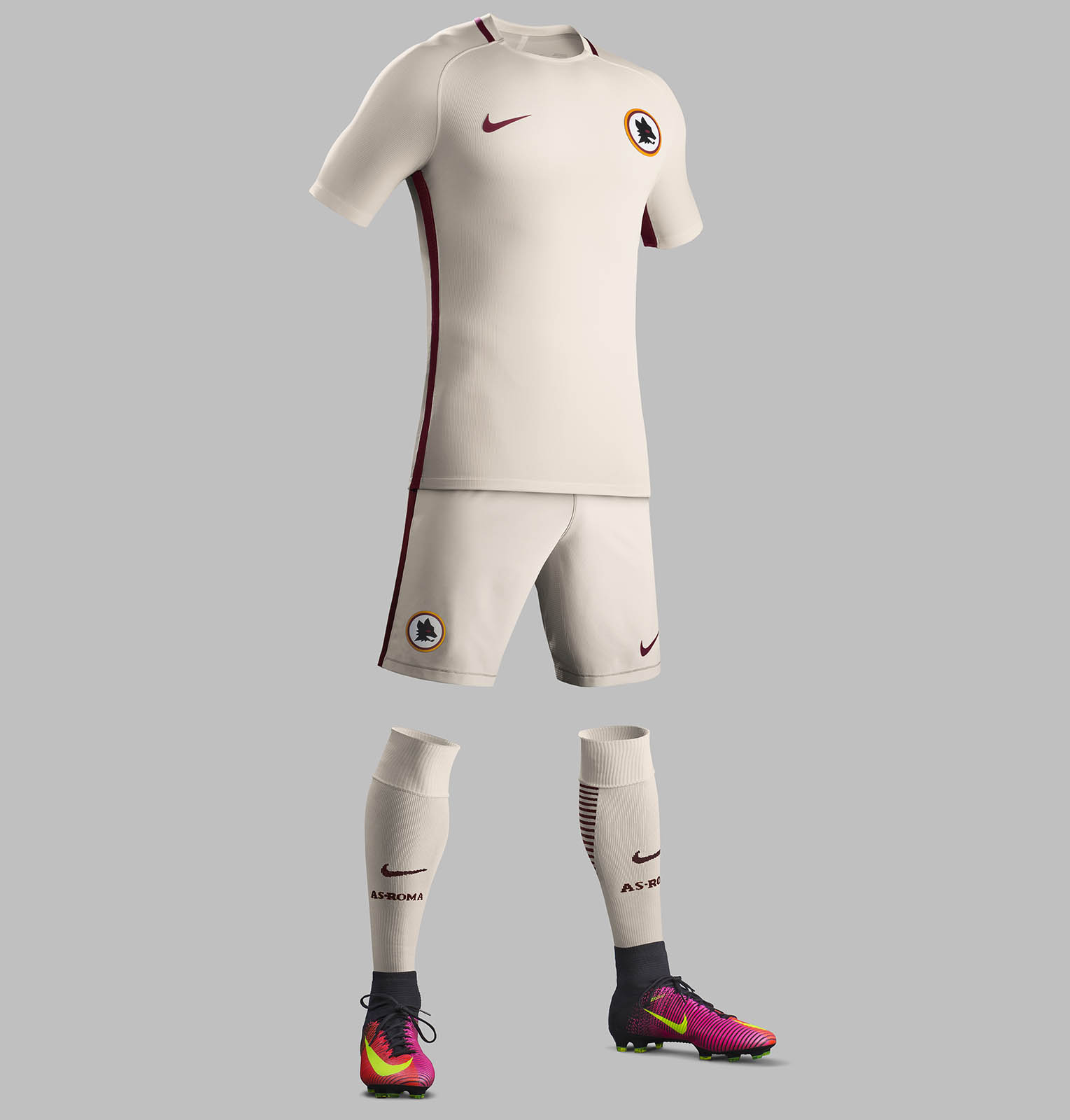
AS Roma's away strip. Beautiful and the lupetto logo has returned - just on the away strip.

fancyscum
Radical Crommunist
That is a kick ass looking kit! White would have looked good but the beige/cream colour is beautiful. Not a big fan of this nike template in practice but it looks nice and clean.AS Roma's away strip. Beautiful and the lupetto logo has returned - just on the away strip.
Got a very mixed feeling from the supporters though, but it has aged quite well, I liked the checquered blue away kit the season after, that was a hitIn retrospect, I reckon the tartan patterned United kit from Ferguson's last season was one of their best.
So Northampton Towns new home kit for this season didn't arrive in time for the weekends first game lol
- Nov 15, 2010
- 2,409
- 2,157
- AFL Club
- Fremantle
- Other Teams
- WACA, Western Force, Arsenal, Glory
So Northampton Towns new home kit for this season didn't arrive in time for the weekends first game lol

Klim
Brownlow Medallist
- Sep 17, 2013
- 12,532
- 10,363
- AFL Club
- Sydney
Klim
Brownlow Medallist
- Sep 17, 2013
- 12,532
- 10,363
- AFL Club
- Sydney
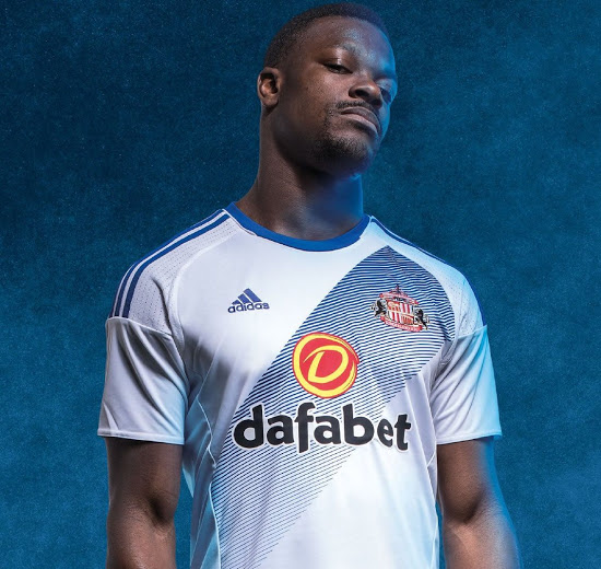
Sunderland 16-17 away kit.
Klim
Brownlow Medallist
- Sep 17, 2013
- 12,532
- 10,363
- AFL Club
- Sydney
hässlich
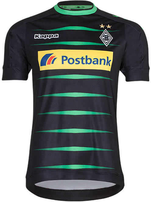
Feels like our kit has taken on a pinkish hue too often, watching these preseason games. The colour doesn't cope well in the sun.


Feels like our kit has taken on a pinkish hue too often, watching these preseason games. The colour doesn't cope well in the sun.
Me when someone comes in and makes the inevitable "When did BLK start making Liverpool's kits?" comment

Me when someone comes in and makes the inevitable "When did BLK start making Liverpool's kits?" comment
View attachment 274307

So, uhh, when did BLK start making Liverpool's kits?
Freight Train
Once hit the sign at the Mercantile Mutual Cup
- Moderator
- #5,494
So, uhh, when did BLK start making Liverpool's kits?
bantz.

Anyway, back on topic...
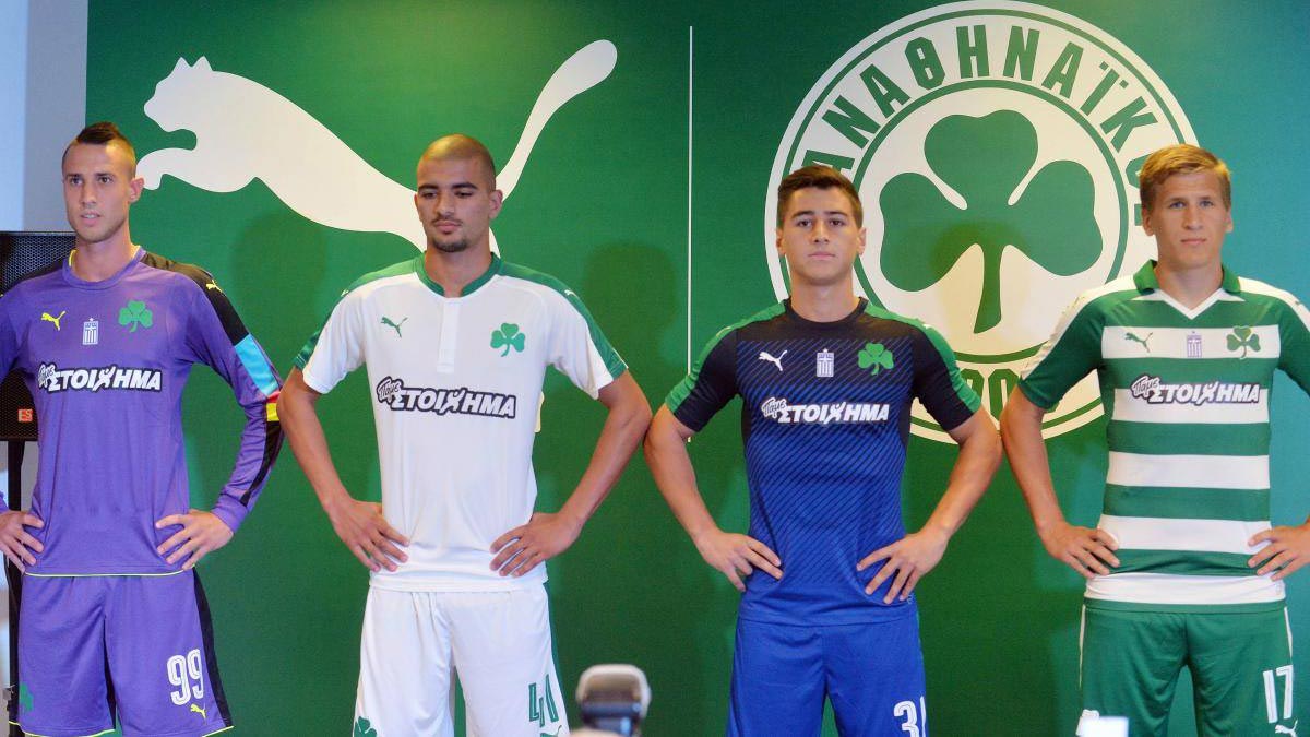
New Panathinaikos kits. Gone back to the hoops from a couple of seasons ago, which is disappointing. The all green look is much stronger, IMO. Looks like Puma recoloured Arsenal's home kit from last year for our away kit, and the blue third kit has a very similar look to last season, which seems an odd choice. All in all, pretty disappointed.
New Panathinaikos kits. Gone back to the hoops from a couple of seasons ago, which is disappointing. The all green look is much stronger, IMO. Looks like Puma recoloured Arsenal's home kit from last year for our away kit, and the blue third kit has a very similar look to last season, which seems an odd choice. All in all, pretty disappointed.
Fizzler
BBTB
- Dec 26, 2013
- 12,785
- 16,370
- AFL Club
- Port Adelaide
- Other Teams
- OKC, Coburg, Werribee, Storm, QPR
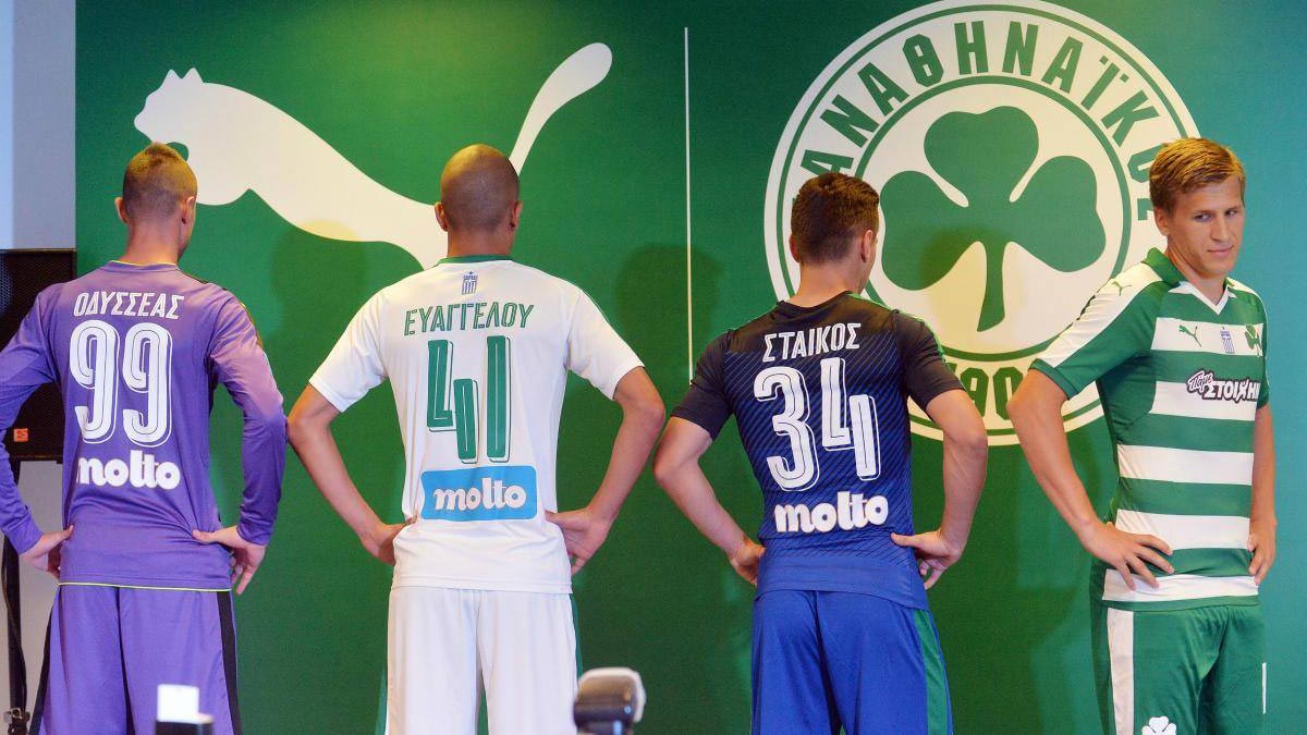
OAYEEEAE, EYATTEAOY and ETAIKOE is how I read those names.
They all look disappointed.
OAYEEEAE, EYATTEAOY and ETAIKOE is how I read those names.
Odisseas, Evangelou and Staikos.
Its a real pet hate of mine when English words are done in a Greek-looking font and Σ gets used as an E, because it is actually an S (and to a lesser extent, Δ (D) and Λ (L) as an A).
Like how in German ß looks like B but is actually a ss sound.Odisseas, Evangelou and Staikos.
Its a real pet hate of mine when English words are done in a Greek-looking font and Σ gets used as an E, because it is actually an S (and to a lesser extent, Δ (D) and Λ (L) as an A).
- Status
- Not open for further replies.
Similar threads
- Replies
- 41
- Views
- 2K
- Replies
- 2
- Views
- 267
